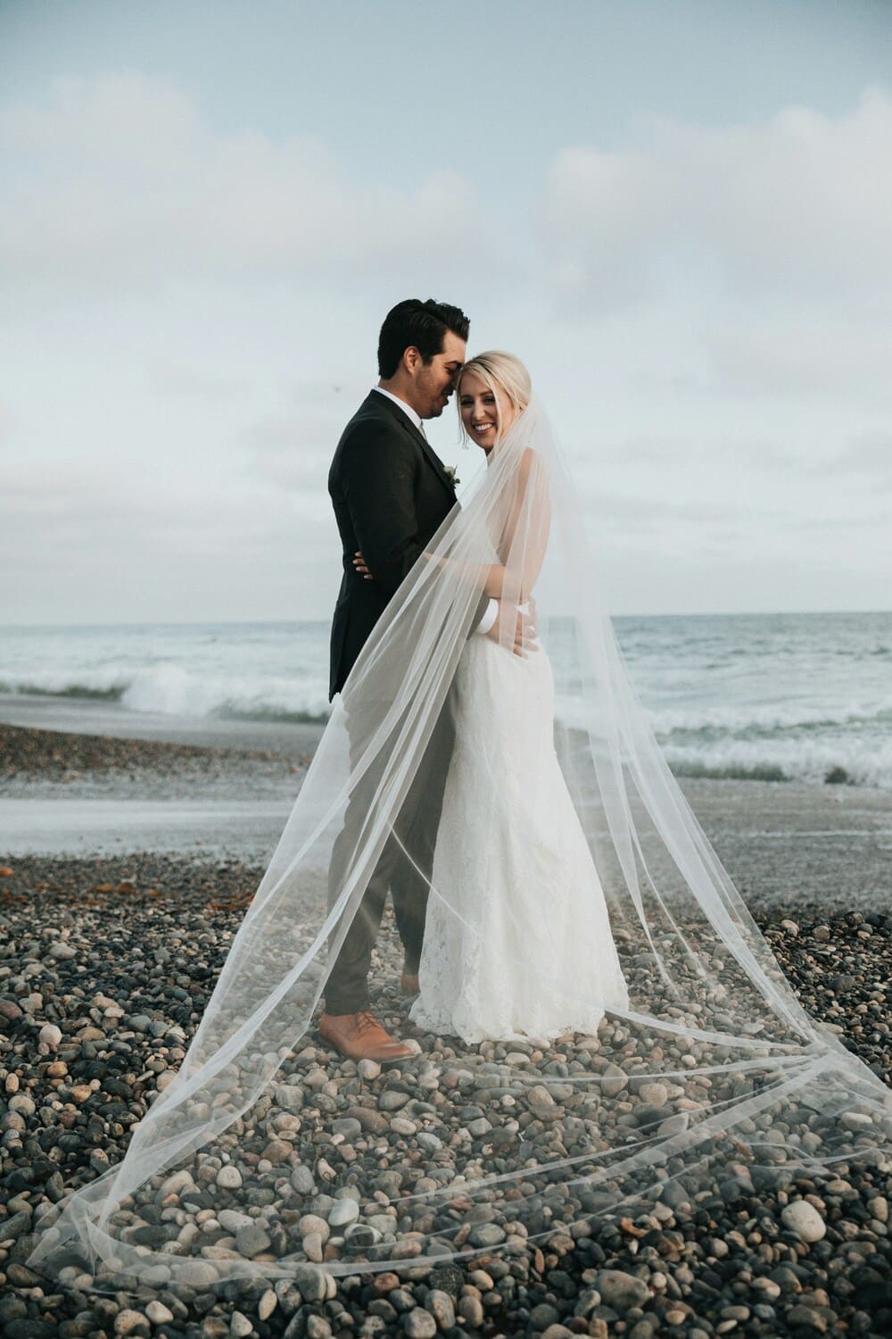
Elegant doesn’t mean expensive, and it doesn’t mean identical. The 25 invitations collected here range from crisp white suites with a single gold detail to deep navy with ornate calligraphy to deckled paper with watercolor botanicals. What they share is intention: every design choice feels considered, nothing is filler, and the overall effect tells you exactly what kind of event you’re walking into.
Whether you’re after something timeless and formal, moody and dramatic, or quietly romantic with the right finishing detail, you’ll find it here. Click through any of the images to see the full wedding. And for even more inspiration, browse our Real Weddings directory.
Classic White and Ivory Wedding Invitations
White and ivory invitations are the baseline of formal stationery for a reason. A clean background lets the typography, monogram, or border take full credit — nothing competes. The suites below prove that restraint is its own form of style.
Clean White Suite with Matching Envelope Liner

Nothing competing for attention, which is exactly the point. The matching envelope liner keeps the whole suite cohesive in the quietest possible way. When the design has this kind of confidence in simplicity, it reads as polished without even trying.
See Catherine and David’s Alabama Wedding →
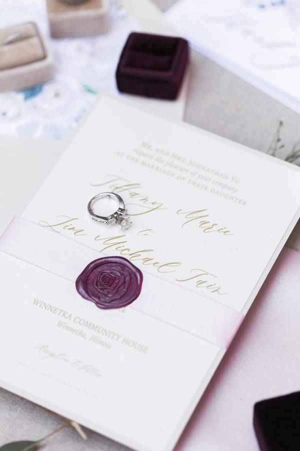
Formal White Invitation with Classic Typography and Ring Box Styling

A clean invitation and one prop: the ring box that tells you everything about the reception to follow. The typography is clear and formal without veering into stuffy, and the styling makes the image feel editorial without trying to be anything other than what it is.
See Duggan and Hegwood’s Winery Wedding →
White Invitation with Lace Paper Texture and Green Botanical Leaf Accents

Lace texture on paper stock adds romantic weight without adding color. Paired with fresh green botanicals tucked into the flat lay, the result is soft, delicate, and quietly formal in a way that avoids the rustic category entirely. It takes a careful hand to stay on the right side of that line.
See Renee and Chris’s Illinois Farm Wedding →
Flowing Script Calligraphy on White with Gold Geometric Envelope Liner
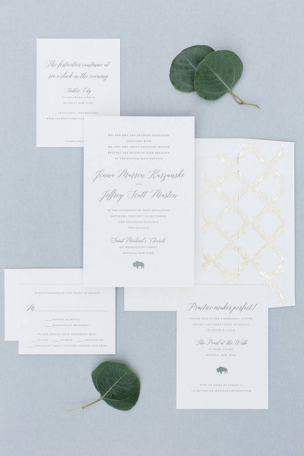
One statement per element. The invitation itself is restrained and clean, calligraphy on white with no competing detail. Then the envelope opens to reveal a gold quatrefoil liner that earns a small exhale. That balance — one quiet choice plus one show-stopping choice — is what makes a suite feel designed rather than assembled.
See Jenna and Jeff’s Buffalo Wedding →
Soft Watercolor Wash Framing Calligraphy Script Names
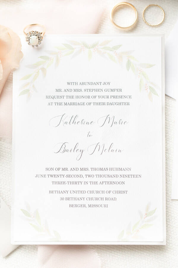
The watercolor border here is barely a suggestion of color rather than a design element in the traditional sense. Applied with such a light hand that it reads as a wash, it gives the calligraphy names room to breathe rather than competing with them. Romantic without any fuss.
See Kate and Bailey’s Hermann Hill Wedding →
Dark and Dramatic Wedding Invitations
There’s a formal authority that only comes with a dark invitation suite. Deep navy, charcoal, and dark slate communicate black-tie before anyone reads a word. These five show exactly how much range you have inside that category.
Silver Embossed Block Typography on Deep Navy

Silver embossing on deep navy: a contrast that punches well above its weight. The all-caps names in block letters give it a formal authority that reads as an event before any details have been absorbed. For couples who want the stationery to signal “this is a real occasion,” this delivers immediately.
See Nichole and Scott’s Sacramento Art Museum Wedding →
Ornate White Calligraphy Suite on Deep Navy with Scrollwork

The ornate calligraphy and scrollwork flourishes feel like something out of a formal European ceremony, and on this navy background, that feeling lands hard. Full names in white script against navy requires a strong design hand to avoid looking too busy — this one pulls it off because the contrast is so deliberately high and every letter is given its space.
See this Arizona Desert Styled Shoot →
Charcoal Invitation with Calligraphy Script and Gold Wax Seal

Charcoal stationery is less common than navy, which is exactly what makes this one stand out. The gold wax seal adds a ceremonial weight — it asks you to pause before opening — and the flowing calligraphy handles the names with real grace. Styled with dried lavender on wood, the overall effect is both intimate and refined.
See Paige and Haeden’s Bleckley Inn Wedding →
Navy Pocket Envelope Revealing a Cream Invitation with Botanical Wreath
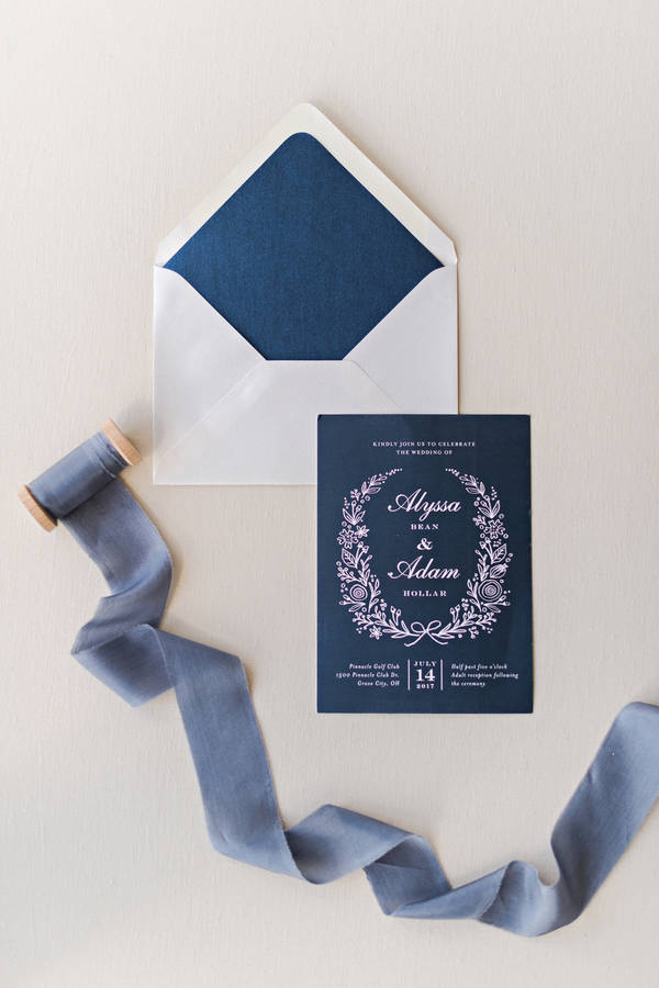
The reveal is part of the experience here. Navy on the outside, and then a cream invitation inside with the couple’s names hand-lettered inside a delicate botanical wreath. It’s a small choreography of opening that makes the whole thing feel like a gift rather than just a piece of mail.
See Alyssa and Adam’s Garden Wedding →
Bold Navy Invitation with White Calligraphy Styled on Bridal Lace
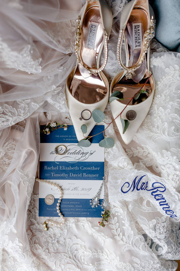
Shot against bridal lace with white satin heels in the frame, this dark navy invitation earns every bit of the editorial treatment it’s been given. The white calligraphy is sharp and legible against the dark background, and the overall image works as a cohesive bridal flat lay that happens to also be an excellent invitation.
See Rachael and Tim’s Austin Villa Wedding →
Gold and Metallic Wedding Invitations
Gold foil, metallic embossing, engraving-style detailing: these are the finishing choices that transform a paper invitation into something that feels genuinely luxurious. A little goes a long way, and these five all understand exactly how much to use.
Gold Crest Monogram on a Moody Dark Background
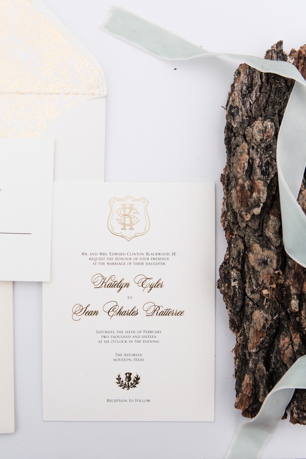
A crest monogram as the design anchor is one of those choices with deep roots in formal correspondence, and it earns that history every time it’s used well. Gold embossing on a clean layout, styled against a dark background that sets it apart from anything basic: this invitation signals formality without spelling it out.
See this Olive and Gold Inspiration Shoot →
Fine-Line Gold Botanical Branch Border Suite
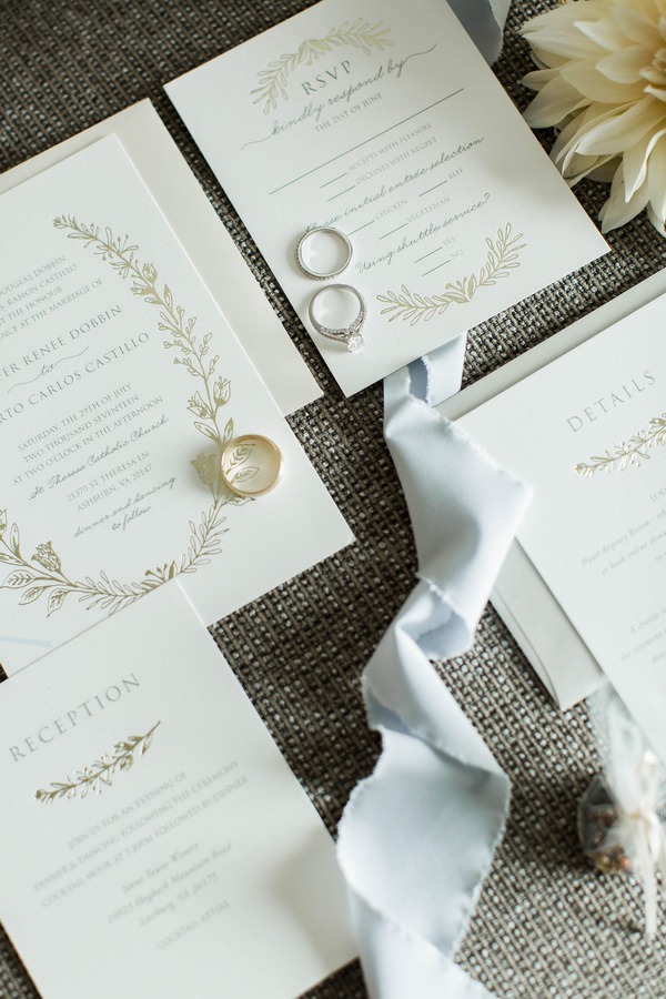
Fine gold botanical branches as a border land in an interesting middle ground: formal enough to imply a ceremony, natural enough to suggest a garden setting. The rings placed in the flat lay underscore exactly what this suite is leading toward. Elegant, cohesive, and easy to read at any postage size.
See Jennifer and Alberto’s Stone Tower Winery Wedding →
Blue Calligraphy and Gold Foil Detail Invitation
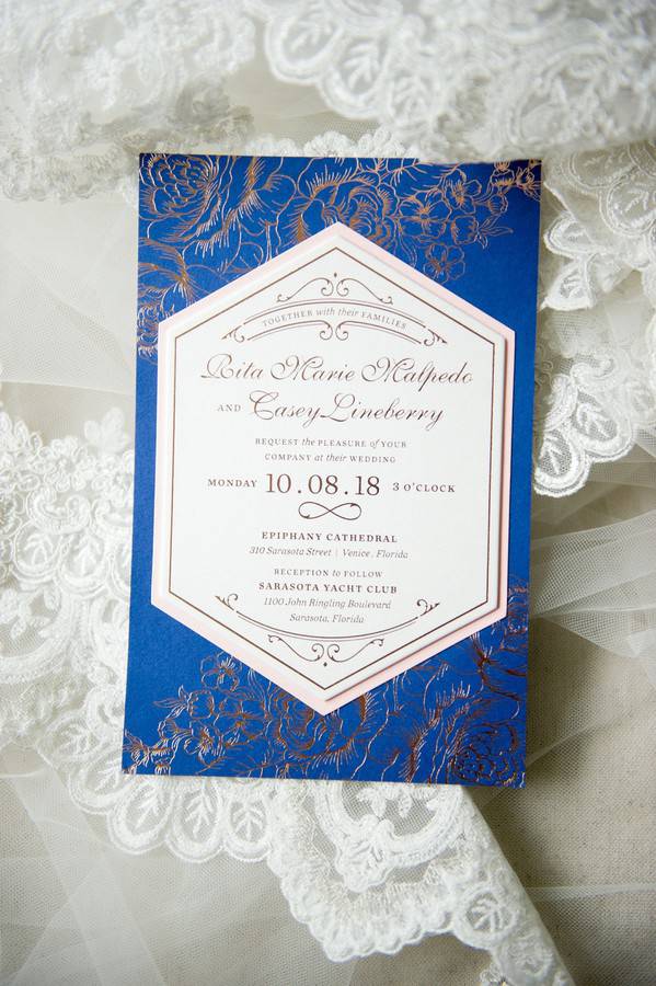
Blue calligraphy and gold foil is the invitation pairing that has never caused trouble at any reception. Formal enough for a yacht club, legible enough that guests don’t need help reading it, and good-looking enough to keep on a shelf. It’s a reliable combination for a reason, and this one executes it cleanly.
See Rita and Casey’s Sarasota Yacht Club Wedding →
Ornate Gold Crest Invitation Styled on Dark Slate with Perfume and Rings
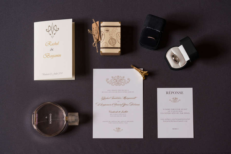
The styling here does as much work as the invitation itself. Shot on dark slate with a perfume bottle and a stack of rings, the gold crest invitation reads like a private event in a Paris apartment. Regal without being overworked, and the dark surface photography makes the cream and gold feel warmer than they might under different conditions.
See Rachel and Benjamin’s Paris Wedding →
Intricate Gold Engraving-Style Invitation
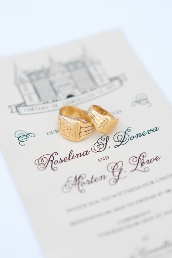
Engraving-style gold detail is the design choice for when you want the invitation to feel like a keepsake before it’s even been opened. Every element of this design is intentional, the kind of invitation that takes time to fully look at rather than scan. The French chateau wedding it came from matched it completely.
See Roselina and Morten’s French Chateau Wedding →
Floral and Botanical Wedding Invitations
Floral invitations cover a lot of ground, from dense illustrated bouquets to barely-there botanical lines. The ones that read as elegant tend to use florals with restraint: a border that frames rather than overwhelms, a sprig that anchors the design, or a watercolor wash that adds color without claiming the whole card. All five below stay on the right side of that line.
Periwinkle-Bordered Suite with a Silk Ribbon and Lavender Sprig

The periwinkle border is soft enough not to dominate the whole composition, and the fresh lavender in the styling pulls the color palette together without any fuss. Nothing in this suite is competing for attention, and that cohesion is its own kind of elegance.
See Julie and Dan’s New Jersey Wedding →
Peach Suite with a Large Centered Calligraphy Monogram

Peach is a warm alternative to blush that photographs beautifully and reads as formal without feeling cold. The large centered monogram gives the suite an anchor, and the classic font underneath keeps everything from veering into anything too casual. A very considered color and layout choice that pays off.
See Rachel and Wesley’s Tennessee Church Wedding →
Loose Watercolor Floral Illustration Styled with Pearl Earrings and Rings
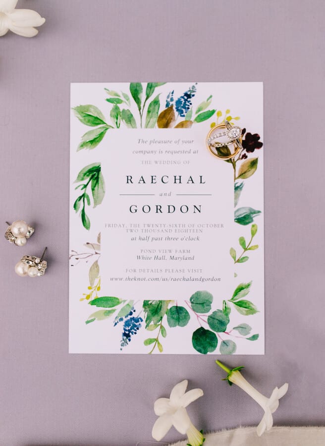
Open and airy watercolor florals rather than dense or tight ones: that’s the move here. The illustration doesn’t crowd the card, which keeps the invitation feeling clean even with a floral element. The pearl earrings and diamond rings in the flat lay feel like a natural extension of the bridal look rather than an afterthought.
See Raechal and Gordon’s Maryland Wedding →
Delicate Watercolor Florals on a Black-Tie Invitation Suite

Soft painted florals on a formal invitation sounds like it shouldn’t work, but the contrast is exactly what makes this one interesting. The loose, delicate watercolor quality reads as warm and approachable, while the calligraphy and layout signal black-tie. Both things are true at once, and the invitation is better for it.
See Logan and Steven’s Southern Wedding →
Olive Branch Watercolor on Deckled-Edge Paper with Bold Serif Names

Deckled paper edges give an invitation a handmade, considered quality that clean-cut stock simply can’t replicate. The olive branch watercolor here feels both natural and modern, and the bold blocked names ground the whole thing with real authority. The styling on wood with rings placed on the card completes a very cohesive image.
See Kristen and Kevin’s Vermont Barn Wedding →
The Details That Make an Invitation Truly Elegant
The difference between an invitation that looks nice and one that feels truly special usually comes down to a single detail: a wax seal, a deckled edge, a ribbon in exactly the right color, or a flat lay prop that makes the image impossible to scroll past. These five are the ones where the details are doing the most work.
Diamond Engagement Ring Resting on a White Invitation
There’s something very direct about styling a wedding invitation with the ring that caused the whole event. No competing props, no elaborate arrangement. The diamond on white isn’t trying to be clever. It just works every time, because it’s true.
See this Purple and Gold Inspiration Shoot →
Plain White Card with Confident Hand-Lettered Calligraphy
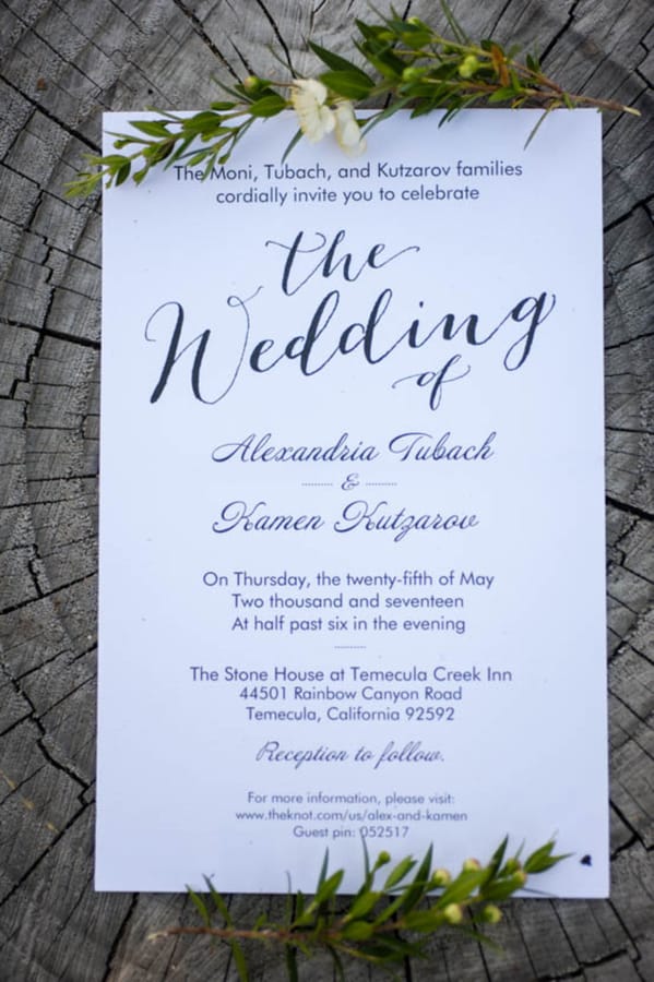
No border. No illustration. No embellishment of any kind. Just calligraphy on white, executed with the kind of confidence that makes the simplicity feel like a statement rather than a shortcut. This is the invitation that trusts the handwriting to carry everything, and it absolutely does.
See Alexandria and Kamen’s Temecula Wedding →
Cream Suite with Gold Calligraphy and a Stamped Wax Seal
A wax seal isn’t a small decision. It slows down the opening, creates a small ceremony around simply reading the invitation, and tells the guest this couple took their time. Cream stock with gold calligraphy is the right foundation for a seal like this — nothing about the suite is fighting for attention, so the seal lands exactly as intended.
See Katlea and Nayef’s Blush Ballroom Wedding →
Dusty Blue Watercolor on Deckled Paper with Gold Crest and Velvet Ring Box
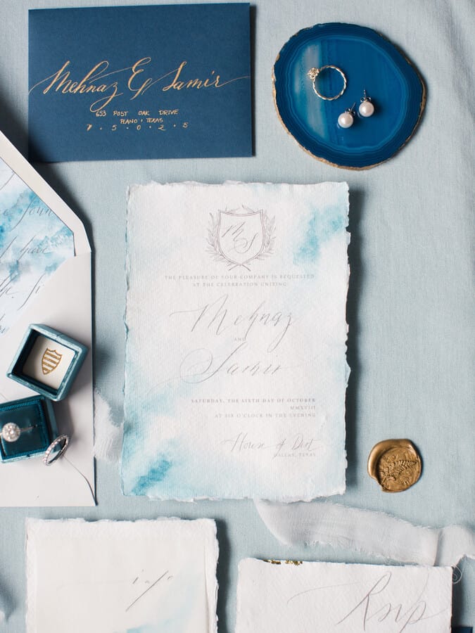
Three details working together: deckled edges for a handcrafted quality, a dusty blue watercolor wash for softness and color, and a gold crest shield monogram for formal weight. The velvet ring box in the styling is a deliberately chosen prop, and the pearl earrings extend the color palette into the accessories. Nothing here is accidental.
See Mehnaz and Samir’s Dallas Wedding →
Monochrome Calligraphy Flat Lay with Cream Roses
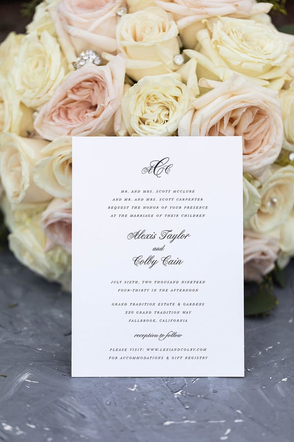
A monochrome flat lay keeps the eye on the invitation itself rather than props competing for attention. The cream roses and white invitation are close enough in tone that the image reads as a single cohesive object, with the calligraphy names providing the only real contrast. Subtle, considered, and very easy to keep looking at.
See Lexi and Colby’s Estate Wedding →
FAQs
What makes a wedding invitation look elegant?
Restraint, mostly. Elegant invitations tend to use one or two strong design choices rather than stacking up every available element. That might mean a dramatic dark background with crisp white calligraphy, or a plain white card with a single gold crest, or deckled edges paired with a watercolor wash. What they share is intention: nothing looks like it ended up there by accident, and nothing is fighting with anything else for attention. Photography matters too. The styling in the flat lay — what props are included, how the suite is arranged — contributes to how elegant the invitation actually reads.
What paper types are best for elegant wedding invitations?
Thick, smooth card stock is the baseline for formal stationery — anything that feels substantial when held. From there, the choices that tend to read as most elegant are cotton or letterpress stock (which has a slight texture and depth to the printing), vellum overlays for a layered effect, and deckled-edge paper for an artisanal, handcrafted quality. Linen-texture finishes add a subtle warmth without going rustic. Kraft paper and recycled stock tend to skew casual or rustic rather than elegant, regardless of what’s printed on them.
When should elegant wedding invitations be sent?
The general rule is six to eight weeks before the wedding, with RSVPs due three to four weeks before. For formal or destination weddings, sending invitations eight to twelve weeks out gives guests more time to make travel arrangements, and it also signals that this is a significant event worth planning around. Save-the-dates usually go out six to twelve months in advance for destination weddings, or three to six months for local ones. The more formal the wedding, the earlier all of this should happen.
What is a wax seal and how is it used on invitations?
A wax seal is a decorative closure made from melted sealing wax pressed with a stamp to create an embossed design. On wedding invitations, they’re used on the envelope flap as a closure, or placed on the outside of a folded invitation as a decorative element. The stamp can be a custom monogram, a botanical motif, or a simple shape. One practical note: the USPS generally requires hand-canceling for envelopes with wax seals, so check with your post office before sending. Some couples use a sticker seal instead that mimics the look without the sorting-machine risk.
How do you choose between a white suite and a dark invitation?
Think about your venue and the overall tone of the wedding rather than your personal color preferences alone. Dark invitations — navy, charcoal, deep green — communicate black-tie, formal, or evening event energy before anyone reads the details. White and ivory suites read as classic and flexible, appropriate for almost any level of formality. If your wedding leans formal and evening-heavy, a dark suite will reinforce that from the first mailbox delivery. If the wedding is daytime, garden, or somewhere in between, white or ivory with metallic detail is usually the cleaner choice. When in doubt, the invitation should match the level of formality of the reception, not just the personal taste of the couple.
Don’t forget to pin this to your Wedding Stationery Board for later!