Simple invitations are harder to pull off than ornate ones — restraint requires more confidence than adding more stuff. But when it’s done right, a simple invitation reads as intentional, polished, and often more memorable than something with ten competing graphic elements. The key is that every choice has to carry its weight: the font, the layout, the paper, the envelope.
Whether you want pure calligraphy on white, a single geometric line, or one carefully chosen detail that sets the whole suite apart, we’ve found eighteen invitations that prove less really is more. For even more inspiration, browse our Real Weddings directory.

Pure Typography
No graphics, no borders, no motifs — just fonts, spacing, and the right words. These invitations let the typography do all the work, and it turns out that’s enough.
Hand-Lettered Calligraphy on White, Nothing More
There’s not a single graphic element here — just clean calligraphy set against white paper. The lettering carries all the visual weight: the slight variation in ink pressure, the natural rhythm of the script. It’s the kind of invitation that looks more expensive than it probably was, because restraint reads as confidence.
See Alex and Kamen’s Temecula Wedding →
Calligraphy Suite with Natural Kraft Envelope
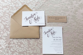
The white card lets the script take center stage, while the natural kraft envelope adds warmth without decoration. Classic fonts, clean layout, nothing extra. The contrast between the white card face and the kraft paper does all the work a floral motif would otherwise be doing — and does it better.
See Jennifer and Kyle’s Virginia Beach Wedding →
White Calligraphy Card with Printed Envelope Lining

The invitation card itself is pure white with calligraphy — no graphics on the face. The only moment of pattern is hidden inside the envelope, where a printed lining creates a small surprise that doesn’t compete with the clean front. It’s a smart approach: all the personality tucked where it belongs, none of the visual noise on the invite itself.
See this Cosmic Light Styled Shoot →
Navy Typography with Silver Accent
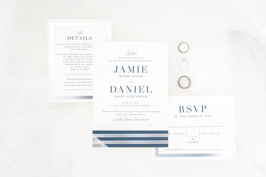
Classic navy on white, set in a structured bold font with subtle silver type handling the secondary details. It reads formal without being stuffy — the kind of invitation that suggests a seaside or garden ceremony without showing you a nautical rope or a flower. Clean, confident, and completely unfussy.
See Jamie and Daniel’s Bayside Wedding →
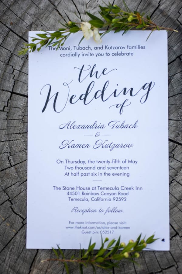
Arch-Top Card in Pure Typography

The arch shape does all the heavy lifting — no need for graphics when the card’s silhouette is already interesting. The typography is minimal, well-spaced, and unfussy. It’s a good example of how one small format decision (the cut of the card) can give a suite a distinctive personality without introducing a single decorative element.
See Mariah and Julio’s Boise Valley Wedding →
Script Monogram and Calligraphy Names on White
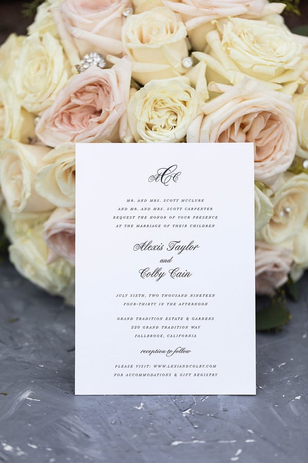
A small calligraphic monogram at the top sets the formal tone, and then the names take over in full script — the rest is small caps detail text on clean white. No graphics, no illustrations, nothing extra. The card is propped here against a blush bouquet, but the design stands entirely on its own: all typography, all the time.
See Alexis and Colby’s Fallbrook Wedding →
Modern Minimalist
These invitations have one deliberate design choice — a geometric line, a bold layout, a high-contrast palette — and nothing else. That one thing is doing a lot of work.
Bold Black-and-White Landscape Format
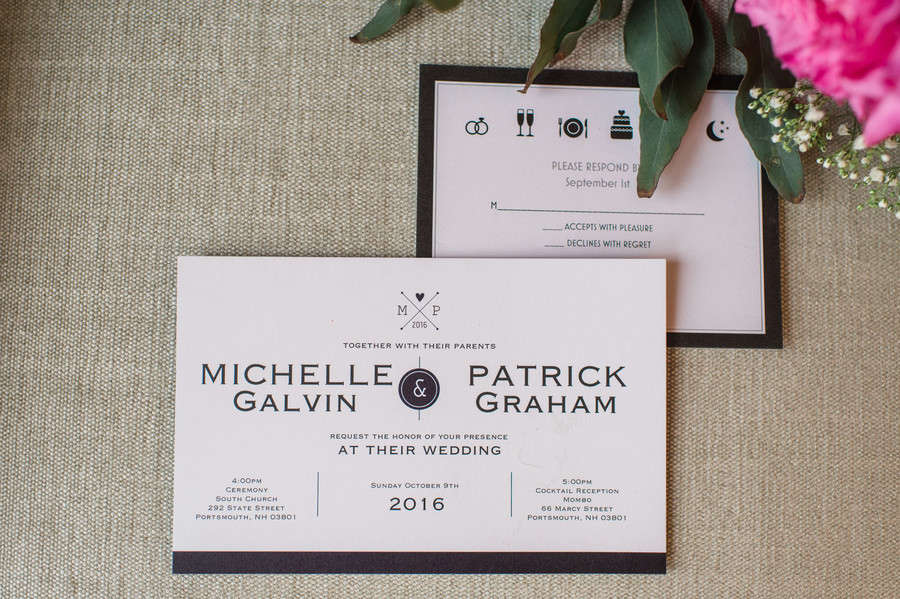
Turning the card landscape is a format choice that reads as intentional rather than standard, and this high-contrast black-and-white suite leans into it. The flat lay shows the full suite — invitation, RSVP, detail card — in the same graphic minimal style. Very deliberate. Very not-boring.
See Michelle and Patrick’s Portsmouth Wedding →
Monochrome Suite with Minimal Monogram
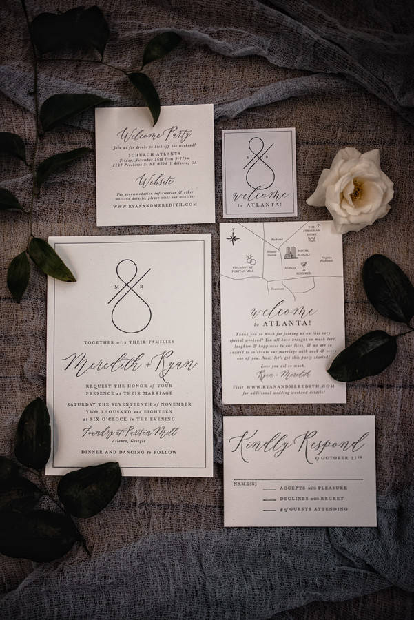
Black, white, and a small monogram — that’s the entire design language of this suite. The monogram is subtle enough to read as a typographic element rather than a graphic flourish. For an industrial or modern venue, this stationery matches the setting without trying to look like it.
See Meredith and Ryan’s Puritan Mill Wedding →
Paddle-Shaped Invitation in White and Gray
The paddle shape is an unusual format choice that reads as artisanal without being precious — the kind of thing guests actually comment on. The typography is clean and modern, no graphic ornamentation anywhere. Just shape and type, and it’s more than enough.
See this Industrial Chic Styled Shoot →
Subtle Teal Geometric Monogram Frame

A geometric frame built from simple angular lines provides just enough structure around the typography without competing with it. The teal accent is restrained — present enough to feel intentional, quiet enough to not take over. It’s a classic invitation with exactly one contemporary detail.
See this Minimalistic Spring Styled Shoot →
Fine Rose Gold Geometric Lines on White
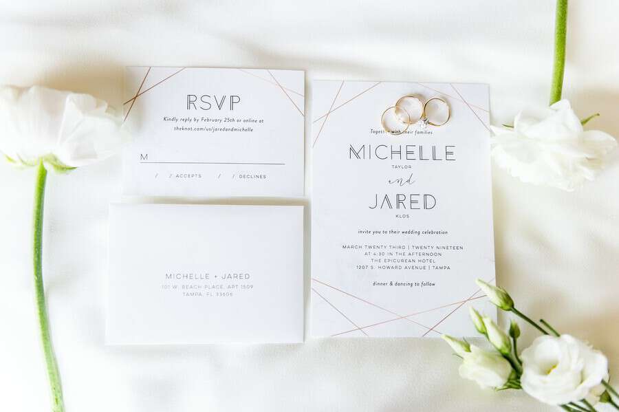
Hairline rose gold lines form a simple border geometry that feels current without being trendy. The rest of the card is white and type-only, which makes the metallic detail pop without competing. A perfect choice for a spring or garden wedding that wants a little warmth without any florals on the paper.
See Michelle and Jared’s Tampa Wedding →
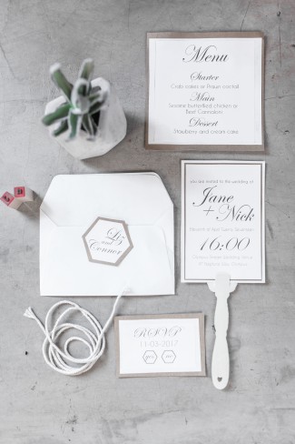
Bold Pink Calligraphy Names with Geometric Monogram
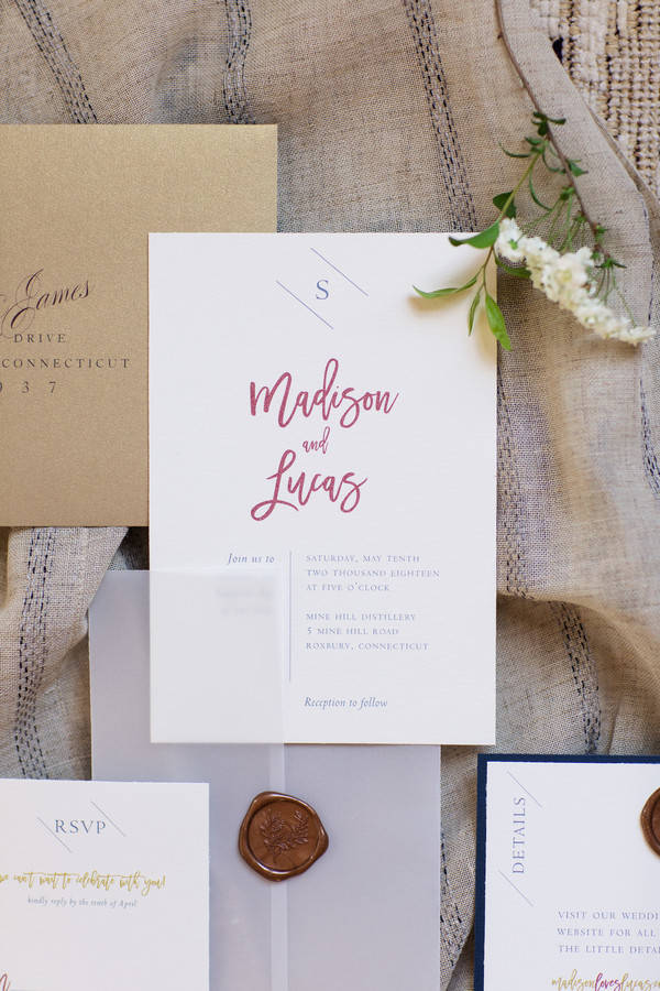
The names dominate in oversized hot pink calligraphy — bold, graphic, and completely in charge. Everything else steps back: a small geometric monogram at the top, clean sans-serif detail text below. The full suite has a vellum wrap with a wax seal and a navy details card, but the invitation face itself is confidently simple. The color is the whole point, and it works.
See Madison and Lucas’s Connecticut Wedding →
One Intentional Detail
One leaf, one wax seal, one carefully drawn botanical border. These invitations are still simple — no clutter, no competing elements — but there’s one thing you’re meant to notice. It’s the difference between minimal and bare.
Landscape Card with Delicate Leaf Garland
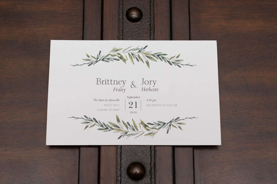
A small leaf garland sits quietly at the top and bottom of a landscape card — that’s the only graphic element in sight. Everything else is white space and clean type. The organic motif feels like a nod to the outdoor setting without committing to a full botanical design. Exactly the right amount for a barn or garden wedding.
See Brittney and Jory’s Indiana Barn Wedding →
Dusty Blue Card with Minimal Botanical Line Border
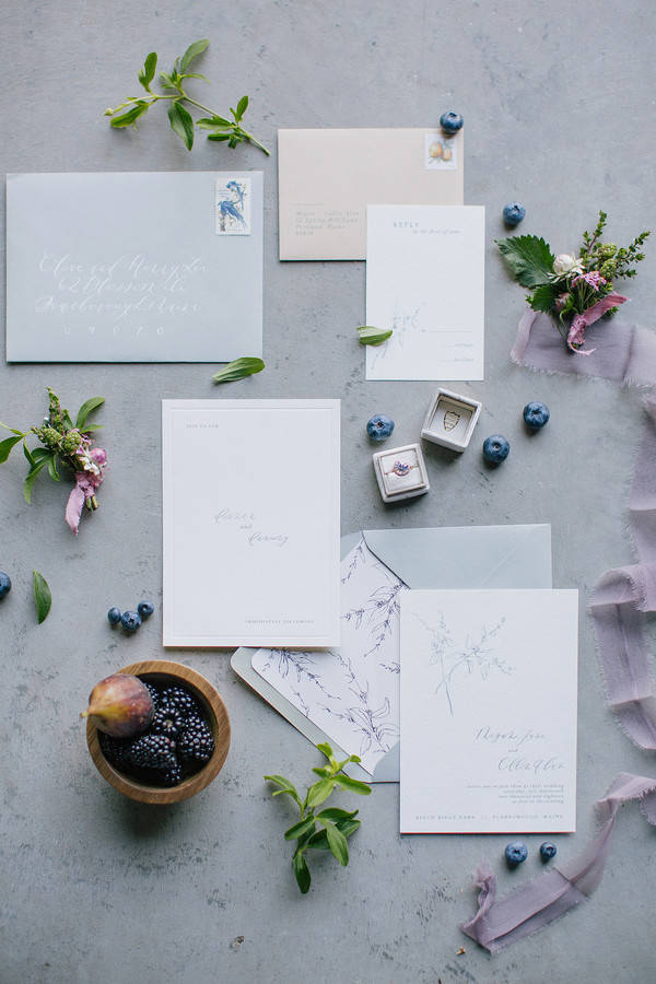
The dusty blue card is doing most of the work — the color alone gives this suite an editorial, autumn-ready feel. The botanical border is fine-lined and airy, more like a sketch than a graphic, and the calligraphy keeps the face clean. A small amount of art direction, a lot of restraint. It really works.
See this Maine Harvest Styled Shoot →
Vellum Envelope with Wax Seal and Calligraphy

The invitation card itself is plain calligraphy on white — the story is in the envelope. Vellum adds a translucent, tactile quality that photographs beautifully and feels genuinely elevated in person. The wax seal is the single decorative moment, and it provides a satisfying, old-world detail without adding anything to the card’s clean face. This is simple done lavishly.
See Sarah and Chris’s Woodsy Wedding →
White Card with Bold Black Border Frame

A thick black border defines the card edge and adds visual weight without requiring any graphic imagery inside it. Within the frame, the typography is clean and generously spaced. Paired here with a matching RSVP card and a white bouquet, it reads as a composed, intentional suite — formal but not fussy.
See Brittany and KJ’s Arizona Mountain Wedding →
Deckled-Edge Handmade Paper Suite

Every card in this suite is printed on handmade paper with torn deckled edges — that’s the one design choice, and it’s a strong one. The invitation face is pure typography in soft gray, the envelope is hand-calligraphy addressed, and a small venue illustration appears on a separate details card (not the invitation itself). Quiet, editorial, and genuinely tactile in a way that photographs can’t fully capture.
See this Old World Feast Styled Shoot →
Clean White Suite with Tiny Buffalo Motif
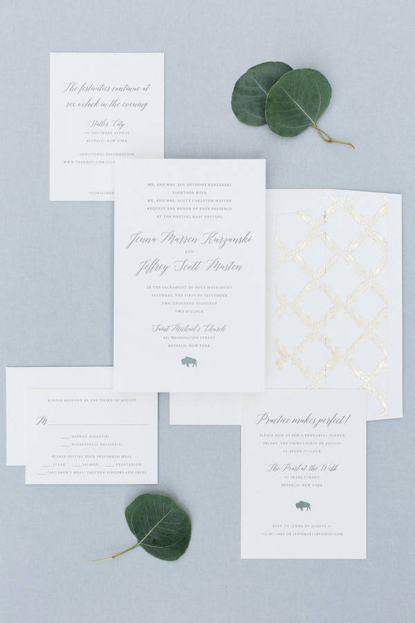
The invitation face is calligraphy names on white with clean small caps details — and one tiny buffalo at the bottom, a nod to the couple’s Buffalo, NY home. The gold trellis pattern lives inside the envelope only. It’s a great example of how one small personal mark can give a plain white suite a whole personality without cluttering the design.
See Jenna and Jeff’s Buffalo Wedding →
FAQs
What makes a wedding invitation “simple”?
A simple wedding invitation relies on typography, layout, and sometimes paper choice to do all the work — without decorative illustrations, busy floral graphics, or multiple competing visual elements. The card might be plain white with calligraphy, or it might have one geometric line or a single color accent, but there’s nothing extra. The goal is that every element has a clear reason to be there.
Do simple wedding invitations look cheap?
Not at all — in fact, restraint often reads as more expensive than ornamentation. What makes an invitation look inexpensive is poor-quality printing, thin paper, or design choices that look accidental rather than decided. A simple invitation on thick card stock with a crisp font will always look more polished than a busy design on flimsy paper. The key is making each element feel intentional, not just absent.
What paper should I choose for a simple invitation?
For simple invitations, the paper itself becomes part of the design — it’s more visible when there’s less on the card. A heavier cardstock (at least 100 lb cover weight) gives the invitation substance and photographs well. Matte white or off-white is the classic choice, but textured cotton or recycled stock adds tactile interest without visual clutter. If you’re adding a detail like a wax seal, vellum wraps or translucent envelopes are a beautiful pairing.
How do I add personality to a simple invitation without adding graphics?
Format, color, and envelope choice are your main tools. An arch-top or landscape card already feels distinctive before you’ve added a single word. Colored envelopes or printed envelope linings hide personality inside without cluttering the face. Colored ink, letterpress printing, or foil stamping add character through the printing method rather than the illustration. And a wax seal on the envelope is one of the best single-detail additions you can make — it reads as crafted and personal without requiring any design work on the card itself.
When should I send simple wedding invitations?
The standard guidance is to send invitations six to eight weeks before the wedding, or ten to twelve weeks for a destination wedding or one requiring significant travel. If your guest list is mostly local and you’ve already sent save-the-dates, six weeks is plenty. If many guests need to book travel or accommodations, give them at least three months. Simple invitations with clean layouts are also easier to translate to digital versions for guests who prefer paperless, which can speed up your RSVP timeline considerably.
Don’t forget to pin this to your Wedding Stationery Board for later!