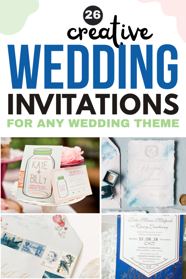
“Modern” doesn’t mean cold or minimal if that’s not your thing. It means intentional. It means a design that tells your story—whether that’s a bold black art deco invite that screams old Hollywood, an ink-washed watercolor card with rose gold foil, or a laser-cut geometric frame that makes guests gasp when they pull it from the envelope.
Whether you’re drawn to dramatic dark paper goods, clean minimalist type, or something in between, we’ve gathered our favorite modern wedding invitations from real weddings and styled shoots to inspire your own. And if you fall in love with a look, click through to see the full wedding! For even more inspiration, browse our Real Weddings directory.

Clean and Minimalist Modern Invitations
These invitations let the typography do the talking. Clean white paper, well-chosen fonts, and just enough graphic detail to make it unmistakably modern—not a single flourish wasted.
Bold Black-and-White Landscape Invitation with Icon RSVP
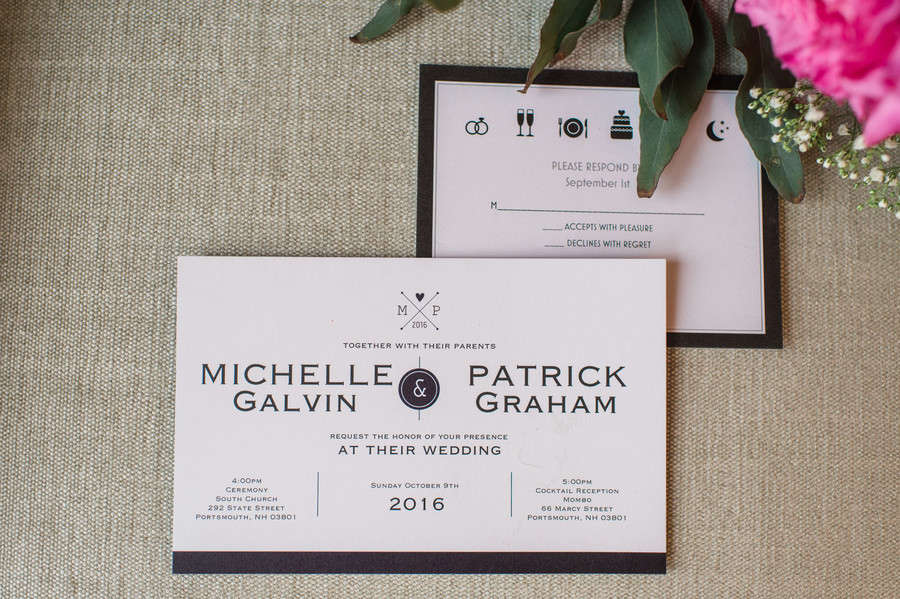
There’s something refreshing about an invitation that commits fully to black and white and means it. Michelle and Patrick’s suite features a wide horizontal format—already a departure from the expected—with their names set in bold, widely-spaced serif type. The RSVP card replaces the usual checkboxes with small illustrated icons for drinks, dinner, and cake. It’s clean, confident, and immediately sets the tone for a party worth attending.
See Michelle and Patrick’s Portsmouth Wedding →
White Invitation with Navy Bold Type and Silver Stripe Accent
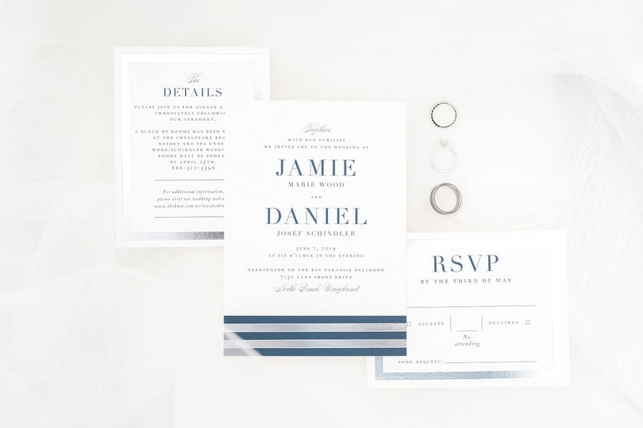
The invitation itself is almost austere: white card, navy serif type, nothing fussy. What elevates it into modern territory is the RSVP card, which anchors the suite with bold navy and silver diagonal stripes along the bottom edge. That one graphic move—restrained but decisive—makes the whole set feel purposeful. Jamie and Daniel’s Chesapeake Bay wedding stationery is proof you don’t need many design elements when you choose the right ones.
See Jamie and Daniel’s Herrington on the Bay Wedding →
Geometric Diamond Monogram Invitation on Monstera Leaf

Set against tropical monstera leaves on a warm wood surface, this clean white invitation uses a simple geometric diamond monogram in teal as its only design element—and it’s enough. The rest of the card lets the typography breathe: light, lowercase lettering with generous white space. It’s the kind of invitation that looks incredibly chic in a photo but reads effortlessly when it arrives in the mail.
See this Erie Minimalist Styled Shoot →
White Invitation with Geometric Polygon Frame and Black Belly Band
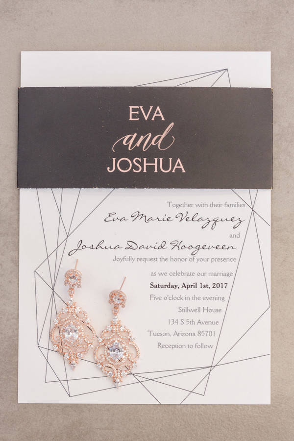
The invitation card itself is understated—a soft geometric polygon outline on clean white paper, script and print typography in quiet gray. But the belly band wrapping the suite changes everything: stark black with the couple’s names in bold rose gold foil, the kind of typographic move that feels almost editorial. The contrast between the two elements is the whole design story, and it works completely.
See Eva and Josh’s Tucson Garden Wedding →
Concrete Flatlay Invitation with Hexagon Wax Seal
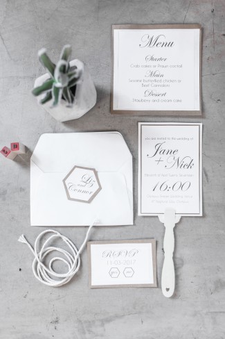
Shot on raw concrete at an old Johannesburg syrup factory, this invitation takes the concept of minimalism and makes it feel genuinely interesting. The main card pairs script lettering with clean block type in a thin-bordered layout. The white envelope carries a hexagon monogram wax seal—the one detail that saves the whole suite from being plain. A small potted succulent adds just enough warmth to the composition.
See this Johannesburg Industrial Styled Shoot →
Dark and Dramatic Modern Invitations
These are for the couples who want their invitation to feel like a movie poster—moody, bold, and impossible to forget. Dark paper and rich contrast make every word command attention.
Black Invitation with Bold Block Names and Illustrated Greenery

When the background is matte black and the botanical illustration is rendered in vivid green with white berries, the couple’s names in massive block type read like a marquee sign. Kelsey and Cameron’s invitation from their Biddle Ranch Vineyard wedding in San Luis Obispo is bold in every sense—dark, graphic, alive. A matching RSVP in the same green-and-white palette makes the suite feel completely intentional from start to finish.
See Kelsey and Cameron’s Vineyard Wedding →
Charcoal Invitation with Full Illustrated Floral Garden

Think garden party, but make it dramatic. The charcoal background of this invitation is covered in a lush illustrated floral arrangement in hot pink, coral, and purple—the kind of print you’d expect on a designer dress rather than a wedding card. The couple’s names in sweeping calligraphy hold the center, with both wedding bands resting across the design in the detail shot. It’s romantic and bold at the same time, which is a hard balance to pull off.
See Bridget and Nathan’s Detroit Yacht Club Wedding →
Matte Black Art Deco Invitation with Gold Corner Accents
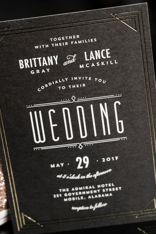
“WEDDING” in massive block letters. Gold art deco line accents at the corners. The couple’s names in white serif type above. Brittany and Lance’s invitation for their Admiral Hotel celebration in Mobile, Alabama doesn’t whisper—it announces. The matte black card with its geometric gold details pulls directly from the venue’s 1940s architecture, making the paper goods feel like a genuine extension of the space rather than an afterthought.
See Brittany and Lance’s Mobile Wedding →
Black Flatlay with Loose Calligraphy and Custom Labrador Portrait

Katie and Jeremy’s wedding stationery proves that personalization and sophistication can absolutely coexist. The suite—designed by Laura Cleary Art—features loose expressive calligraphy alongside a save-the-date illustrated with a watercolor portrait of their black Lab, Hampton. The whole set is styled dramatically on black velvet with a kraft gift box, gold heels, and silver cufflinks. It works because the design has a clear, confident point of view, and that point of view happens to include a very good dog.
See Katie and Jeremy’s Chattanooga Museum Wedding →
Monochrome Suite with Custom Bold Ampersand Monogram
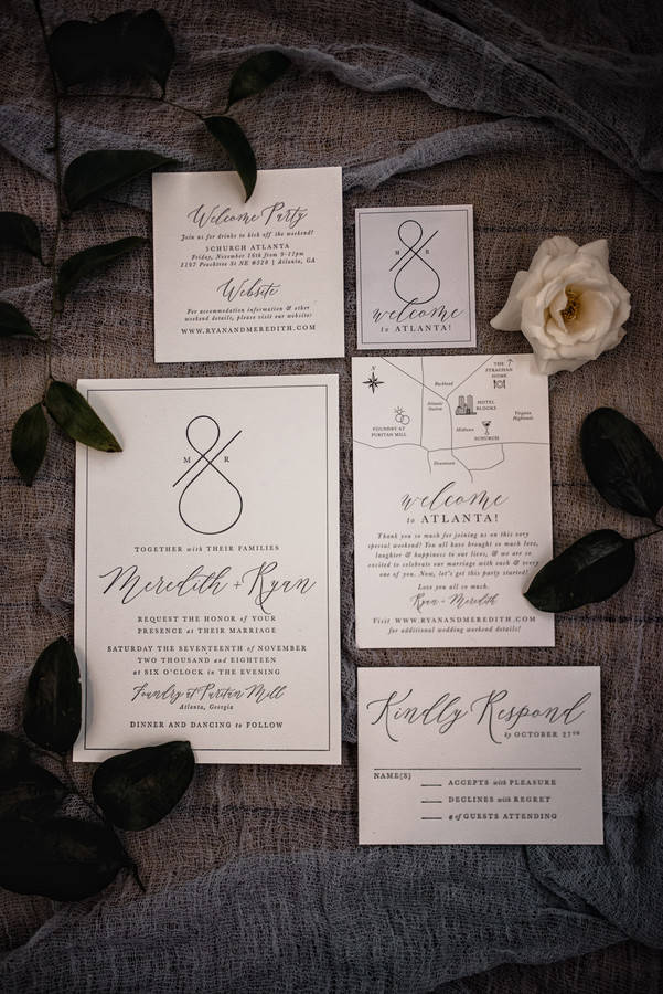
Meredith and Ryan’s suite for their Foundry at Puritan Mill wedding in Atlanta takes modern monochrome to its logical extreme. The design centers on a custom “M&R” ampersand monogram executed in bold, graphic lines—nothing more. Black, white, and the confidence to let strong typography do all the work. The result is stationery that feels almost architectural, more design studio than traditional wedding, which is exactly the point.
See Meredith and Ryan’s Atlanta Warehouse Wedding →
Oversized Date Typography on White with Forest Green Color Block
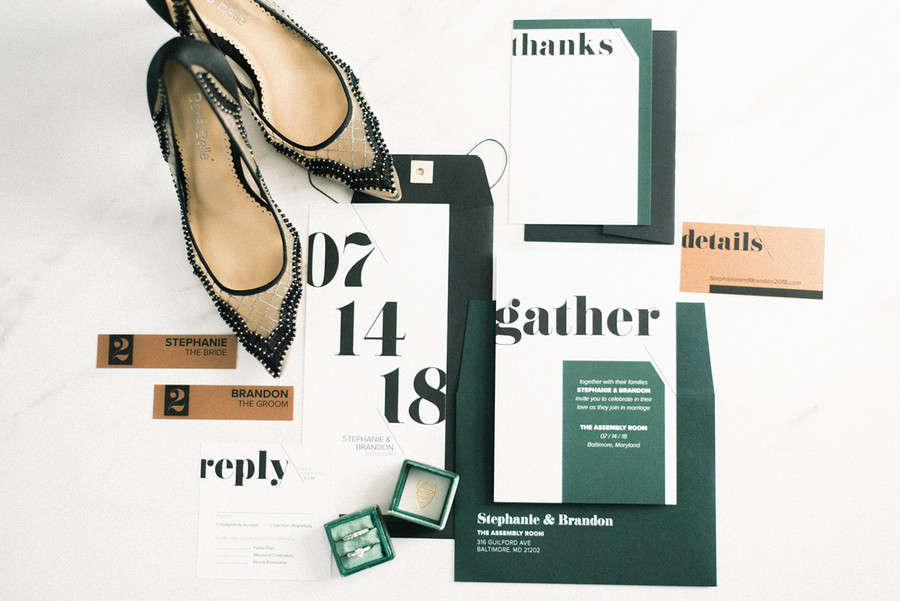
Most invitations bury the date near the bottom in small print. This suite put it at the center in numbers so large they are the invitation: “07 / 14 / 18″ in massive bold type, with the couple’s names barely visible beneath. The dark forest green companion card—”gather” in oversized serif, wedding details in white—provides the counterpart. Two cards, two typographic moments, one completely committed design statement. Styled for The Assembly Room in Baltimore, this one earns every inch of drama.
See this Baltimore Industrial Styled Shoot →
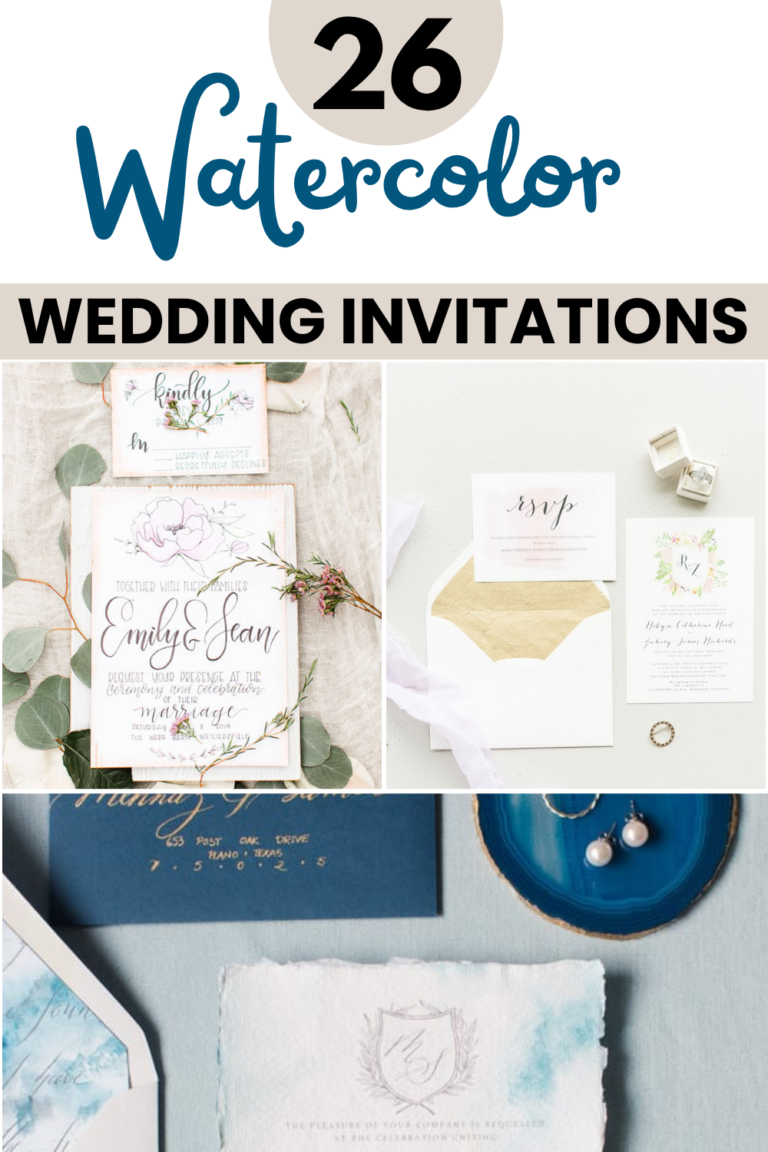
Watercolor and Metallic Foil Invitations
Watercolor ink, abstract brushstrokes, and metallic foil are some of the most stunning combinations in modern wedding stationery. These invitations are practically works of art—frame-worthy long after the wedding day is over.
Navy Watercolor Ink Wash with Gold Foil Splatters
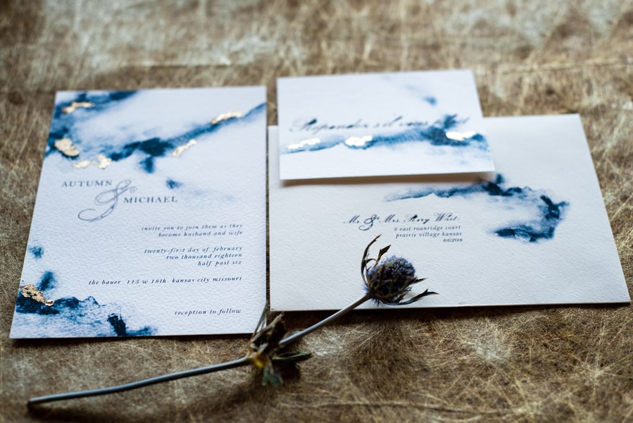
This invitation looks like a painting that happened to contain wedding details. Deep navy ink spreads in abstract washes across the white card, with scattered gold foil pieces that catch the light unpredictably. Designed by Chrissy Taylor of Sugarbean Paper Co. for a Kansas City styled shoot, it’s proof that a simple palette—navy, white, and gold—can produce something genuinely artful when the medium is watercolor and metallic foil working together.
See this Kansas City Urban Loft Styled Shoot →
Dusty Slate Watercolor Suite with Rose Gold Foil

The full suite for this Lake Winnipesaukee styled shoot is one of those sets you save to three different mood board folders and still can’t decide which it belongs on. Every piece—invitation, details card, RSVP, ceremony program—carries the same dusty slate watercolor wash with rose gold foil typography, all designed by Sugarhouse Stationery. Diagonal geometric line accents add structure to the fluid color. Styled on wicker with eucalyptus and a sparkly ring stack, it’s a complete vision.
See this Lake Winnipesaukee Winter Styled Shoot →
Gold Confetti Oval Border Suite with Photo Save-the-Date

The Minted suite Megan and Ryan chose for their Sowell Farms wedding in Milton, Florida pairs a scattered gold confetti oval border on the invitation with a beach photo save-the-date—modern but warm rather than cold. The confetti scatters asymmetrically around the card edges, which gives it energy without overwhelming the text. The suite’s mix of photo elements and graphic design keeps it feeling contemporary rather than overly precious.
See Megan and Ryan’s Sowell Farms Wedding →
Gold Foil Diamond Frame on Watercolor Botanical Card

The watercolor botanical print does the romance; the rotated gold foil diamond frame does the structure. Emily and Michael’s invitation for their Rivercrest Farm wedding in Dover, Ohio layers both elements so completely that it’s hard to say where one ends and the other begins. The diamond shape—just a gold border, nothing else—frames the bold navy names inside like a window cut into the card. It’s a contemporary move that gives a classic watercolor technique an entirely modern edge.
See Emily and Michael’s Rivercrest Farm Wedding →
Geometric, Laser-Cut, and Graphic Invitations
When the design itself becomes the talking point, you know you nailed it. These invitations bring bold geometry, precision cutting, and unexpected structure that guests will still be talking about after they send in their RSVPs.
Copper Geometric Line Invitation with Copper Envelope Liner

The diagonal copper lines crossing this invitation move across the card at angles that give it momentum and direction—it’s the kind of geometric pattern that looks deceptively simple until you realize how precisely everything is placed. Designed by Emma Allen for a Victoria, Canada styled shoot, the invitation pairs with a copper-foil envelope liner that makes the moment of opening feel like part of the design. Urban, sculptural, and genuinely striking.
See this Victoria Urban Styled Shoot →
Laser-Cut Geometric Frame Invitation
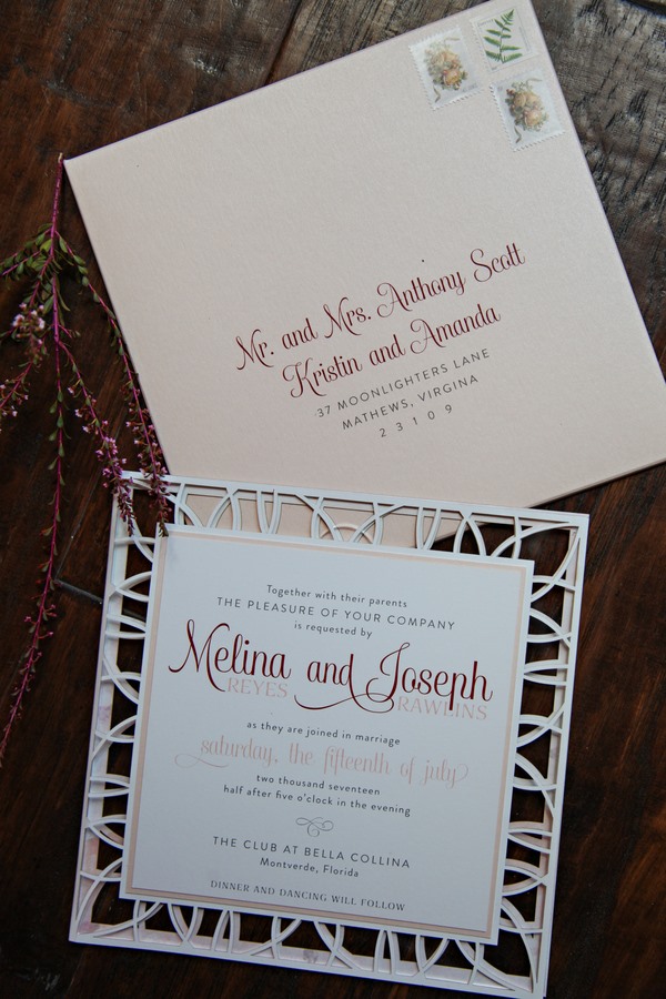
Laser-cutting elevates this invitation from beautiful to genuinely unexpected. The outer wrapper is a delicate white lattice of geometric shapes—the kind of precision only a machine can achieve, but with the visual effect of something handmade. Inside, a softer blush card with script and serif typography for Melina and Joseph. The cream envelope is addressed in flowing calligraphy, which keeps the whole suite feeling personal despite how technically impressive the laser-cut element is. Designed by Dogwood Blossom Stationery and Invitation Studio for a Bella Collina styled shoot.
See this Florida Modern Boho Styled Shoot →
Colorful Pastel Geometric Diamond-Pattern Invitation

This is the invitation you send when you want guests to feel the energy before they even read the details. The border pattern by Marlie Renee Designs borrows from folk-inspired geometry—repeating diamond shapes in mint, dusty pink, butter yellow, and soft purple—arranged along the left side and bottom edge of a clean white card. The result is playful and completely non-traditional without sacrificing legibility or elegance. Sarah and Daniel’s New Jersey wedding stationery proves you can be colorful and polished at the same time.
See Sarah and Daniel’s Rock Island Lake Wedding →
Navy Suite Flatlay with Diagonal Color Blocks and Script Typography

This Rutland-inspired styled shoot produced one of the most cohesive stationery flatlays on this list. The full suite—invitation, menu, RSVP, place card, and table number—is arranged on a deep navy surface with loose rose petals and a small rose bouquet. Every piece carries the same diagonal pastel-and-blue color block treatment, which ties the set together instantly. It’s the kind of stationery that photographs just as well on the tables at the reception as it does in a flatlay.
Blush Circular Die-Cut Suite with Rose Motif Vellum
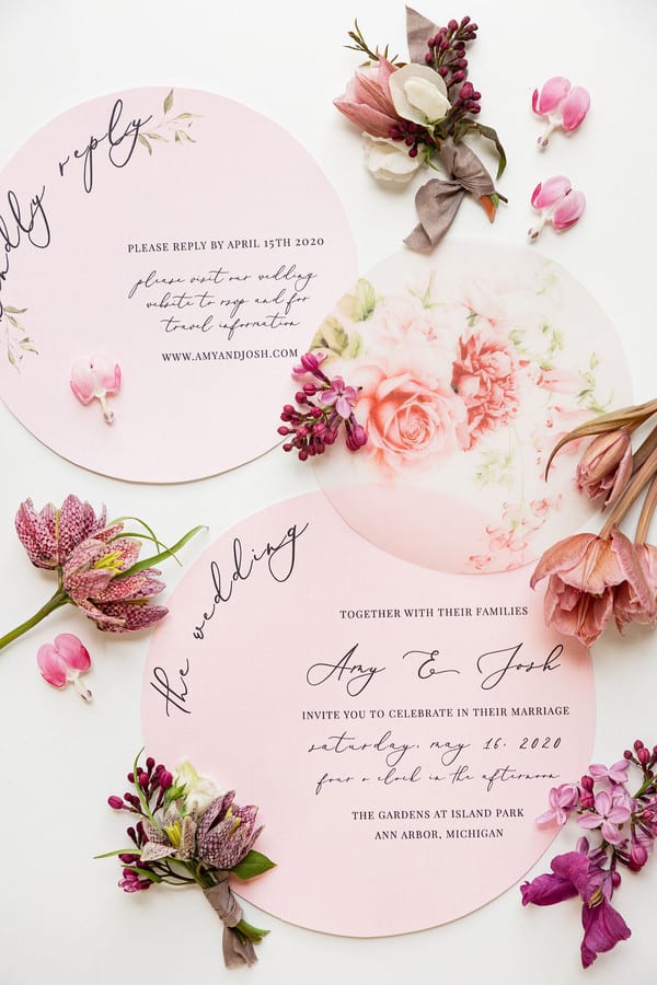
A round invitation is a commitment—it requires a different envelope, a different flatlay, a different everything. This circular suite from a private riverside elopement in Ann Arbor, Michigan embraces that completely. Designed by Shaytionery Designs, the blush die-cut card features a delicate rose motif with a translucent vellum overlay that adds dimension without cluttering the design. The format itself is the statement: no corners means no convention.
See this Ann Arbor Riverside Elopement →
Abstract Rose Gold Crossing Lines with Bold All-Caps Names
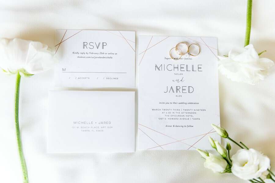
Thin rose gold lines cross the white card at decisive angles—changing direction mid-surface like a designer’s sketch that became a wedding invitation. Nothing else competes with that pattern except the bold all-caps names “MICHELLE” and “JARED,” surnames in smaller type below, surrounded by generous white space. The RSVP carries the same lines. Michelle and Jared’s suite for their celebration at The Epicurean Hotel in Tampa, Florida has an editorial quality that’s hard to fake and harder to forget.
See Michelle and Jared’s Tampa Wedding →
Bold Illustrated Citrus Suite with Couple Portrait
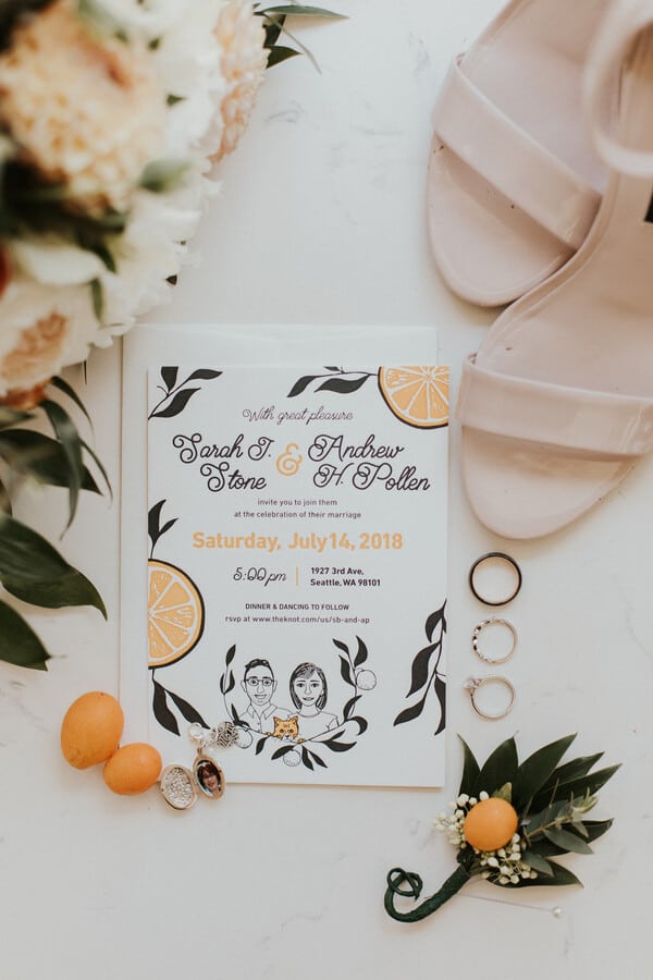
Most illustrated invitations go botanical. Sarah and Andrew’s Seattle suite went somewhere bolder: a graphic citrus print paired with a custom illustrated couple portrait, the kind of personalization that makes guests immediately understand this is going to be a memorable wedding. The flat-lay styling—loose bouquet, boutonniere, ivory heels on a light wood surface—frames the stationery without overshadowing it. It’s playful, graphic, and genuinely fun to look at.
See Sarah and Andrew’s Seattle Wedding →
FAQs
What makes a wedding invitation “modern”?
Modern wedding invitations generally move away from traditional script-on-ivory in favor of intentional, graphic design choices. This can mean bold typography, unexpected paper colors (black, slate, deep navy), geometric patterns, metallic foil, watercolor techniques, or laser-cut elements. There’s no single rule—modern is more about having a clear design point of view than following a specific trend.
How far in advance should modern wedding invitations be sent?
Most couples send invitations six to eight weeks before the wedding, with RSVPs due three to four weeks before. If you have a lot of out-of-town guests, eight to ten weeks gives people more time to make travel arrangements. Keep in mind that custom designs—especially anything with laser cutting or specialty foils—often take longer to produce, so build extra lead time into your stationery timeline.
What’s the difference between digital printing and letterpress for modern invitations?
Digital printing is more affordable and allows for full-color designs, making it ideal for watercolor effects, photographs, and colorful geometric patterns. Letterpress presses type or designs into thick paper, creating a tactile, slightly debossed finish that feels genuinely luxurious in hand—but works best with fewer colors and simpler designs. Foil stamping is a third option that adds metallic accents and pairs beautifully with both approaches. Your stationer can help you decide which method suits your design and budget.
Do modern wedding invitations need to match the wedding theme?
They don’t have to match exactly, but they should feel related. Your invitation sets the expectation—if it’s bold and graphic, guests will arrive expecting something with a distinct visual identity. If it’s a soft watercolor suite, they’ll expect something romantic and ethereal. The most successful invitations don’t replicate the wedding decor; they preview the feeling of it. Think of it as the opening scene of a film rather than a color-matched accessory.
Is it okay to skip the inner envelope with modern invitations?
Absolutely. The inner envelope is a traditional formality that many modern couples skip without any issue. What matters is that the outer envelope is addressed clearly and the invitation itself is well-packaged so nothing arrives bent or damaged. If you love the look of a belly band or a wax seal on the envelope, those can serve a similar purpose—keeping everything together and making the opening feel like a moment—without adding a second envelope to the mix.
Don’t forget to pin this to your Wedding Stationery Board for later!