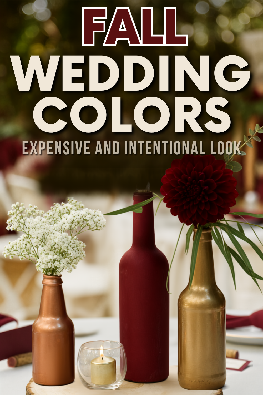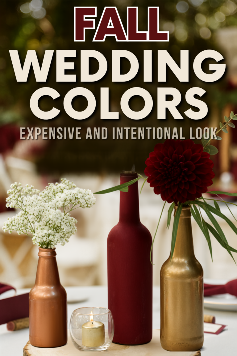
The fix isn’t luck, it’s a plan. We pulled together the fall wedding color schemes that read as expensive, then broke down the styling rules that turn a pile of random swatches into a real fall wedding color palette: the 60/30/10 ratio, easy budget swaps, and our favorite “uncommon but works” combinations.
Whether you want soft, early fall wedding colors for a September date or something moodier for November, the best wedding colors fall into a few reliable families. Start with the heavy-hitters, the ones that make everything look expensive.
Burgundy: The Unchallenged Queen of Autumn
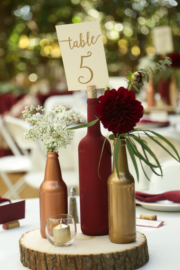
Burgundy is where almost every fall palette starts, and for good reason. It perfectly mirrors the changing foliage and looks insanely rich once the candlelight kicks in.
But how do you keep your venue from looking like a gloomy cave?
The trick is balance. Pair this gorgeous wine shade with:
- Ivory or cream to add instant brightness.
- Gold to amp up the cozy warmth.
- Blush to soften the overall romantic vibe.
- Black if you want a sharp, modern edge.
Showcase burgundy in bridesmaid dresses, plush velvet linens, taper candles, or dahlias tied with silk ribbons. Just avoid going 100% dark by combining burgundy, black, and dark wood. Unless you want your wedding photos to look like a gothic dungeon, you need some light neutrals for contrast.
Deep Green: The Expensive-Looking Palette
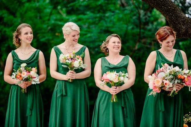
Deep green is the color that makes a wedding look like it cost twice what it did. It beautifully echoes late-season foliage, bringing a rich, jewel-toned formality that flexes from ballroom to backyard. Think of it as the great shapeshifter of fall palettes.
First, choose your specific vibe:
- Emerald: A cooler, high-fashion jewel tone.
- Forest green: An earthy, woodsy tone that grounds your design.
To make it sing, pair your green with brass, cream, terracotta, burgundy, or navy. We love working it in through:
- Bridesmaid velvet or satin dresses
- Groomsmen ties and pocket squares
- Reception table runners
- Custom signage backgrounds
Just watch out for one major design trap: pairing emerald with bright Christmas red. Unless you want Santa crashing the reception, swap that red for deep burgundy and add plenty of warm, soft cream.
Navy: The Moody Neutral That Is Anything But Nautical
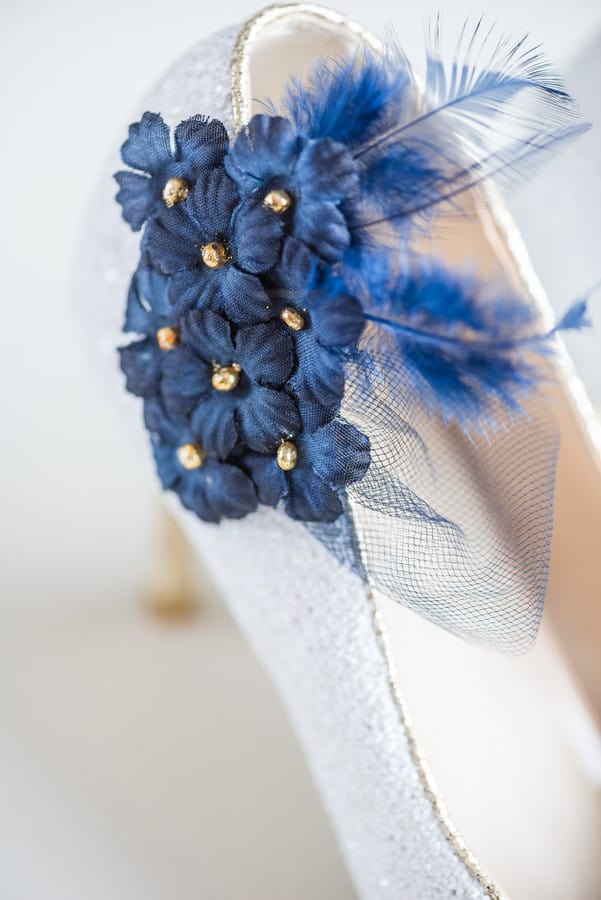
Navy isn’t strictly for summer yacht clubs. Style it with the right palette and it becomes a moody autumn neutral that brings serious drama to your fall wedding colors.
It reads formal and grounded, creating a gorgeous, dark backdrop that makes flickering candlelight and warm florals pop.
Skip the nautical vibes by pairing navy with rich, cozy accents:
- Gold and copper
- Rust and marigold
- Blush and cream
Use this sophisticated shade for sharp suits, velvet napkins, or invitations featuring navy ink on warm white cardstock.
Just avoid the patriotic trap of combining navy, bright red, and white. Unless you want your reception to look like an election night party, swap those out for burgundy, ivory, and antique gold.
Terracotta: Earthy Elegance Without the Boho Clichés
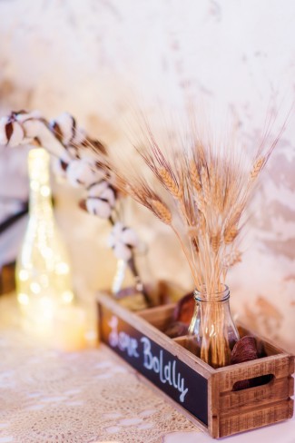
Terracotta often gets pigeonholed as a boho-only shade, but this rich tone is one of the most versatile fall wedding colors going. Its warm undertone beautifully mimics golden autumn light and feels entirely natural alongside rustic wood or stone.
Don’t mistake it for standard clay, though. While clay is dusty and soft, true terracotta is much deeper and richer.
To style this like a pro, focus on texture and neutral balance. Keep your palette sophisticated with these key elements:
- The best pairings: Cream, camel, sage, and antique copper.
- Where to use it: Linen napkins, bridesmaid dresses, matte ceramics, and dried grasses.
One golden rule: avoid pairing terracotta with bright orange accents. Unless you want your reception looking like a cartoonish jack-o’-lantern, keep your oranges muted and grounded.
Rust: The Radiant Shade That Isn’t Neon

Rust is the high-impact choice that echoes changing foliage without screaming neon or looking like a commercial pumpkin patch. It’s one of the richest fall wedding colors you can build around.
To elevate this rich hue, pair it with sophisticated accents:
- Ivory, taupe, and navy to balance the warmth.
- Forest green for an organic, woodland vibe.
- Copper to add metallic, cozy shine.
We love showcasing this shade in velvet bridesmaid dresses, chiffon table runners, elegant taper candles, or lush dahlias and mums.
Just avoid the spooky trap. Pairing rust with pure black and pumpkin orange instantly screams Halloween. Swap that harsh black for charcoal gray and add soft cream to keep your aesthetic elevated.
Pumpkin: The High-Energy Accent That Isn’t Just for Pies

We know what you’re thinking. Pumpkin? Like your neighbor’s tacky porch display? Hear us out.
When done right, this shade is a high-energy nod to harvest season that breathes life into your fall wedding colors. The trick to keeping it modern? Use pumpkin as a 10 to 30% accent, not your entire world.
Pair it with these shades to keep it sophisticated:
- Cream and taupe to soften the contrast
- Navy or deep green to ground the palette
- Gold for instant glam
Scatter the hue across florals, cocktail napkins, stationery, or cozy aisle blankets. Just promise us you won’t pair pumpkin with black. That is instant Halloween. Instead, dodge the spooky vibes by adding a soft neutral and a deep jewel tone.
Yellow: The Bold Accent That Warmly Glows
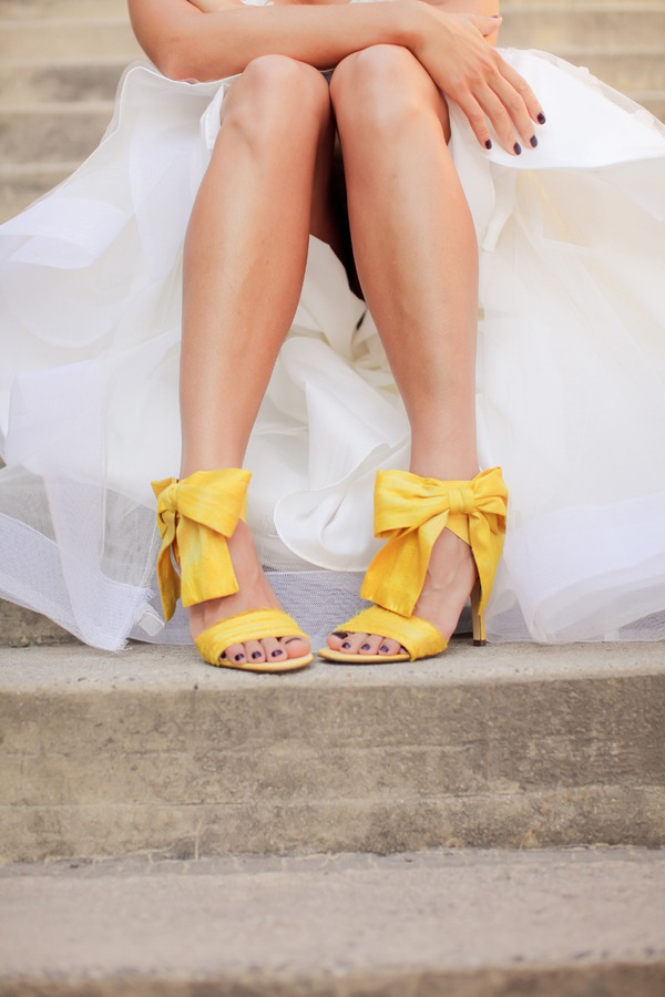
Yellow wedding decor sounds like a highlighter risk, we know. But when done right, it makes everything glow. It works because it mimics late-afternoon sun and foliage highlights, which makes it a sneaky-good pick for your fall wedding colors.
Pick your intensity:
- Marigold: Bold, vibrant, and cheerful.
- Mustard: Muted, earthy, and sophisticated.
- Amber: A warm, glassy, vintage tone.
Pair these shades with navy, burgundy, forest green, taupe, or gold. We love introducing the color in taper candles, bridesmaid bouquets, small floral pops, or glassware.
Just avoid using yellow for more than half your palette, or it will dominate photos. Keep it as an accent and repeat it two or three times so it feels planned.
Cranberry Red: Rich Autumn Romance Without the Santa Vibes

How do you use red in October without looking like you hosted an early Secret Santa? It’s easier than you think, but you have to master tone control for your fall wedding colors.
Deep seasonal fruits and heavy saturation read as pure romance. The rule? Ditch bright cherry and aim for wine undertones like cranberry or ruby instead.
This rich shade pairs beautifully with:
- Blush and cream
- Charcoal and deep green
- Warm gold
Bring this hue to life using silk bouquet ribbons, statement florals, custom wax seals, or a signature pomegranate cocktail.
Just dodge the holiday trap. Never mix emerald, bright red, and stark white. If you want red and green, mute the red to cranberry and swap white for warm ivory or champagne.
Deep Purple: High-Drama Romance
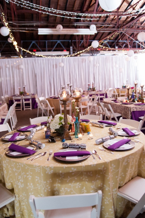
Purple gets a bad rap for looking like a 2004 high school prom. Lean into a rich, dark jewel tone, though, and it becomes luxe, dramatic, and sophisticated instead.
It’s one of the most underrated fall wedding colors because it looks genuinely magical under flickering candlelight. To keep the vibe grown-up, pair it with sophisticated neutrals like navy, gold, sage, mauve, or cream.
We love showcasing this gorgeous hue in:
- Rich bridesmaid velvet
- Heavy reception linens
- Moody taper candles
- Elegant statement signage
Just avoid the “party theme” trap of pairing deep purple with bright pink or neon lavender. That instantly skews sweet sixteen. Keep your main purple dark, and let your supporting shades stay dusty and neutral.
Muted Pink: The Unexpected Way to Soften Your Autumn Palette

Who says your autumn big day has to be entirely dark and moody? Not us.
Muted pink is the unexpected way to soften modern fall wedding colors. When you pair dusty rose or mauve with warm, grounding tones, it reads incredibly romantic and cozy instead of sugary sweet.
To master this look, pair your pinks with:
- Rich contrasts: Burgundy or charcoal
- Grounding neutrals: Taupe, camel, or warm ivory
- Warm metals: Antique copper
Try this gorgeous palette for your bridesmaid dresses, textured napkins, organic florals, and deckled-edge stationery.
Just avoid the classic icy trap. Pairing pink with stark white and cool silver instantly skews winter. Swap those cold tones for champagne gold and warm ivory to keep your autumn vibe perfectly cozy.
Dusty Lavender: The Sunset Haze You Didn’t Know You Needed
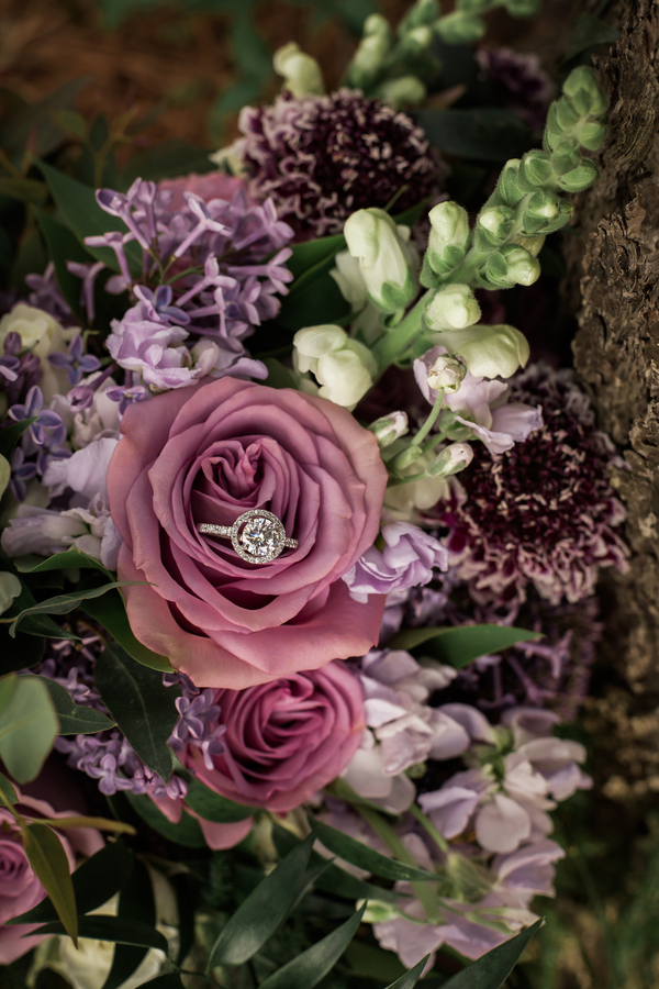
Lavender reads spring Easter egg hunt until you mute it. Dusty, warmed-up tones transform this shade into a gorgeous sunset haze, which makes it the perfect unexpected choice for late September fall wedding colors.
To keep the vibe cozy, skip the cool undertones and lean into warm, earthy counterweights that feel rich and inviting.
We love pairing this dusty shade with:
- Rust or terracotta
- Charcoal
- Sage green
- Warm ivory
Incorporate these colors throughout your:
- Bouquet accents
- Mix-and-match bridesmaid dresses
- Taper candles
- Custom signage details
Just promise us you will avoid the spring trap of pairing lavender with bright lemon yellow and stark white. Instead, keep your yellows in the cozy mustard or amber family, and make sure your whites stay beautifully warm.
Teal: The Unexpected Jewel Tone That Redefines Autumn

Who decided that autumn weddings must stick to basic oranges and browns? If you want to shake things up, invite teal to the party. It brings a rich, saturated gemstone vibe that adds depth to your fall wedding colors without feeling heavy.
To ground this bold shade, try these strategic pairings:
- Classic elegance: Navy, emerald, copper, and cream
- Modern contrast: Punchy rust and teal
You can easily weave this hue into your styling:
- Table linens and glassware accents
- Bridesmaid dresses
- Coordinating bar signage
Just avoid the trap of mixing too many competing jewel tones, unless you want your venue looking like a pirate’s chest. Keep teal as your hero, let supporting colors stay muted, and repeat one warm metallic to tie the look together.
Blue: The Sophisticated Hue for Every Formality Level

Blue isn’t only for summer beach bashes. As one of our favorite unexpected fall wedding colors, it balances warm autumn tones and keeps your photos looking incredibly crisp.
Match your shade to your formality level:
- Dusty blue: Soft, muted, and romantic.
- Cornflower: Bright, cheerful, and rustic.
- Sapphire: Deep, rich, and dripping with moody luxury.
Keep it seasonal by pairing your blue with terracotta, mustard, mauve, gold, or cream. You can easily weave this palette through your invitations, bridesmaid dresses, linens, and taper candles.
Just avoid bright pool blue. If your blue feels like a Caribbean cruise, it is too summer. Mute it with gray undertones or deepen it to sapphire to keep your autumn aesthetic on point.
Sage Green: The Quiet Connective Tissue of Understated Autumn
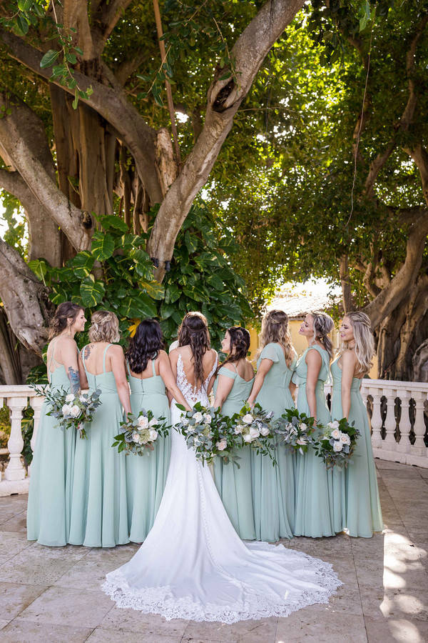
Tying an autumn palette together is where a lot of designs turn into a chaotic craft-store explosion. Sage green is the fix. This soft hue acts as a calming connective tissue, offering an understated, organic vibe that fits any venue style.
It pairs beautifully with terracotta, taupe, dusty rose, charcoal, and gold. You can easily sprinkle it throughout your day:
- Bridesmaid dresses
- Table linens
- Signage ink
Just don’t make the rookie mistake of relying on basic eucalyptus leaves to count as your green. If sage is in your fall wedding colors lineup, you have to repeat it in at least two non-floral elements like napkins, paper menus, or taper candles. This keeps the design looking completely intentional.
Warm Neutrals: The Strategic Weapon for Autumn Contrast
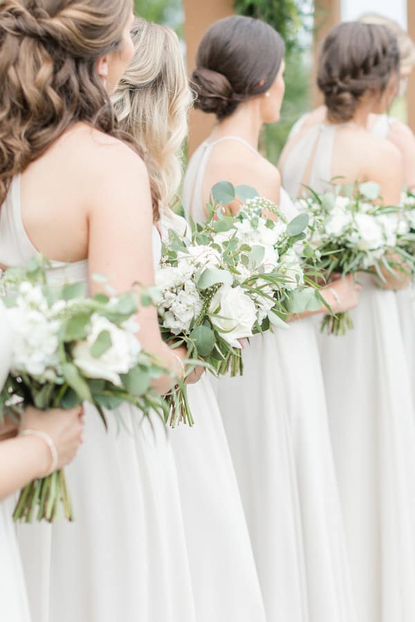
Warm neutrals aren’t a boring fallback. When you’re choosing your fall wedding colors, they’re your strategic tool for creating rich contrast and cozy warmth.
These shades beautifully mimic natural wood, dried botanical textures, and gorgeous golden-hour light. They also provide a soft backdrop that makes your bolder accent colors pop.
- The best pairings: Burgundy, forest green, navy, dusty rose, and marigold.
- Where to use: Table linens, stationery paper, lounge areas, and mix-and-match bridesmaid dresses in nude and caramel tones.
Just avoid going brown-crazy. Mixing camel, chocolate, taupe, and beige all at once looks chaotic. Pick one dominant neutral as your base and one supporting shade to keep your palette clean and intentional.
Warm White and Cream: The Photo Insurance Your Palette Needs

A rich autumn palette can turn into a total black hole in your photo gallery. Warm whites and creams are the insurance policy for your fall wedding colors. These bright neutrals inject a romantic glow and crucial contrast, keeping tablescapes from feeling heavy under dim lighting.
They pair beautifully with autumn heroes like burgundy, rust, navy, emerald, and plum.
For the best photo-friendly results, use them for:
- Base linens and reception draping
- Dinnerware
- Fluffy cream and white florals
Just avoid stark optic white, which feels too cold and modern-minimalist. Instead, warm your space up with cozy champagne tones and brushed brass metals. Your photographer will thank you.
Black: The Sleek Accent That Anchors Autumn

Black sounds too gloomy for a wedding until you use it strategically. Then it becomes the sharpest anchor in a modern set of fall wedding colors.
It adds instant contrast, modernizes warm palettes, and looks gorgeous reflecting flickering candlelight. It’s the perfect anchor for industrial, modern, or evening celebrations when you want to go moody without your big day looking like a holiday party.
Best pairings include:
- Burgundy, rust, or marigold
- Emerald or blush
Where to use it:
- Crisp typography on signage
- Moody taper candles
- Modern table chargers
- Sharp suit accents
Just steer clear of pairing black with pumpkin orange as your main duo, unless you want major Halloween vibes. Toss in warm ivory and a rich jewel tone to instantly steer your design upscale.
Cool Gray: The Industrial Canvas That Doesn’t Fight Your Venue

Trying to force a rustic barn palette into a gritty concrete warehouse is a recipe for a design identity crisis. Instead of fighting your modern architecture, lean into cool gray.
This shade acts as a neutral canvas that makes warm fall wedding colors pop, honoring the industrial bones of lofts and warehouses.
Keep the vibe cozy with these pairings:
- Dusty rose and brass for a romantic edge.
- Marigold and navy for bold contrast.
- Rust and cream for earthy balance.
Incorporate gray through concrete-inspired stationery, textured linens, sleek tapered candleholders, and velvet lounge furniture.
Just avoid going too cold. Piling slate, silver, and icy white together makes your venue look like a refrigerator. Warm it up with champagne accents, candlelight, and wood textures.
Warm Metallics: The Luxe Finish That Ties It All Together
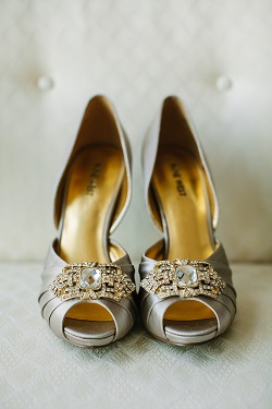
Ever spot a lonely gold arch at a reception that matches nothing in the room? It looks less like a design choice and more like an accident.
Warm metals amplify cozy autumn light and make simple neutrals feel luxe, which is exactly why they belong in your fall wedding colors. The trick is choosing one metal as your design rule:
- Gold: Classic glam
- Copper: Earthy warmth
- Bronze: Vintage or rustic edge
Instead of one giant metal feature, repeat your chosen finish three to five times across the room in small hits:
- Flatware and chargers
- Candleholders
- Table frames
- Invitation wax seals
Avoid mixing random metals without a plan. Sticking to one dominant metallic keeps your design intentional, polished, and glowing under that autumn candlelight.
High-Fashion Wildcards: Unexpected Shades Styled to Perfection
Want gorgeous fall wedding colors without copying every single October Pinterest board? We’ve got you. Elevating your palette means embracing unexpected hues with strict guardrails so your venue looks editorial, not chaotic.
Try these five rule-breaking shades:
- Lapis: This deep mineral blue shines in linens and glassware. Since blue florals are rare, pair it with cream and gold.
- Raisin: This rich brown-purple adds incredible late-fall texture. Pair it with sand, pale pink, and lush greenery.
- Citrus: Keep this zesty orange-yellow strictly to accents. Pair it with warm white and deep green to avoid summer-party vibes.
- Coral: Make this warm pink-orange feel instantly autumnal by pairing it with camel, burgundy, and brass.
- Chartreuse: Use this yellow-green sparingly (think menus, candles, or buds) with navy or charcoal to keep it sophisticated.
The golden rule: For these uncommon hues, always ground them with one deep anchor (navy, charcoal, or burgundy) and one warm neutral (ivory or camel) so it reads as totally intentional.
How to Build Your Fall Wedding Color Palette: The Step-by-Step Guide
Turning a mood board into a real, cohesive plan is where most palettes fall apart. Follow this step-by-step guide to master your fall wedding colors like a seasoned designer.
Step 1: Pick a Hero Hue (Your Lead Color)
Crown your leading color first. This single shade sets the tone for your entire celebration. Choose this primary anchor based on your preferred wedding vibe:
- Romantic: Burgundy.
- Luxe: Emerald green.
- Modern: Navy or charcoal.
- Earthy: Terracotta or rust.
Use simple month logic to guide your decision. September calls for transitional, lighter tones that nod to late summer. October suits classic, warm harvest hues. November demands deeper, dramatic jewel tones as winter approaches.
Step 2: Use the 60/30/10 Rule for Balanced Photos
Balance the visual weight of your decor so your wedding photography looks incredible. Apply this simple 60/30/10 design ratio:
- 60% neutral foundations: Use warm ivory, sand, or light gray for large surfaces like tablecloths, draping, and dinnerware.
- 30% hero and secondary colors: Use your main and supporting shades for bridesmaid attire, major floral arrangements, and napkins.
- 10% accents: Add metallic finishes or dark ink accents on charger plates, flatware, and wax seals.
This ratio prevents your photos from looking chaotic or muddy.
Step 3: Run the Autumn Clash-Prevention Checklist
Avoid turning your beautiful day into a holiday party or local sports tailgate. Use this quick checklist to steer clear of common design traps:
- The Halloween trap: Avoid pairing pumpkin orange with black. Instead, add ivory and navy, or swap bright orange for a muted rust.
- The Christmas trap: Skip bright emerald green paired with bright red. Swap the red for a moody cranberry or burgundy, and use warm champagne instead of stark white.
- The sports team trap: If your two primary colors resemble a local football uniform, insert a third bridging neutral like camel or ivory, then add a warm metal accent.
Always run a phone camera test. Place your fabric and floral swatches in natural window light and snap a quick photo. If the display looks like a commercial holiday store on your screen, adjust your neutrals immediately.
Step 4: Filter by Your Venue’s Existing Style
Work with your venue’s existing architecture, not against it. Match your color scheme to the space:
- Rustic barn or wood space: Choose warm creams, earthy terracotta, and copper accents to complement the wood.
- Grand ballroom: Elevate the drama with deep jewel tones, crisp ivory, and polished gold.
- Industrial loft: Use a sleek charcoal or slate base, then add one warm accent color and brushed brass.
Step 5: Execute Smart Budget-Luxe Swaps
Create an expensive look without blowing your budget. Allocate your cash strategically:
- Where to spend: Invest in high-impact tactile surfaces. Focus on premium textured table linens or custom lighting that transforms the room.
- Where to save: Stick to in-season blooms. Use dried grasses and foraged foliage to bulk up your centerpieces. Thrift your metal decor pieces, then spray-paint them with a single cohesive finish.
Step 6: Map Out Your Menswear Colors
Make sure your partner and the wedding party complement your color scheme rather than fighting it. Coordinate their suits with your palette:
- Navy suit: Pair with rust, marigold, burgundy, or blush.
- Charcoal suit: Pair with emerald green, dusty rose, or copper.
- Brown or tweed suit: Pair with cream, forest green, or amber.
Step 7: Package the Palette for Your Vendors
Make it easy for your creative team to execute your vision exactly as you planned.
- Create a one-page design sheet: List your specific color names, include HEX or Pantone placeholders, and attach two clean reference photos.
- Specify textures: Note materials like velvet, satin, matte paper, or brushed metal. Texture affects how color reflects light and photographs on the big day.
Frequently Asked Autumn Questions
Planning an autumn wedding is a gorgeous, cozy dream, but it can quickly turn into a design minefield if you’re not careful. Between dodging cheesy holiday themes and coordinating a massive wedding party, you have a lot of color decisions to make. Here are quick, direct answers to your most burning autumn color dilemmas so you can design with total confidence.
How many colors should a fall wedding palette have?
We highly recommend sticking to three to five colors total for your big day. To create a balanced look, build your palette using one dominant hero color, one or two supporting shades, one grounding neutral, and one metallic accent. Here’s our favorite quick sanity check: if you cannot describe your entire wedding color scheme in one simple, clear sentence, you have too many colors going on. Keep it beautifully simple.
Do we have to use fall colors for a fall wedding?
Not at all, because wedding rules are meant to be broken. You do not have to limit yourself to typical pumpkin and dried leaf shades just because you’re getting married in October. If you want to use non-traditional colors, just make sure your choices are intentional by repeating them across multiple design elements. You can easily fall-ify cooler hues by introducing rich seasonal textures like plush velvet, warm candle lighting, and cozy, earthy neutrals.
How do I keep my palette from looking like Halloween?
The golden rule is to avoid leading with orange and black as your primary duo. Unless you’re actually hosting a costume party, that specific combination is far too literal. Instead, soften the contrast by swapping harsh black for deep navy, burgundy, or forest green to ground the space. Always introduce warm, rich white tones like ivory or champagne to keep the overall aesthetic looking elevated, bright, and strictly elegant.
How do I keep emerald and red from looking like Christmas?
You can easily keep Santa off your guest list by making a few simple color adjustments. First, ditch the bright cherry red and stark white. Instead, shift your red to a rich, romantic cranberry, ruby, or deep burgundy. Pair these deeper jewel tones with warm champagne or soft ivory rather than bright white, and opt for vintage antique gold instead of shiny chrome accents to keep the vibe strictly sophisticated rather than looking like bright holiday tinsel.
What suit colors work best with popular fall wedding colors?
Navy, charcoal, and deep brown or tweed are your best suit options for autumn. Classic navy looks stunning paired with rust, marigold, or burgundy, while sharp charcoal coordinates beautifully with emerald or dusty rose. If you have a mixed-gender wedding party, we highly suggest choosing the suits first. Selecting versatile neutrals like navy or charcoal ensures your crew gets maximum rewear value out of their investments long after the wedding ends.
Don’t forget to pin this to your Wedding Themes Board for later!