We wanted to explore what is available in the stationery market. We did a bit of digging, and came up with this article to show you how to buy pretty wedding invites for a meager $200.
Our research indicates that on average 136 guests will attend a wedding. We assume that one invite per couple will be mailed out, which means about 140 guests to invite and approximately 70 wedding invitations to procure.
It is easy to get lost in a sea of wedding invitation designs and even more easy to get carried away spending a fortune. Depending on paper type, embellishments, and other add-ons, your $200 stationery budget can quickly balloon to a $400+ budget.
We want to keep you close to that $200 budget!
A Word on Postage
One thing couples may not consider when putting together a wedding budget is postage. Don’t forget to include pesky shipping costs to receive the invitations that you purchased, as well as postage (One-Ounce 49¢ / Two-Ounce 71¢) to mail the invitations to your guests.
We assume that those couples planning a wedding with more than the average amount of guests will end up spending $200 on postage alone. Therefore, don’t rely on this article if you plan to invite more than the average. We are aware that traditional Indian or Chinese wedding parties have upwards of 1,000 guests! I can only imagine the stationery budget for that number of guests.
Our $200 stationery roundup includes postage and chosen invitations that work for a strict budget.
Budget Break Down
Postage: $0.49 * 70 = $34.30
Shipping: Most online invitation companies offer free shipping over a certain dollar amount
RSVP Stamps: $0 (see below)
Budget Remaining for Invitations: $165.70 ($2.36 per invite)
Top Design Picks Under $200
Below, we provide you a number of different options – rustic, vintage, whimsical & floral, formal & elegant, as well as modern & typography.
Arch Photo Gatefold Invitation
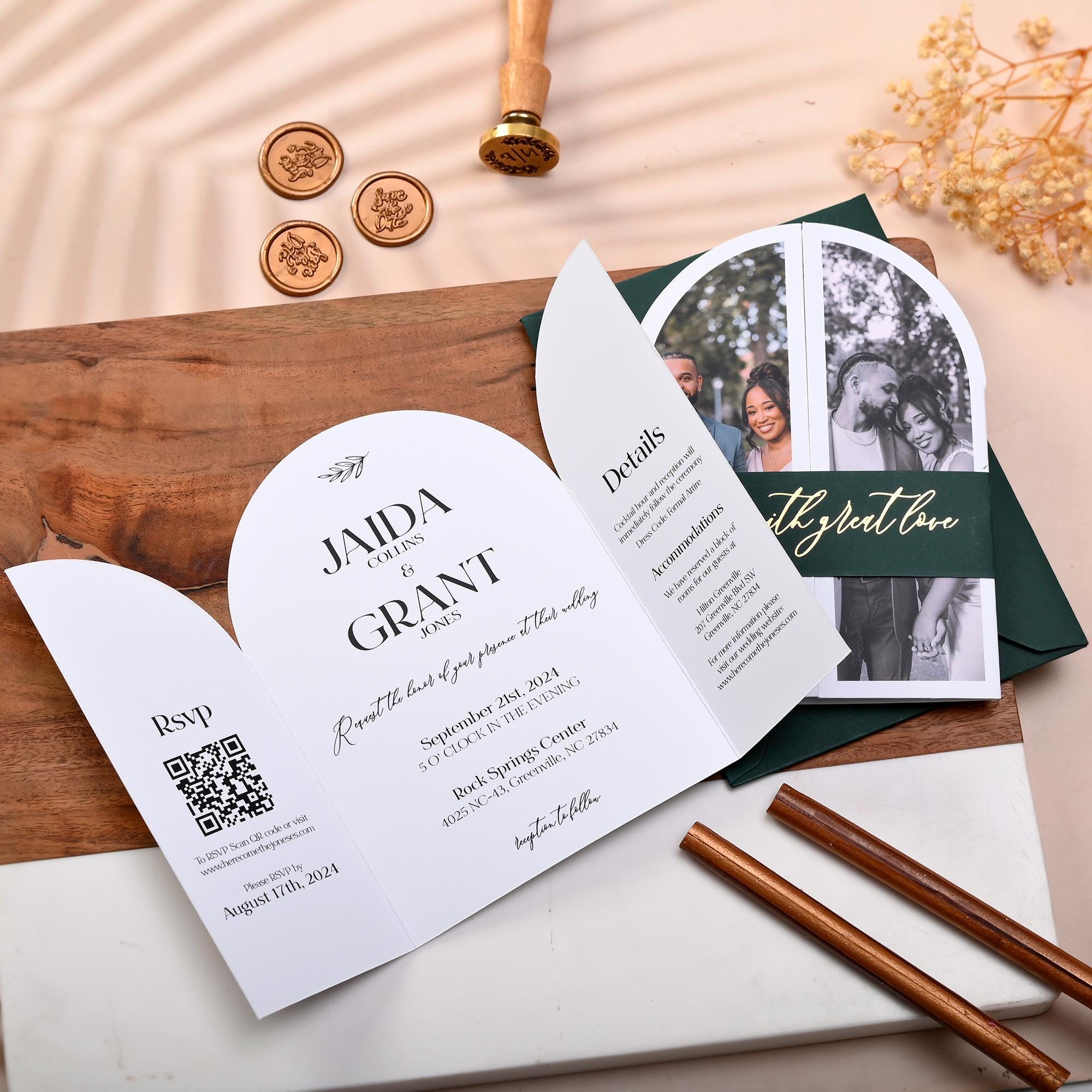
The Arch Photo Gatefold Invitation is a 5×7 inch fold-out card built around a single strong idea: your photo arches across the cover, the gates open, and your event details are waiting inside. The format does real work before anyone reads a word.
It prints on heavyweight paper with enough substance that it holds its shape in hand. No flimsy cardstock, no sad droop when someone picks it up. The gatefold mechanism gives the whole thing a reveal quality that a flat card simply cannot pull off, which matters when you are trying to set a tone months before the actual event.
If you were going to send something plain, you would have already done it. This one is for the person who understands that the invitation is the first impression, and first impressions have weight. Literally, in this case.
Boho Poppy Wedding Invitation
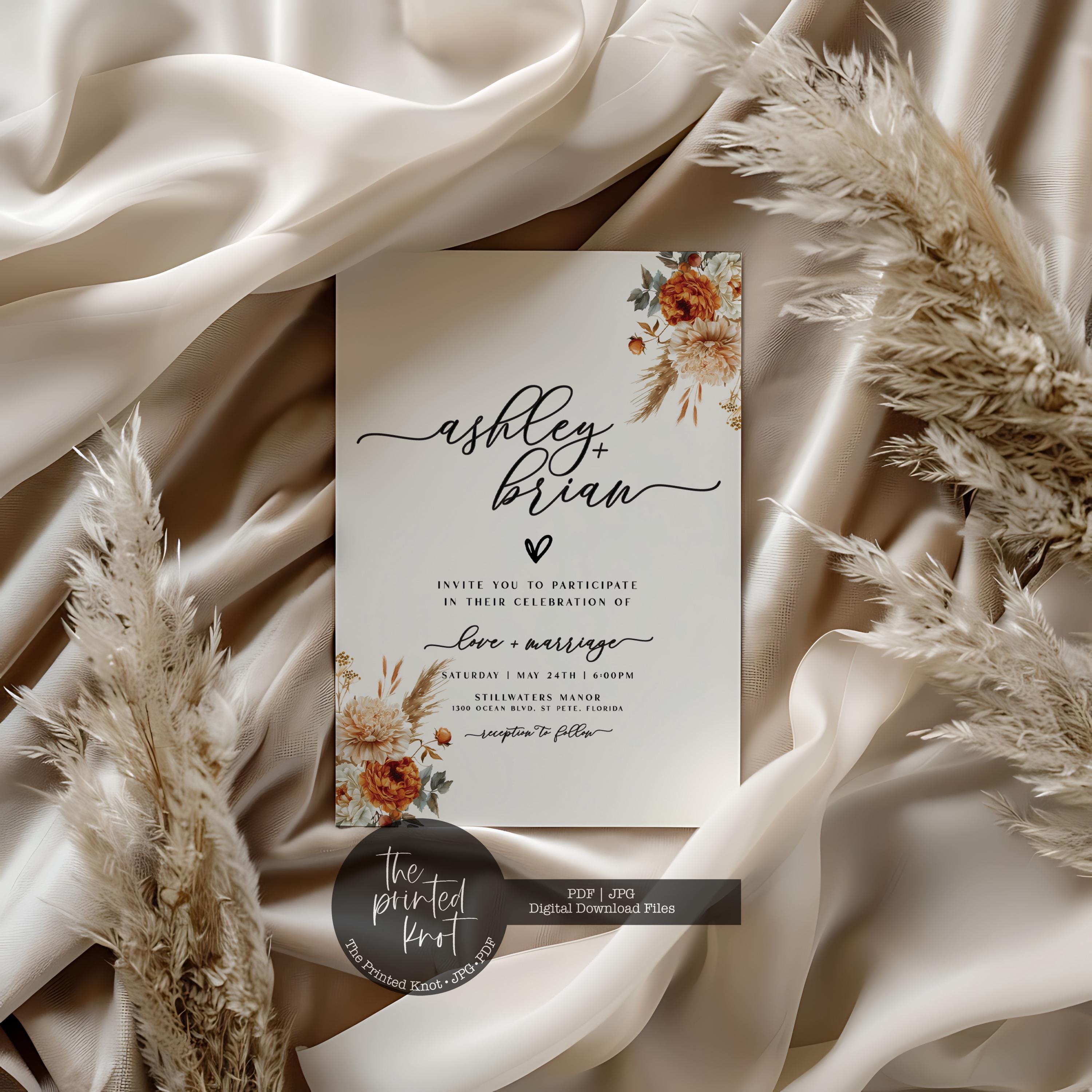
Printed on eco-friendly cardstock, the Boho Poppy Wedding Invitation is a 5×7 inch watercolor poppy design that actually looks as good in person as it does on screen. The paper has real weight to it, and the colors hold up. Eco-conscious and genuinely good-looking, which is not always a given.
The typography is clear and bold, so your guests will clock the date, time, and venue without squinting. Chic envelopes are included, because a bare invitation sliding around in a mailbox is a sad thing. The whole package arrives ready to address and send.
This one is built for the boho-leaning couple with a soft spot for florals and a preference for paper goods that feel considered rather than generic. The watercolor poppies do a lot of heavy lifting visually without tipping into overdone. Send them out early. Invitations this specific tend to set a tone, and this tone is a good one.
Dusty Blue Botanical Invitation
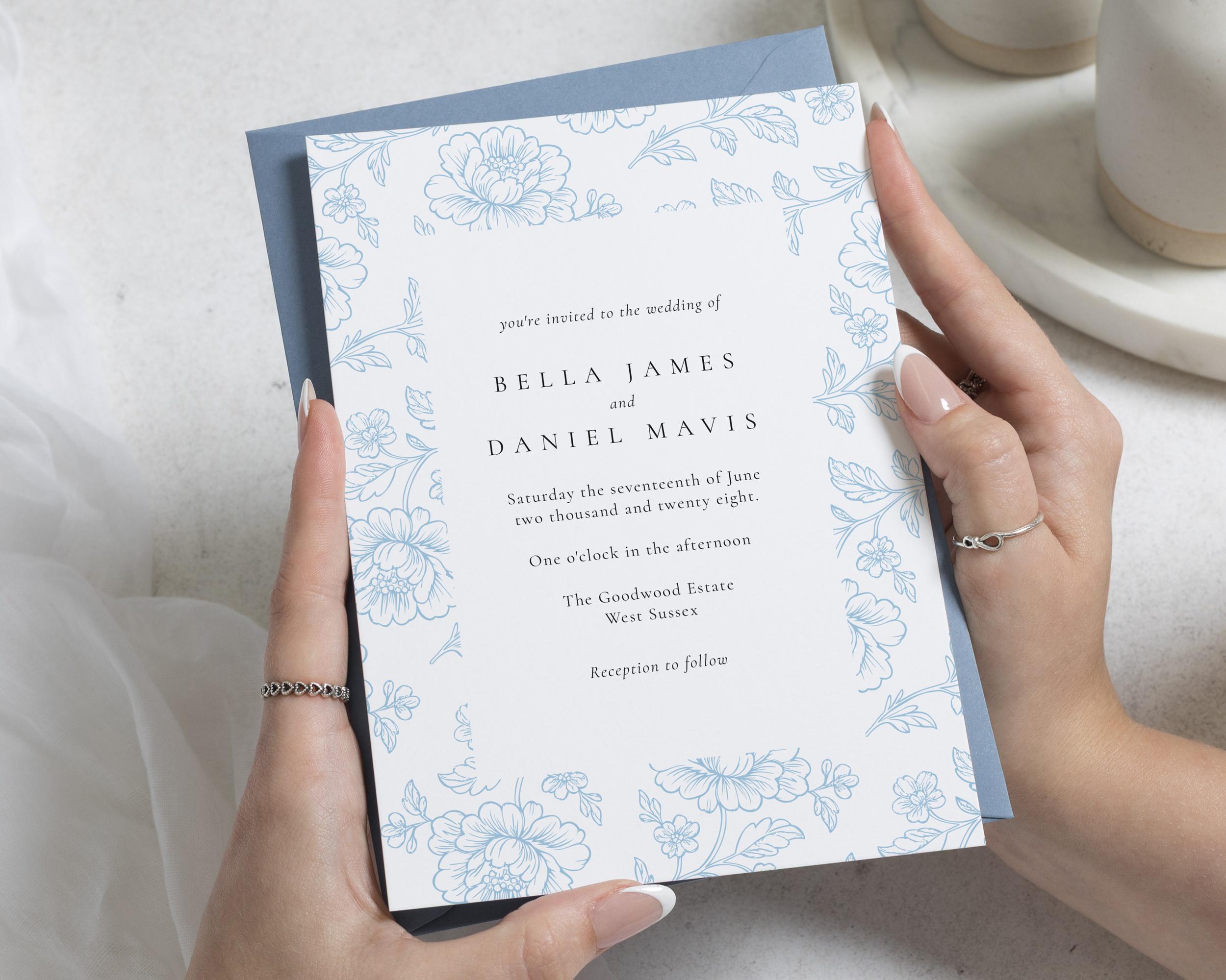
Printed on 120 lb cardstock, this Dusty Blue Botanical Invitation leads with weight you can feel before you even read it. Delicate floral motifs sit against a calm blue backdrop, the kind of design that sets a tone without overworking itself. It reads elegant and grounded at once, which is harder to pull off than it looks.
The typography pairs a classic serif with a modern script, and the combination actually works. No clashing, no awkward hierarchy. The whole thing measures 5×7 inches, big enough to hold the design comfortably and small enough to survive a trip through the mail without drama.
If you want an invitation that gestures toward nature without going full greenhouse, this one does it well. The dusty blue palette keeps things refined, the botanicals keep things warm, and the cardstock weight tells guests this is a real event before they read a single word.
Dusty Blue Floral Ganesh Invitation
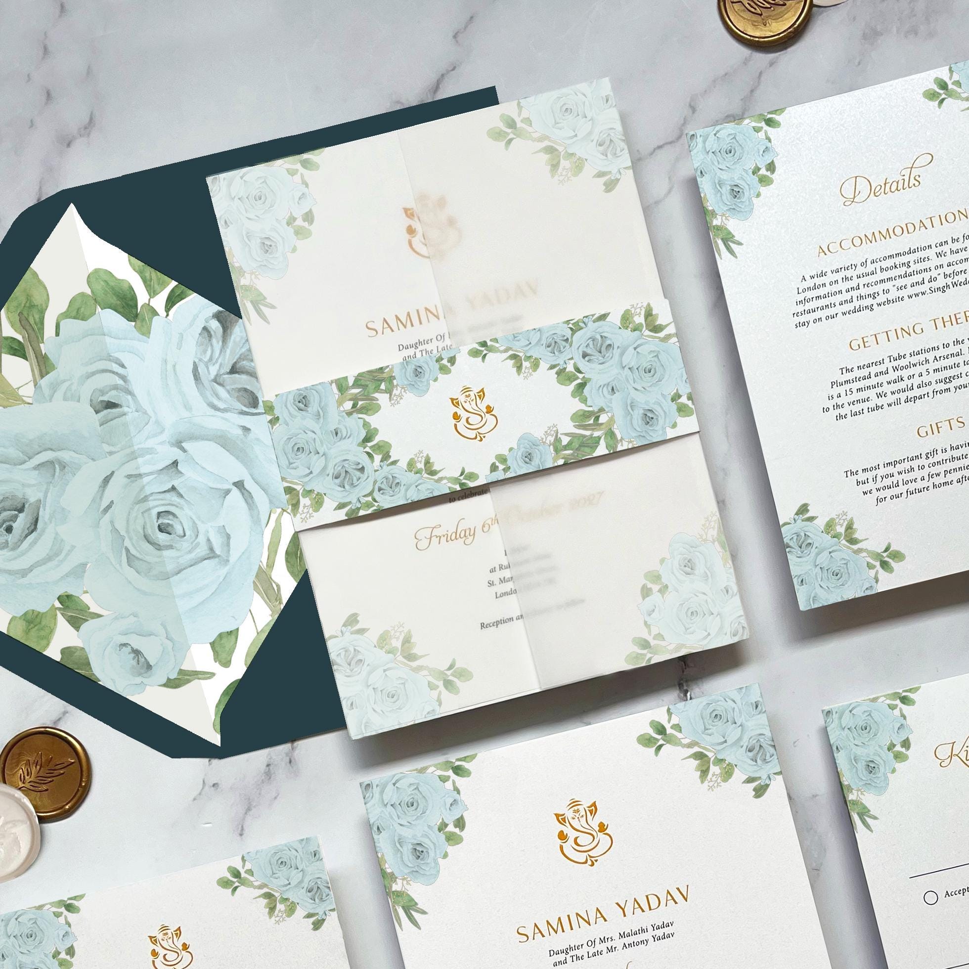
Dusty blue cardstock printed with a delicately illustrated Ganesh wreathed in flowers. It’s a deity doing what deities do best: setting the mood before anyone even walks through the door. Traditional imagery, clean modern layout, the kind of invite that earns a second look before it earns a spot on the fridge.
A digital invite is fine. This is not fine. This is premium cardstock with real weight in your hand, the kind that makes opening an envelope feel like the first act of the celebration. Ganesh has announced bigger occasions than yours, probably, but he’ll give this one the same treatment. Some traditions stick around because they work, and paper invitations are one of them.
The floral detailing is intricate enough to impress Auntie and legible enough that Uncle actually shows up on the right day. Your event gets a blessed start and a visual identity before a single canape is plated. Stationery this considered does the heavy lifting early, so the rest of the day can focus on the dancing.
Elegant Burgundy Foil Vellum Wedding Invitation
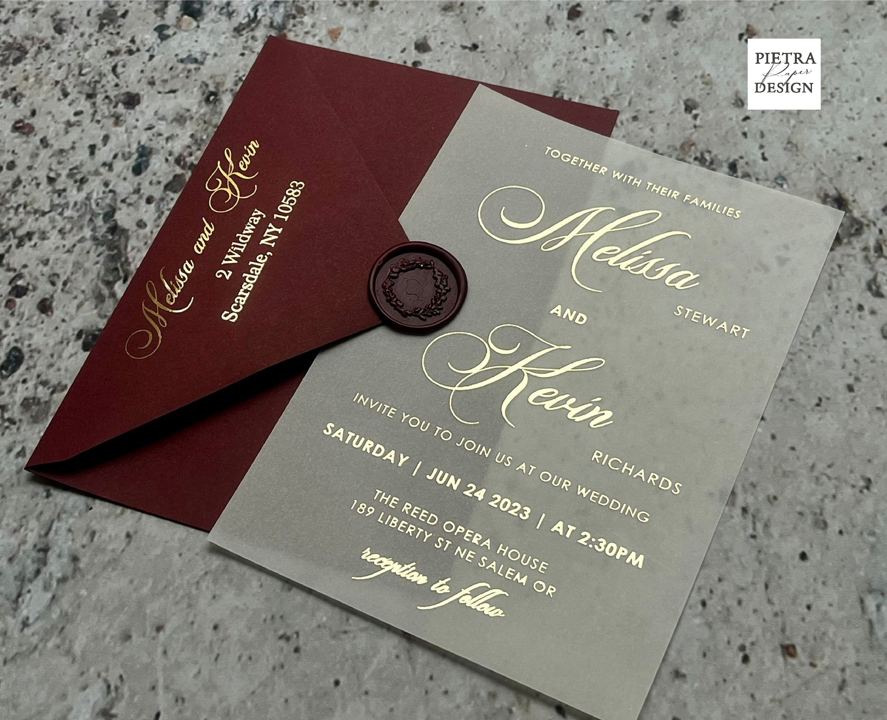
Wrapped in translucent vellum with burgundy foil stamping, this 5×7 inch invitation does the heavy lifting before the party even starts. The foil catches light in a way that flat printing simply cannot, and the vellum layer gives the whole thing a weight and texture that guests will actually notice. Paper that commands a second look is rarer than it sounds.
The 5×7 size hits the standard envelope sweet spot: prominent enough to stand out in a mail pile, small enough to keep postage straightforward. The vellum and foil combination pushes this well past the usual cardstock-and-script formula most couples default to, without veering into anything overwrought or costume-y.
Wedding invitation stacks tend to blur together fast. Burgundy foil on vellum does not blur. It reads as deliberate and specific, which is exactly what a prelude to a celebration should feel like. If the event itself has any personality, this invitation will carry that signal before a single guest RSVP’s.
Eucalyptus Laser Cut Wooden Invitation
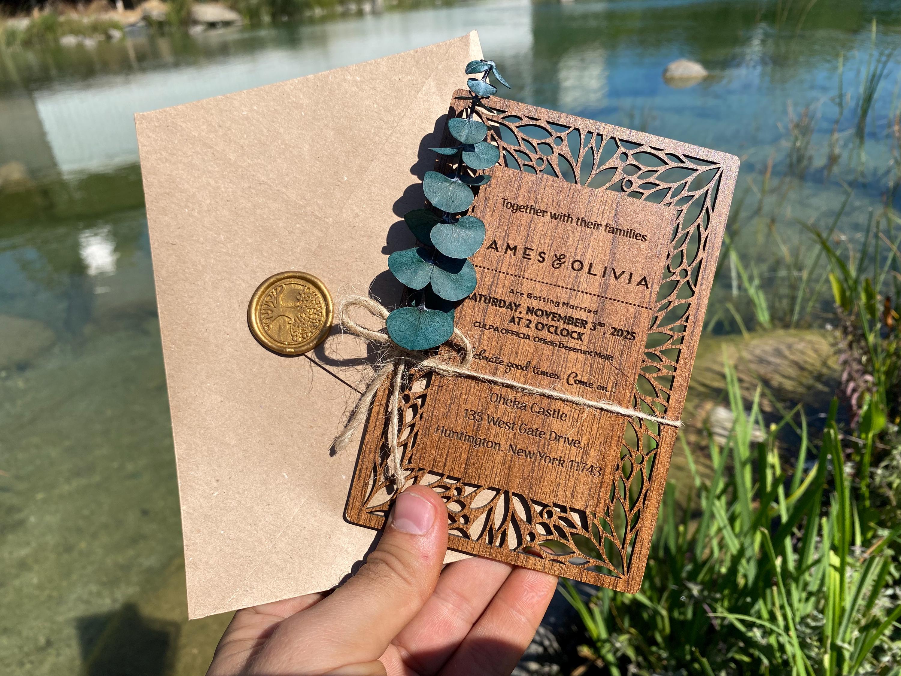
Sustainably sourced wood, a laser-cut eucalyptus pattern, and a 5×7 inch format that doubles as a keepsake. This invitation skips the paper pile entirely and hands your guests something they’ll actually hold onto. The eucalyptus detailing is precise and clean, the kind of thing people notice before they even read the date.
At 5×7 inches, it mails like a standard invitation but arrives like a small piece of decor. No bending, no flimsy corners. The wood is sturdy enough to prop on a mantel, which is exactly where half your guests will put it. Eco-conscious sourcing means the whole thing holds up on principle as well as in practice.
If your wedding has any kind of natural, botanical, or outdoor thread running through it, this invitation sets that tone before anyone steps foot in a venue. It is chic without trying too hard, earthy without being precious, and it does the work of communicating your aesthetic the moment it lands in someone’s hands. Wood invitations are a commitment, and this one earns it.
Flame Polished Acrylic Wedding Invitation
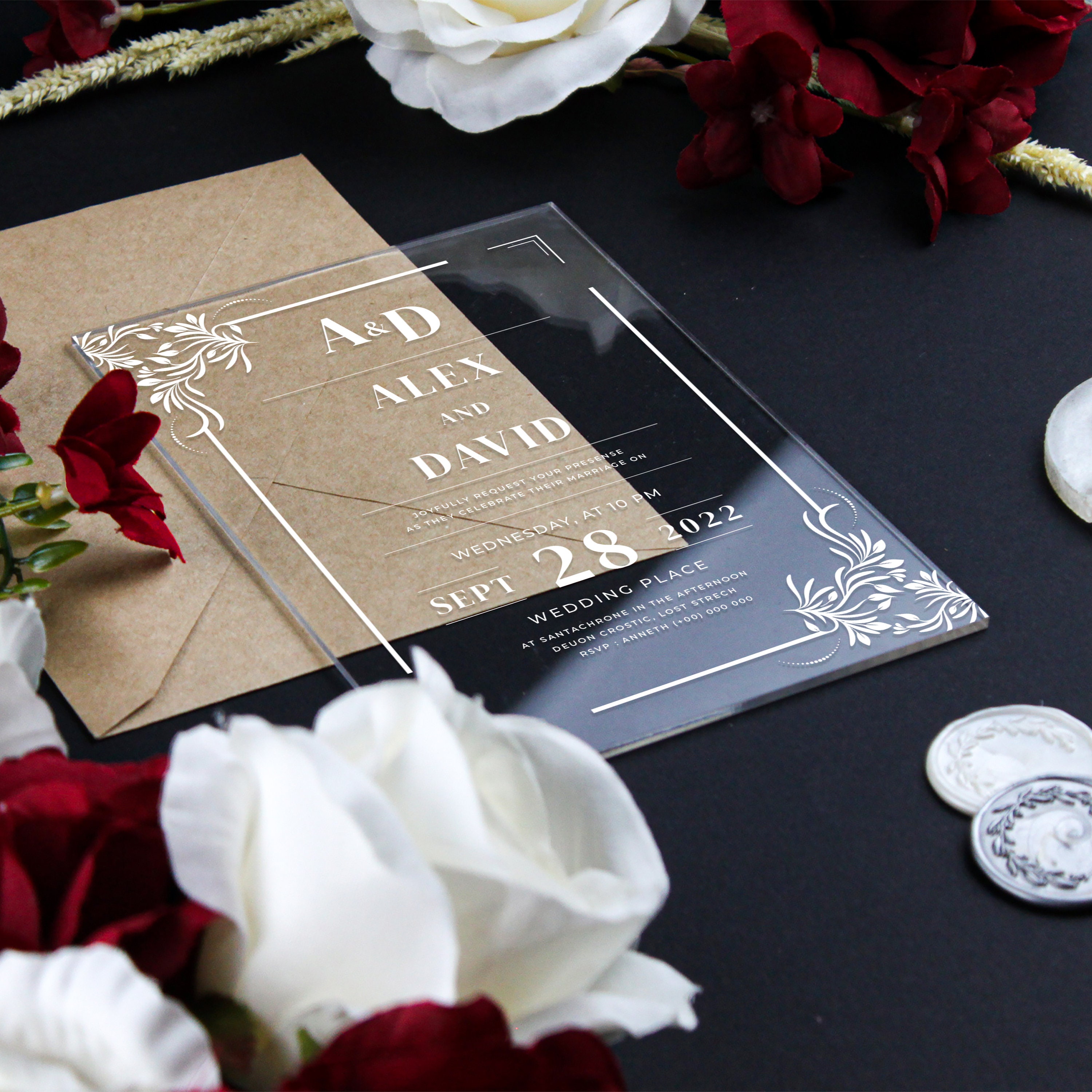
Flame polished acrylic invitation, and yes, it looks exactly as good as it sounds. The crystal-clear transparency and sleek polished edges put it in a different category from cardstock entirely. Guests will actually hold onto this one instead of tossing it on the counter with the takeout menus.
The polished finish catches light in a way that makes every design detail pop, and the acrylic itself is durable enough to survive the journey from envelope to refrigerator door. This is the kind of stationery that signals you thought about it, without having to say so out loud.
It doubles as a keepsake, which means the people you actually want at your wedding will probably keep it. Bold choice, obviously. But if you are going to spend months planning an event, the first thing guests receive should set the tone, and this one does.
Frosted Acrylic Foil Invitation Suite
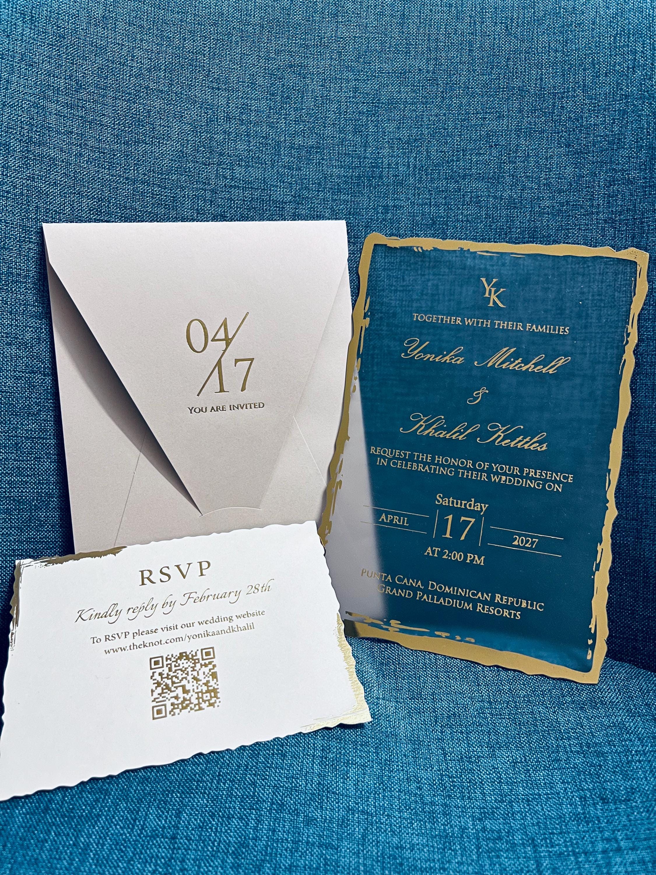
3mm frosted acrylic is the base here, and it earns its keep. The clouded surface catches metallic foil in a way that flat paper simply cannot, and the tactile contrast between the two materials is the kind of thing guests will actually comment on. This is a wedding invitation that functions as a preview of the event itself.
The foil comes in various shades, so you can dial the drama up or down depending on your aesthetic. That range keeps the suite from feeling like a one-note flex. Modern without being cold, polished without being stiff. The materials do the talking without overexplaining themselves.
Acrylic invitations at this finish level tend to circulate long after the wedding. People keep them. Frame them, occasionally. The 3mm thickness gives the piece real weight in hand, and the frosted surface diffuses light in a way that makes the foil pop without going garish. If you want guests to hold something and immediately understand the caliber of what they are walking into, this suite delivers that without any extra effort on your part.
Frosted Acrylic Gold Foil Invitations
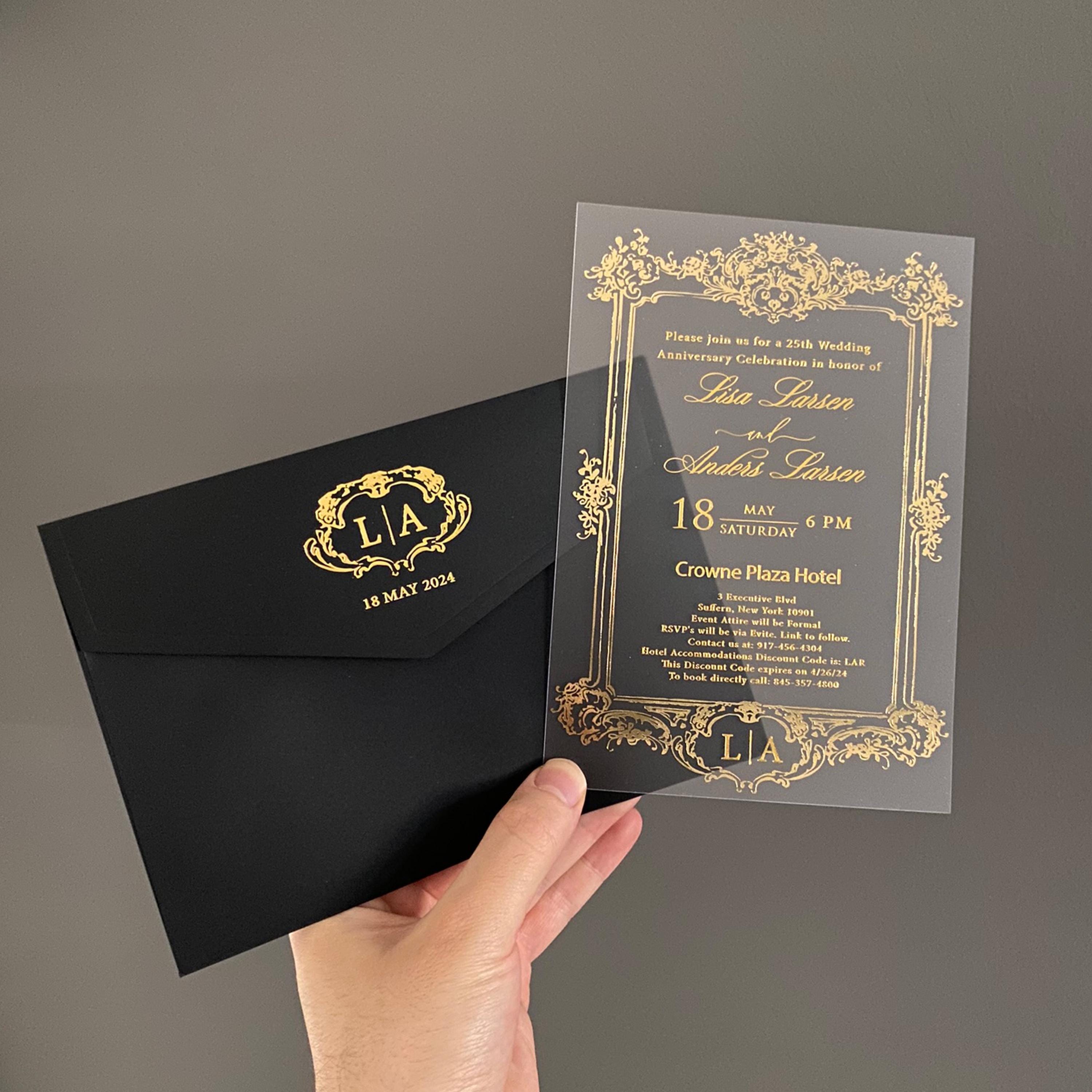
Frosted acrylic with gold foil detailing, cut to 5×7 inches. That’s the short version. The longer version is that these invitations arrive feeling like an object worth keeping, not something guests fish out from under takeout menus. The translucent finish gives the gold foil something to play against, and the result reads expensive without trying too hard.
Acrylic holds its shape. No creased corners, no water damage, no sad little envelope casualties. The frosted surface catches light differently depending on the angle, which means guests actually look at the thing instead of scanning it for the venue address and tossing it aside. Gold foil does the rest of the work, signaling that whatever event this announces is worth showing up to.
These cost more than paper, and they should. They’re the kind of invitation people keep on a shelf or prop against a mirror, which means your event gets a second life as decor in someone’s home. That’s a decent return on a piece of stationery. If you’re already spending serious money on a wedding, birthday, or milestone event, the invite is not the place to go budget.
Frosted Acrylic Gold Print Invitation
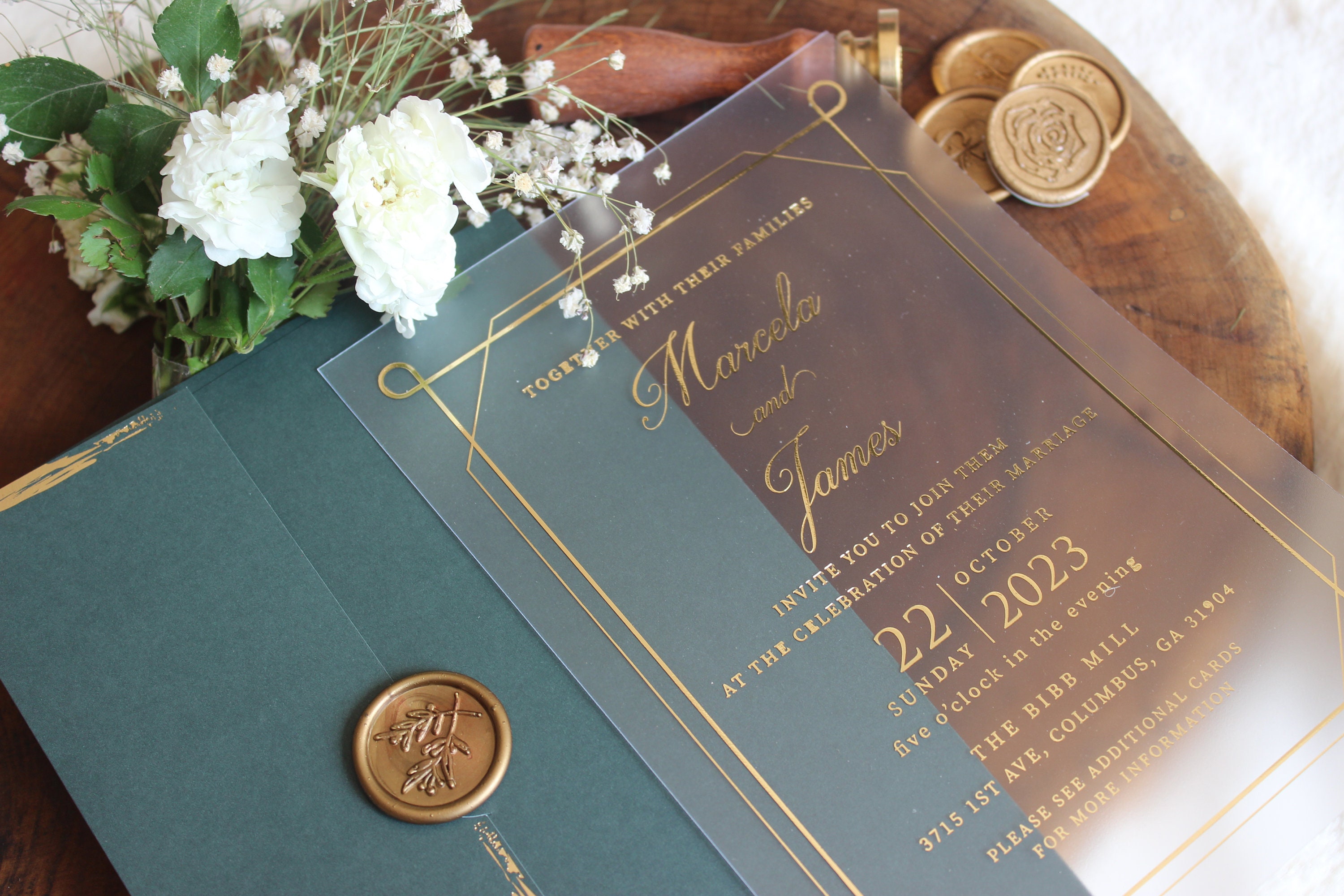
Frosted acrylic with gold print. Translucent, durable, and built to make paper invitations look like an afterthought. These arrive in guests’ hands feeling like something worth keeping, which is the whole point of a first impression.
Gold on frosted acrylic has a weight to it that cardstock simply cannot fake. The finish catches the light, the text pops, and the whole thing reads as deliberate. Guests will turn it over in their hands before they even check the date. That reaction is baked into the material itself.
This is the invite for a couple who wants the ceremony to start before anyone walks through the door. A little Hollywood, a little drama, zero apologies. Acrylic holds up, looks sharp, and signals that the rest of the day will be worth showing up for.
Frosted Acrylic Invitation Suite
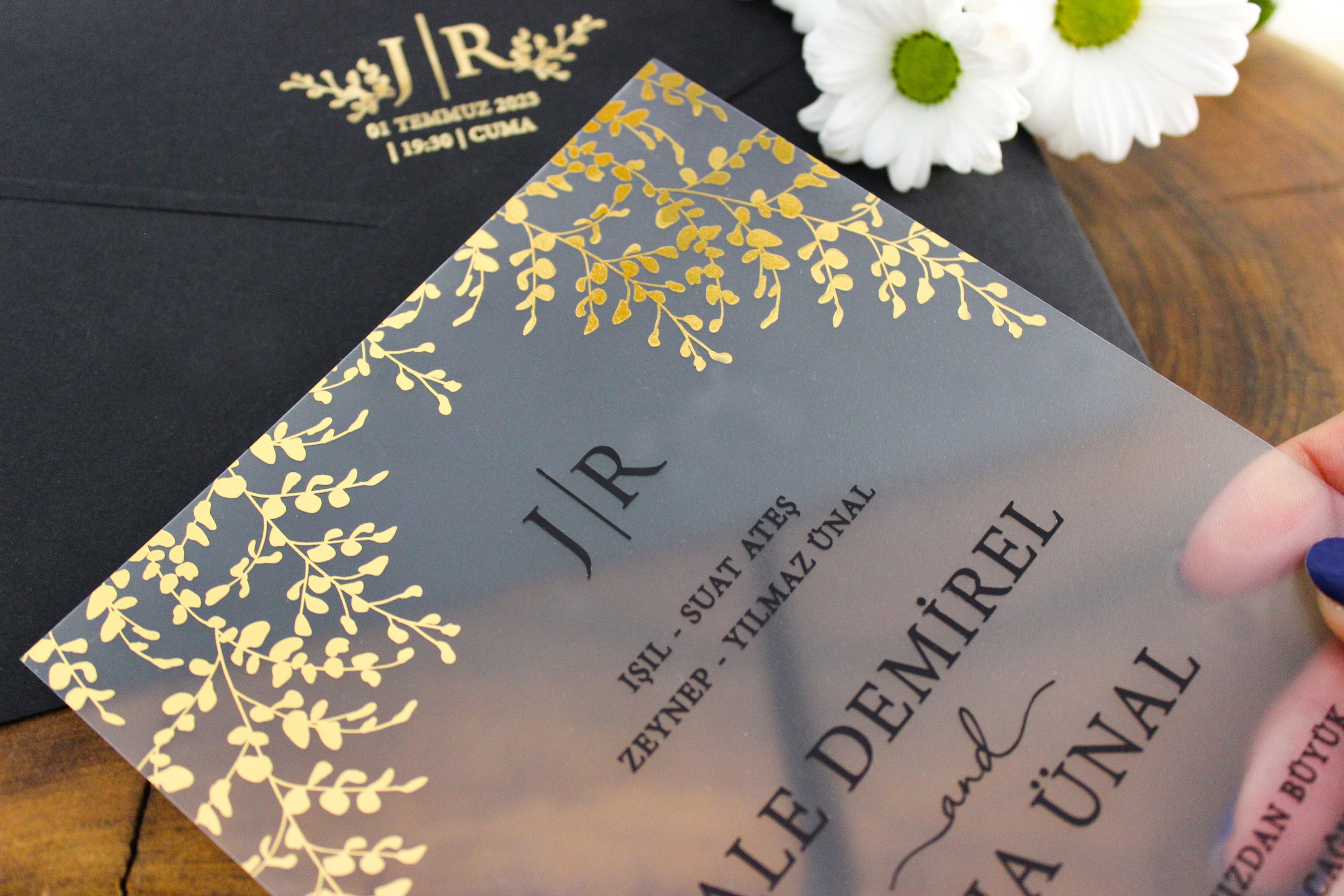
Frosted acrylic, 5mm thick. Think of it as your wedding invitation having gone to a very stylish school in Switzerland. This suite demands attention the moment it lands in someone’s hands, daring guests to run their fingers across that smooth, icy surface. It whispers sophistication without having to try very hard.
Paper is fine, but it does not give off that cool-to-the-touch vibe. This suite is the unexpected twist in an otherwise predictable category of wedding stationery. Couples who choose it are not simply inviting guests. They are curating an experience, and the difference shows. The frosted finish reads as bold without being loud, which is a harder trick to pull off than it sounds.
Pair it with minimalist typography and a sprig of eucalyptus and watch your wedding prep start to resemble an art exhibit. The first glimpse of the big day sets a tone, and this one sets it early and clearly. Toss in a cheeky RSVP card and prepare for a flood of compliments before the big day even arrives.
Frosted Floral Acrylic Invitation
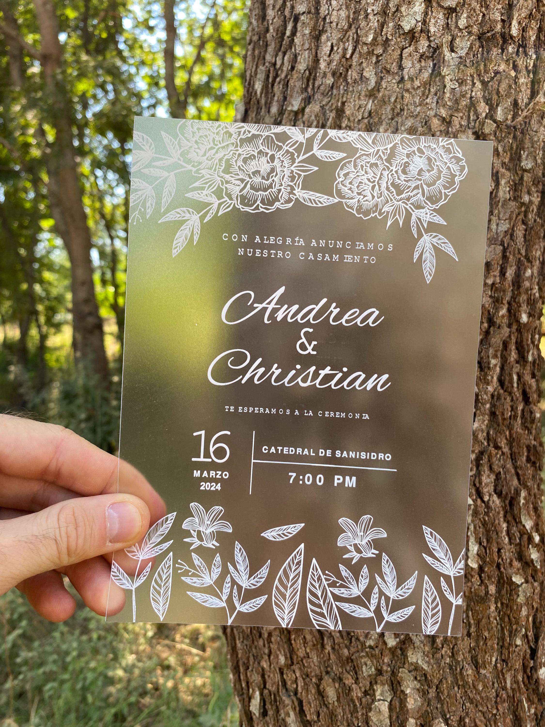
Frosted acrylic, etched floral design, zero chance it ends up in the recycling bin. This invitation is tactile and bold in a way paper simply cannot pull off. The etched florals are genuinely decorative and genuinely structural, carved into a surface that holds its shape long after the event is over. People keep these. Frame them, photograph them, text you about them.
Handing one of these over feels different from sliding a paper envelope across a table. The frosted finish catches light without being flashy, and the sturdy acrylic construction means it arrives looking exactly as it left, no wilting corners or smudged ink. It is the kind of object that earns a spot on the fridge or a shelf, not a shrug and a trash can.
Fair warning: it will upstage other things at your event. Possibly the centerpieces. Possibly Aunt Edna’s dance moves. If you want something slightly unorthodox that doubles as a keepsake, this is it.
Georgian Door Gatefold Suite
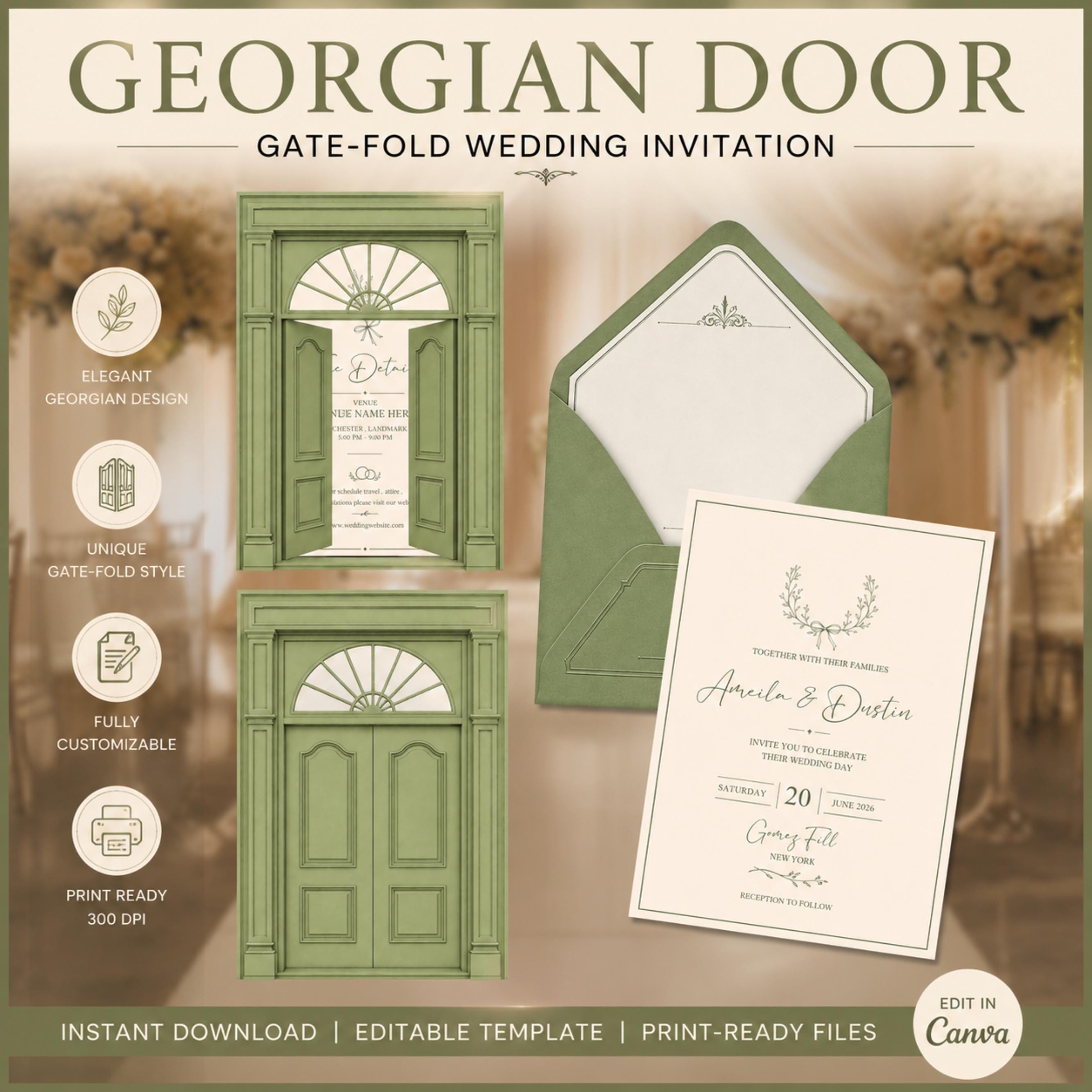
A Georgian door design printed on thick cardstock, this gatefold invitation arrives looking like it belongs in a period drama. The panelled facade folds open to reveal coordinated inserts inside, so the whole suite holds together as one cohesive package rather than a handful of loose paper.
The detailing leans into old-world architecture without tipping into stuffy. Think carved doorways, classical symmetry, the kind of thing that makes guests hold the envelope a second longer before opening it. The cardstock has real weight to it, which matters more than people admit. A flimsy invitation sets a tone too, just not a good one.
This suite works well for couples who want their wedding stationery to signal something specific: that the day will have substance and a bit of character. The Georgian door motif does that quietly, without spelling it out. Coordinated inserts are included, so RSVP cards and detail cards share the same visual language as the main invite.
Gold Foil Beach Acrylic Invitation
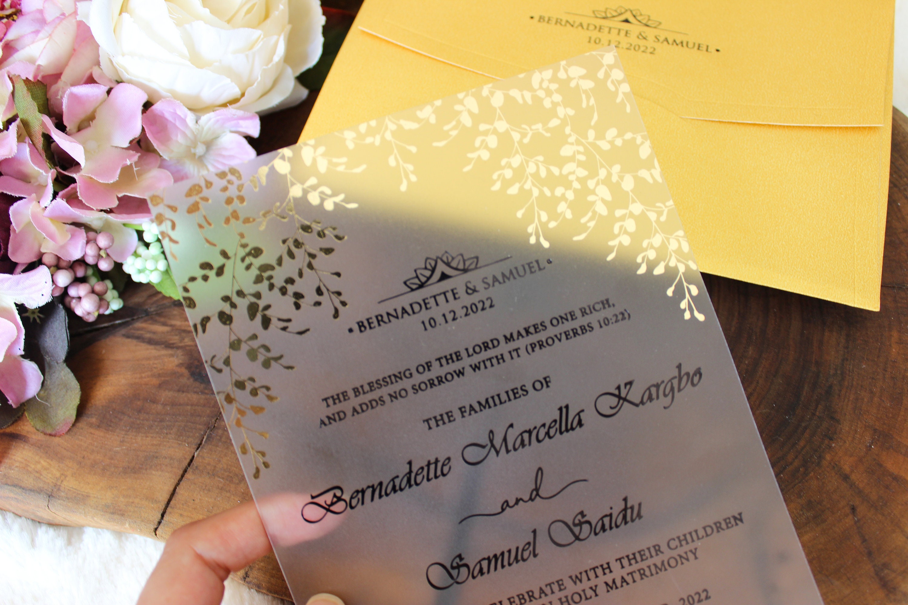
Acrylic, not paper. This invitation is printed on clear acrylic with gold foil detailing that catches the light the way a good beach wedding should. The result sits somewhere between modern and laid-back coastal, which is a harder balance to pull off than it sounds.
The material holds up where paper falls apart. Humidity, a stray splash, a little sand: none of it phases acrylic the way it would a standard card stock invite. Wipe it down and it looks exactly as it did coming out of the envelope. Guests will also be less likely to toss it, because it feels more like an object than a piece of mail.
The gold foil is restrained enough to read as intentional rather than excessive. It signals that some real thought went into this, without crossing into territory that makes people uncomfortable at the stationery. If you want your guests to arrive at the ceremony already understanding the vibe, this is the invite that does that work for you.
Gold Foil Sage Frosted Acrylic Invitations
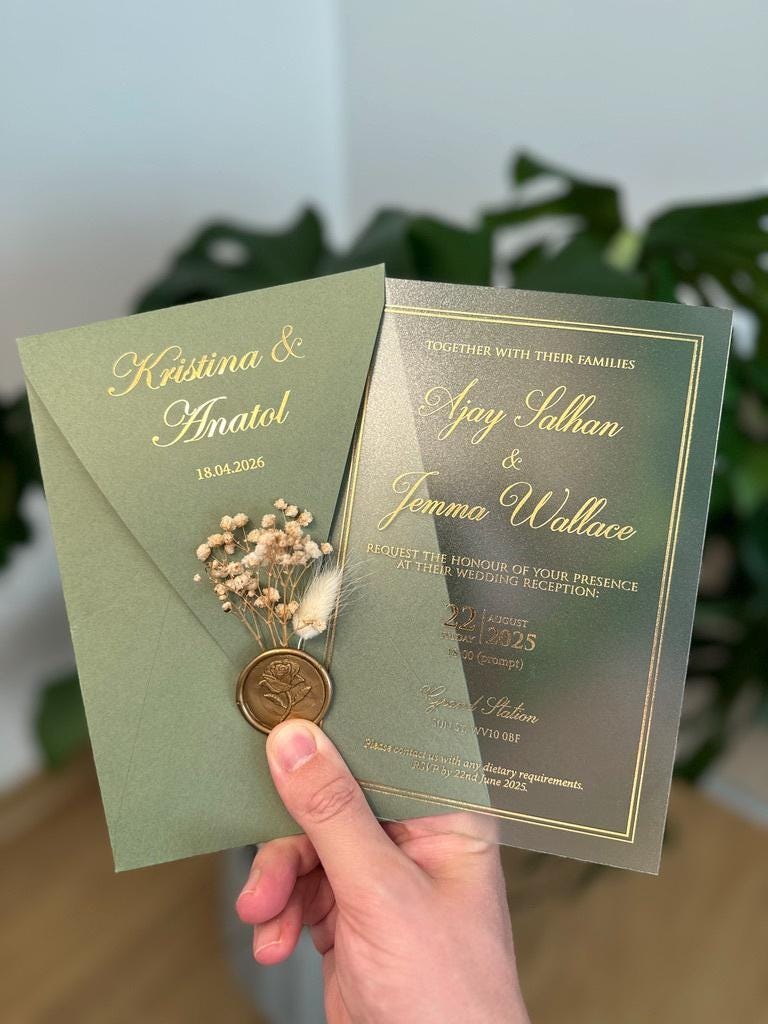
Frosted acrylic, gold foil lettering, 5×7 inches. These invitations arrive before you do, and they arrive with confidence. The James Bond of stationery comparison writes itself, and honestly, it holds up.
The sage frosting gives the gold foil something to work against, and the result catches light in a way flat paper simply cannot. They’re also solid enough to survive the mail, a crowded counter, and whatever chaos precedes your event. Your grandmother probably sent paper. Good for her. This is not that.
The real job of an invitation is to tell guests what kind of party they’re walking into. These do that without a word of explanation. Bold material choice, clean gold type, and a format that photographs well without trying to. Tradition is fine. This just has better taste.
Gold Foil Vellum Invitation Suite
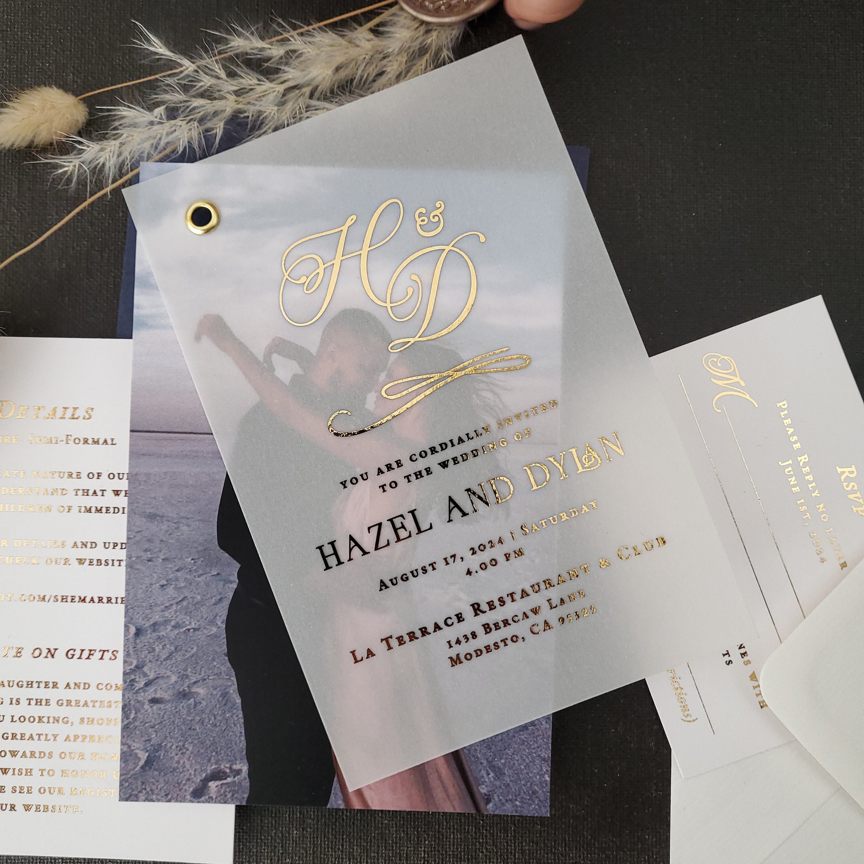
Gold foil on vellum. The combination works because the hard metallic gleam of the foil plays directly against the soft, translucent quality of the vellum sheet beneath it. Your guests won’t just read the details. They’ll turn the thing over in their hands.
There’s something about vellum’s near-transparency that makes an invitation feel less like mail and more like an object. The gold foil keeps it grounded, giving the suite a tactile weight that dreamy-only stationery tends to lack. Together they land somewhere between celestial and genuinely luxurious, which is a harder balance to pull off than it sounds.
The suite comes with everything your guests need, short of an Uber to get them there. Slip one into an envelope and it does the work of setting expectations before anyone has read a single word. Sometimes the cover really does tell the whole story, and in this case the story is a good one.
Gold Foil Vellum Invitations
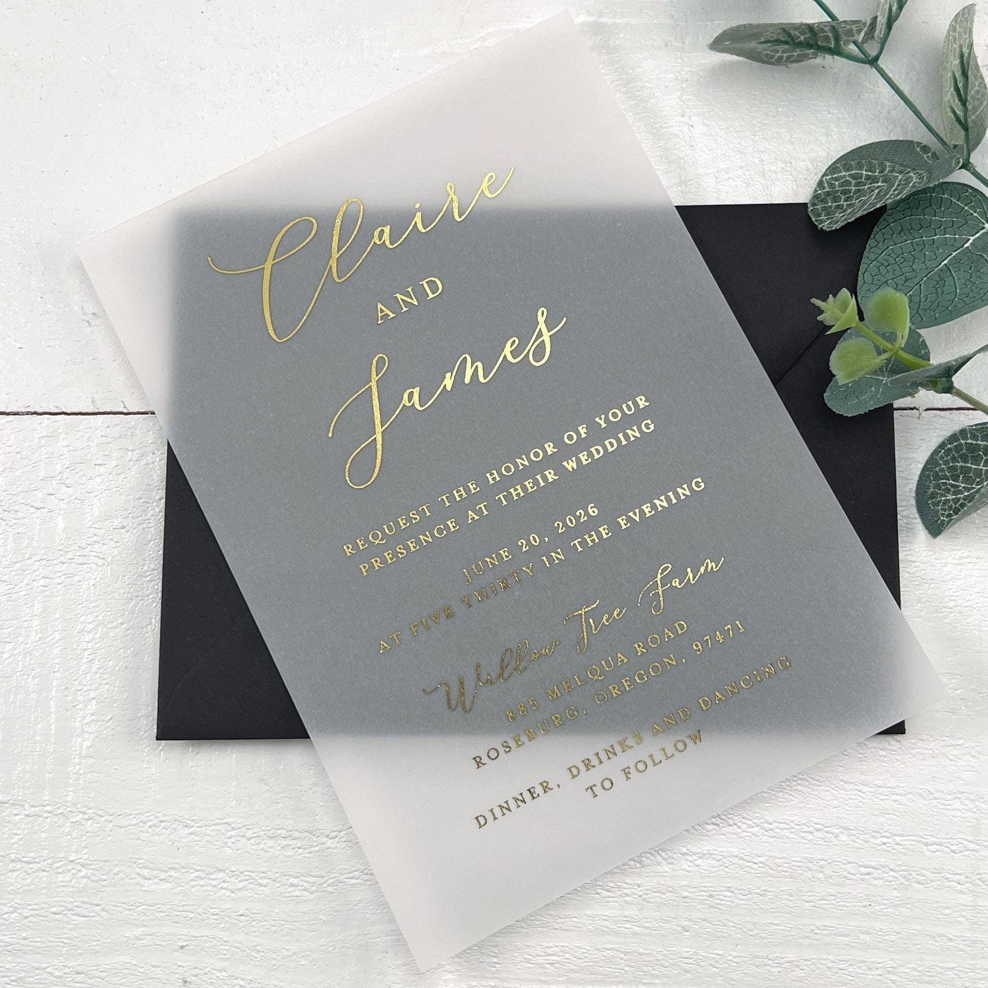
Gold foil pressed into vellum. It’s as decadent as it sounds. These invitations don’t just invite, they announce with a flourish. The kind of thing you send when a phone call feels insufficiently dramatic for the occasion.
The translucent vellum is the point: guests can literally see through it, which gives the whole thing an air of layered intrigue before they’ve even opened an envelope. It’s a sneak preview built into the paper itself. That alone tends to generate more pre-event excitement than most people manage with an entire theme.
Each invitation is a proper piece of stationery, crafted with the kind of attention that makes the object feel intentional rather than incidental. Durable, a little over-the-top, and completely unapologetic about it. If the party you’re planning has any ambition at all, the invitation should too.
Green Botanical Arch Invitation Template
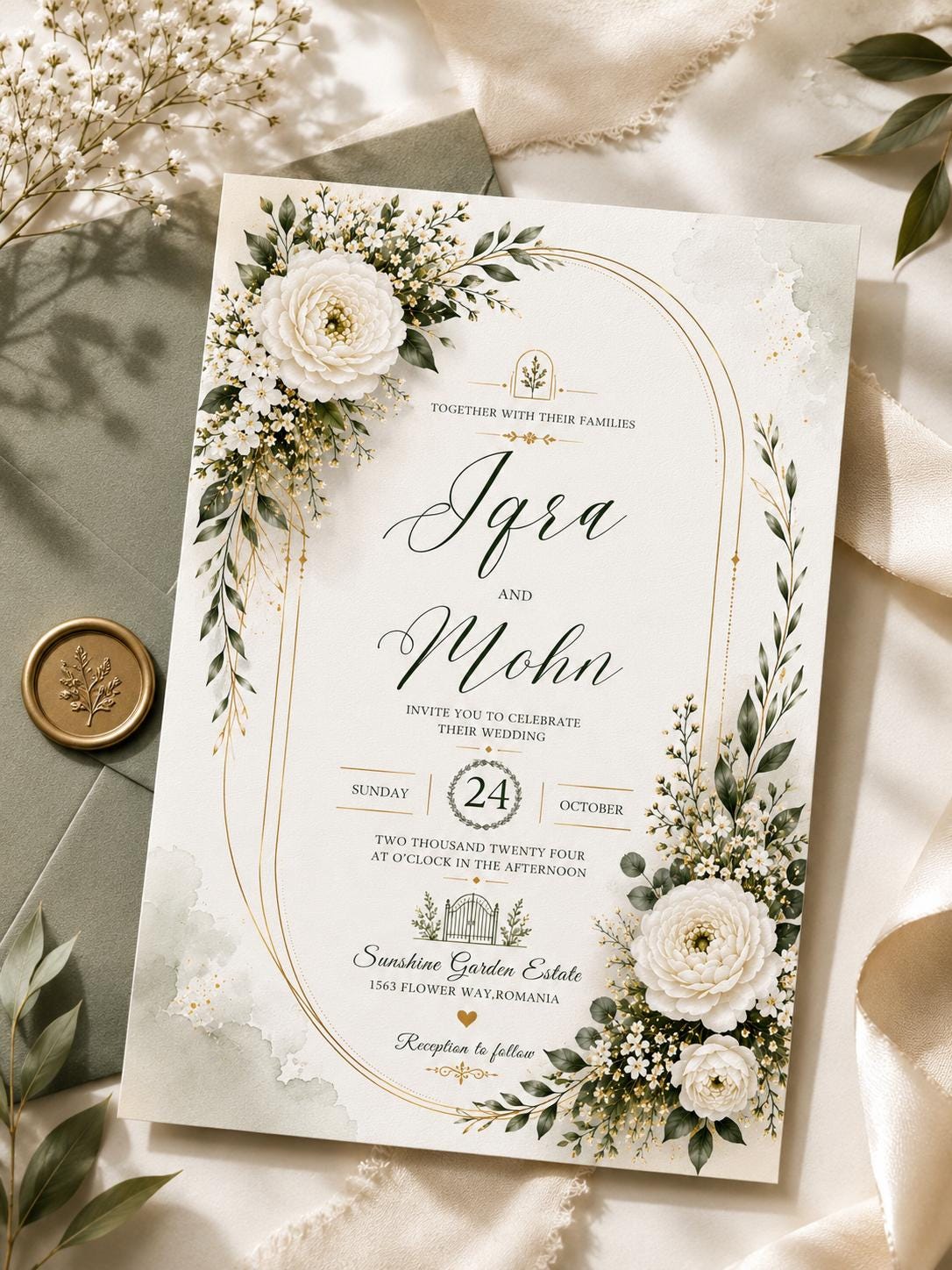
Printed on eco-friendly cardstock, this Green Botanical Arch Invitation Template is for anyone who wants lush greenery without a fussy wedding to match. The arch design runs an emerald vine across the page, landing somewhere between sprightly and sophisticated, much like your Aunt Carol after a glass of Prosecco.
Customization is the whole point here. Tweak the font, the wording, the layout, until your cousin finally stops hovering over your shoulder about kerning. Minimal effort, maximum result. The template does the heavy lifting so you can spend your energy on literally anything else.
It’ll look custom-made without the boutique drama or the price tag of a small family car. Just you, your big love, and a design that somehow has more chill than your entire planning spreadsheet. Go wild, or at least as wild as an Excel-nurtured guest list allows.
Handmade Real Foil Acrylic Suite
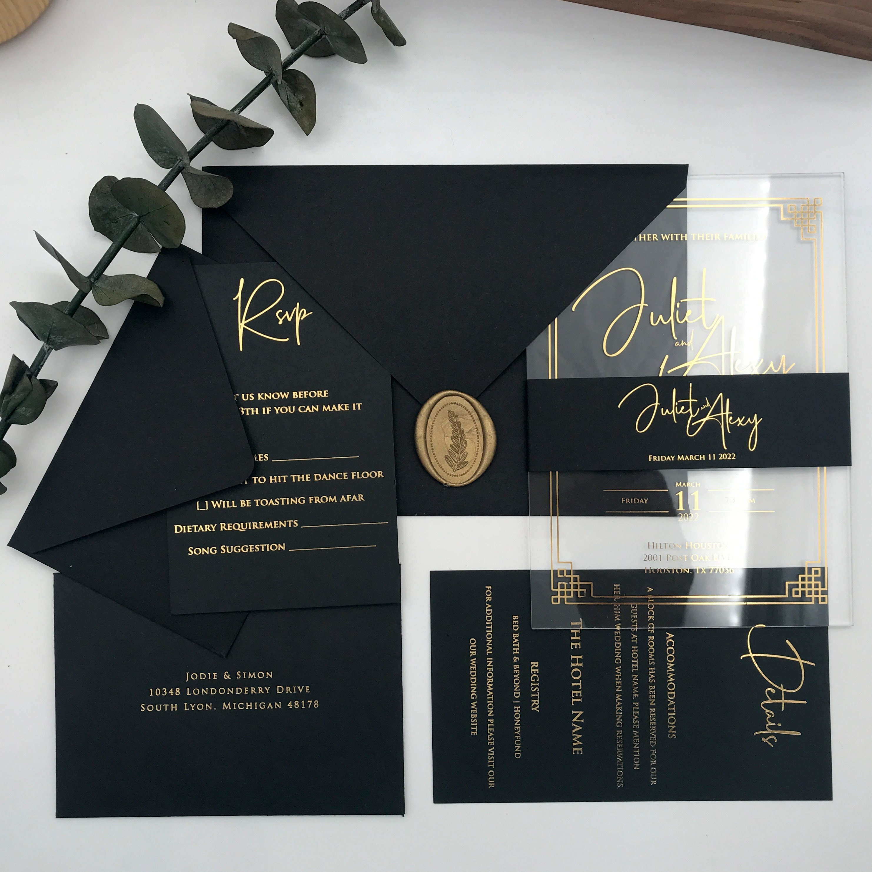
Real foil accents pressed onto sleek acrylic make this invitation suite look like it belongs in a fashion editorial, not a mailbox. The foil catches natural light in a way that flat cardstock simply cannot, and that shimmer lands before a single word gets read. This is stationery that does the first impression work before the event even happens.
Acrylic gives each piece a weight and clarity that paper cannot replicate. Guests will hold this and immediately understand the tone of the event. That is the point. The foil detail is not decorative noise; it is the whole argument for why this suite exists.
If the event calls for something that feels considered and a little theatrical, this suite delivers. It works for weddings, milestone celebrations, or any occasion where the invitation itself needs to signal that the night ahead is worth showing up for. The combination of foil and acrylic is specific enough to read as intentional without veering into excess.
Instant Editable Minimalist Wedding Invitation
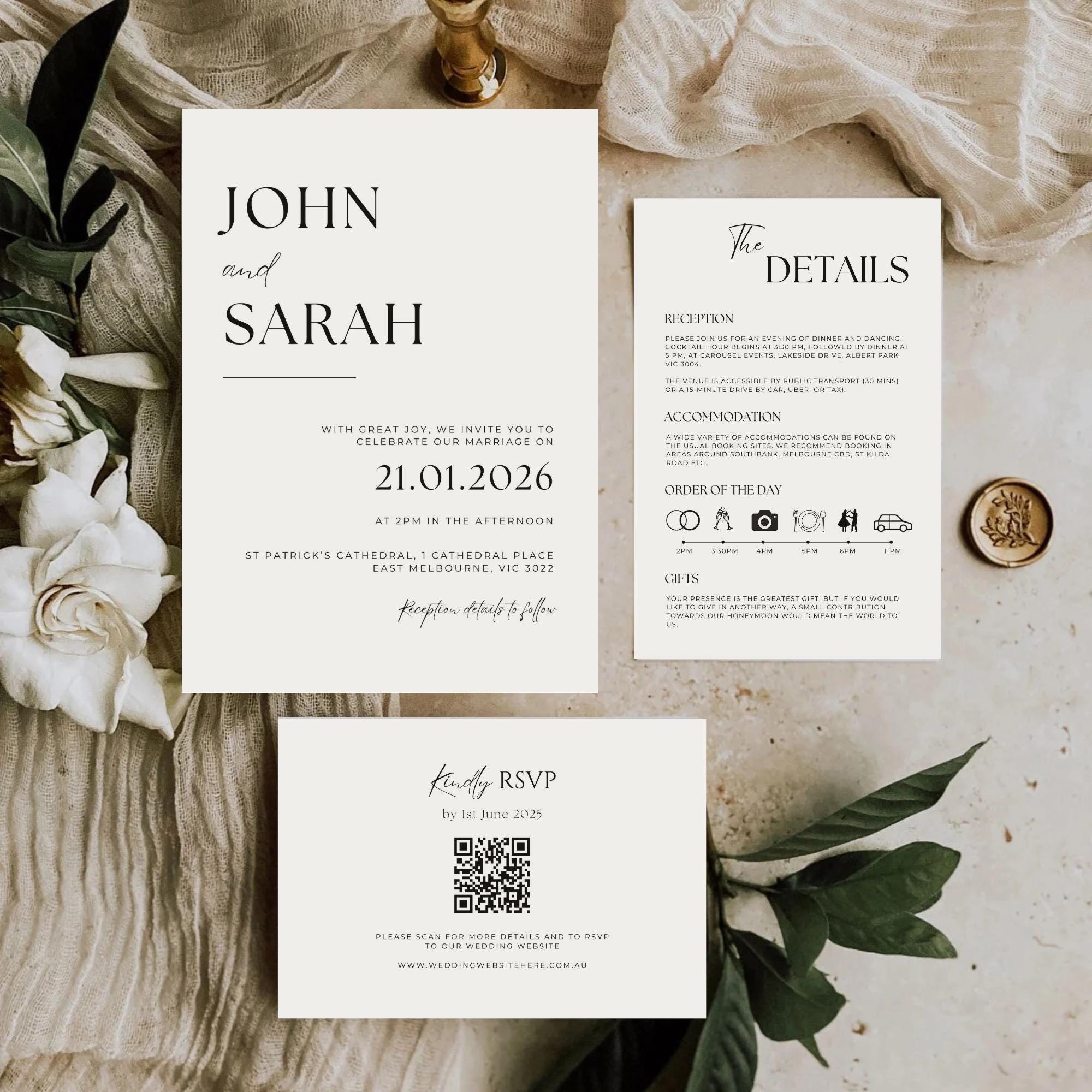
White space and clean lines do the heavy lifting in this instantly editable minimalist wedding invitation. The design leans hard into simplicity, and it works. Swap in your details, adjust the colors to whatever you actually want (celestial blue instead of vanilla? Go for it), and call it done. No graphic design degree required.
Every color in the template is fully customizable, so you are not locked into someone else’s palette. The whole thing is built around the idea that restraint is its own kind of style, and honestly, it makes a strong case.
Edit it on a laptop or tablet. The process is genuinely fast, the kind of fast where you finish before you expected to start. Clean, modern, and ready to send the moment your details are in. Your guests will assume you spent weeks on it. You spent twenty minutes.
Laser Engraved Bamboo Fan
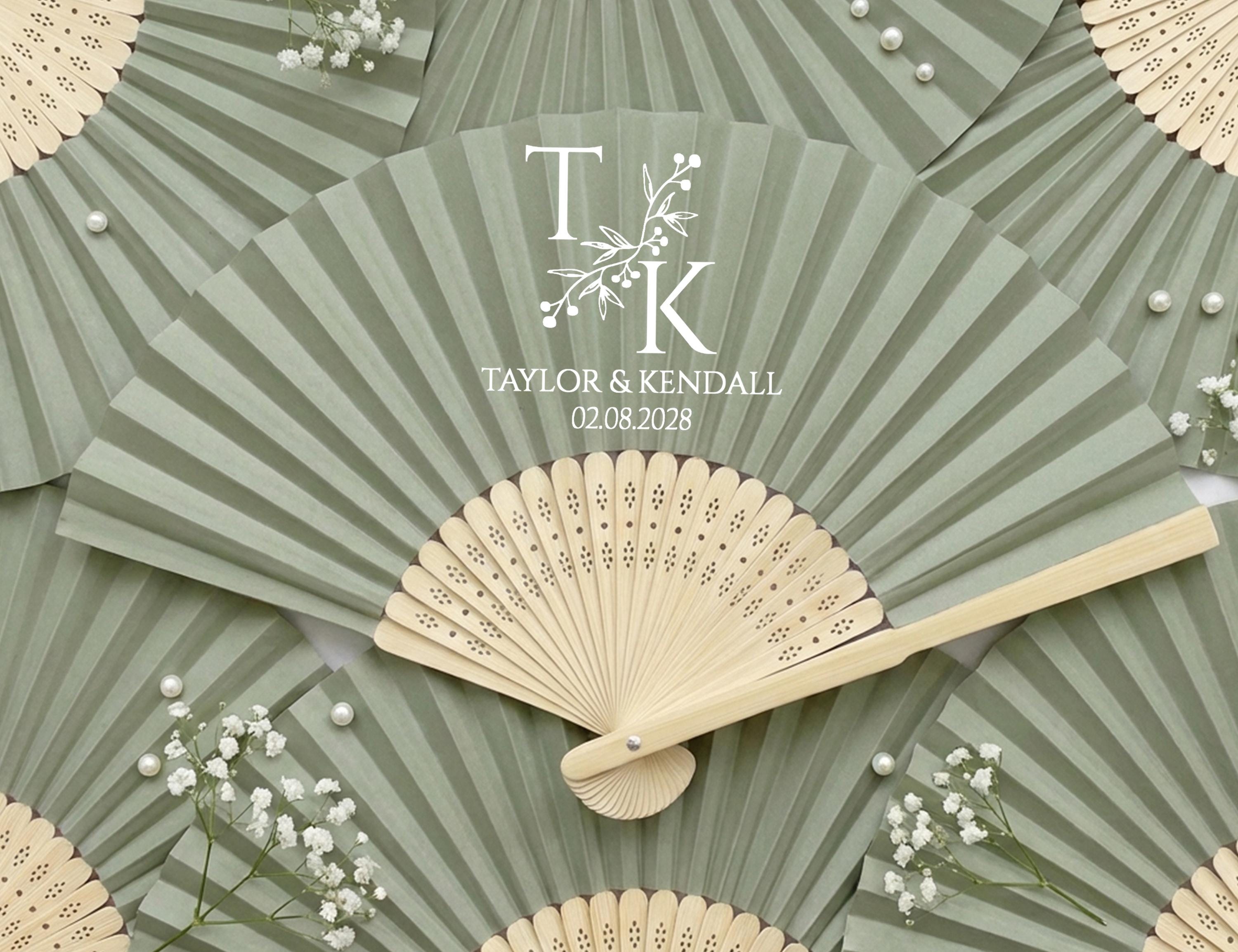
Sustainably sourced bamboo, laser engraved with designs that land somewhere between elegant and a little cheeky. It’s a fan, yes, but not the kind you’re desperately waving during an awkward conversation with your future in-laws.
Lightweight enough that you’ll forget you’re holding it, the bamboo also takes personalization well. Names, dates, a doodle of questionable artistic merit: all can be etched with real precision. The material is eco-friendly, which is a genuine selling point and not just something to mention at dinner parties.
It works at outdoor weddings when the heat is oppressive and the speeches are long. It also works as a keepsake that people will actually keep, unlike the fridge magnet from last summer’s corporate retreat. Your cousin’s dance moves at the reception remain a liability, but at least this part of the day is sorted.
Minimalist Gold Foil Wedding Invitation Suite
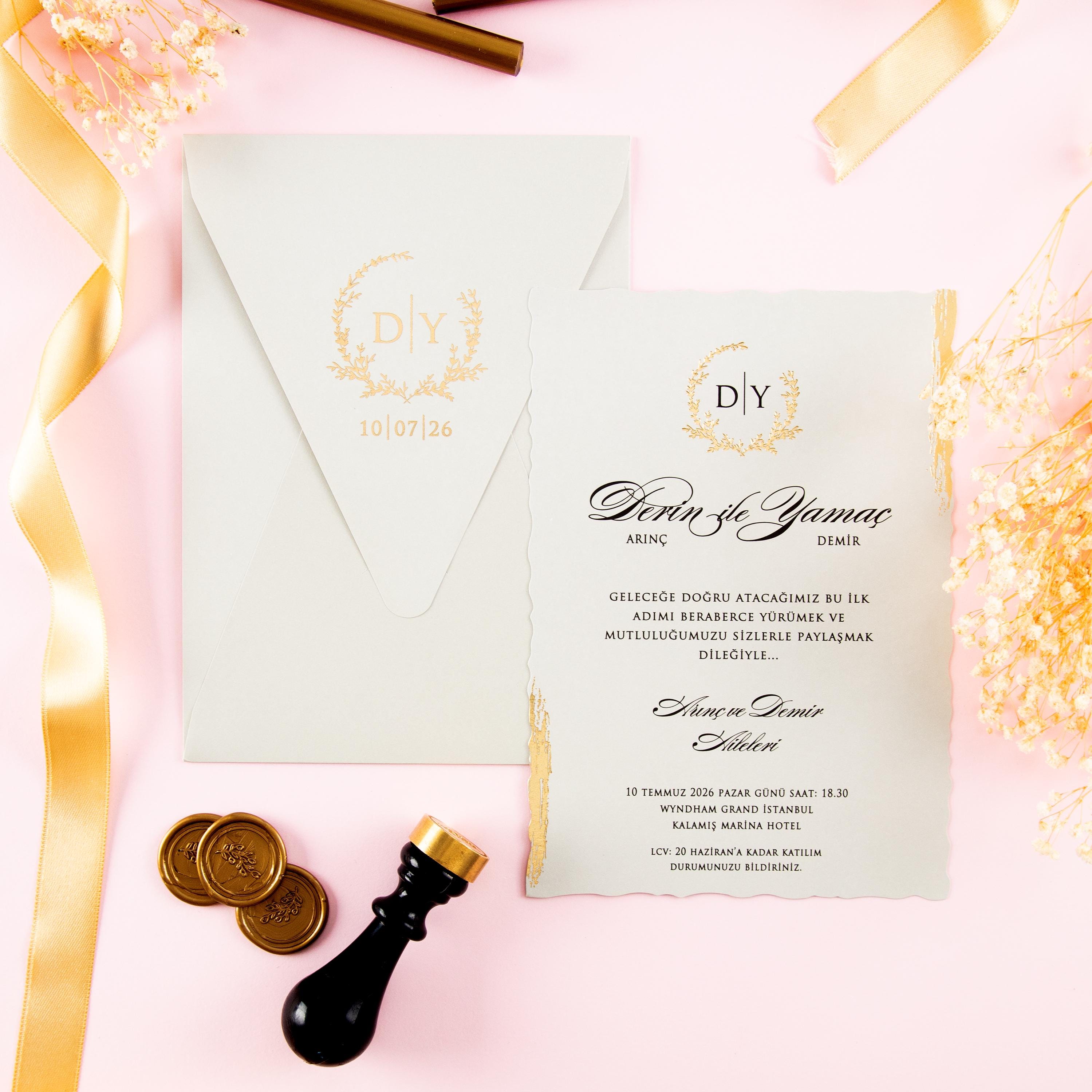
Gold foil on thick cardstock, kept deliberately spare. The shimmering lines sit against a clean backdrop without competing with each other, which is exactly the point. This is the invitation for couples who have strong opinions about what to leave out.
The cardstock has real weight to it. Guests will feel it before they read it, and that first impression lands before a single word registers. No busy patterns, no competing textures, just a precise foil treatment that does its job quietly and well.
Minimalist gold foil suites like this tend to photograph well too, which matters when the stationer’s table ends up in half your reception shots. Sleek, considered, and confident enough to let everything else speak for itself.
Mirrored Gold Acrylic Invitation Suite

The Mirrored Gold Acrylic Invitation Suite arrives before you do, and it does not show up quietly. The high-gloss mirrored gold finish catches light from every angle, and because it is acrylic, it has a weight and rigidity that paper simply cannot fake. No flimsy cardstock, no bending in the envelope.
The suite covers the full set: invitation, RSVP card, and information card, each one a solid slab of glossy gold. Standard sizing means envelopes are easy to source, but nothing about the look reads standard. These are the kind of invitations people prop up on a mantle instead of tossing in a drawer.
Gold is one thing. Gold that literally mirrors your guests’ own shocked expressions back at them is another. Expect the mailbox moment to do a lot of heavy lifting for your wedding’s first impression. The acrylic construction keeps everything pristine in transit, so what lands in the envelope is exactly what you ordered: something that looks almost too good to be an invitation.
Personalized Dusty Pink Acrylic Invitation
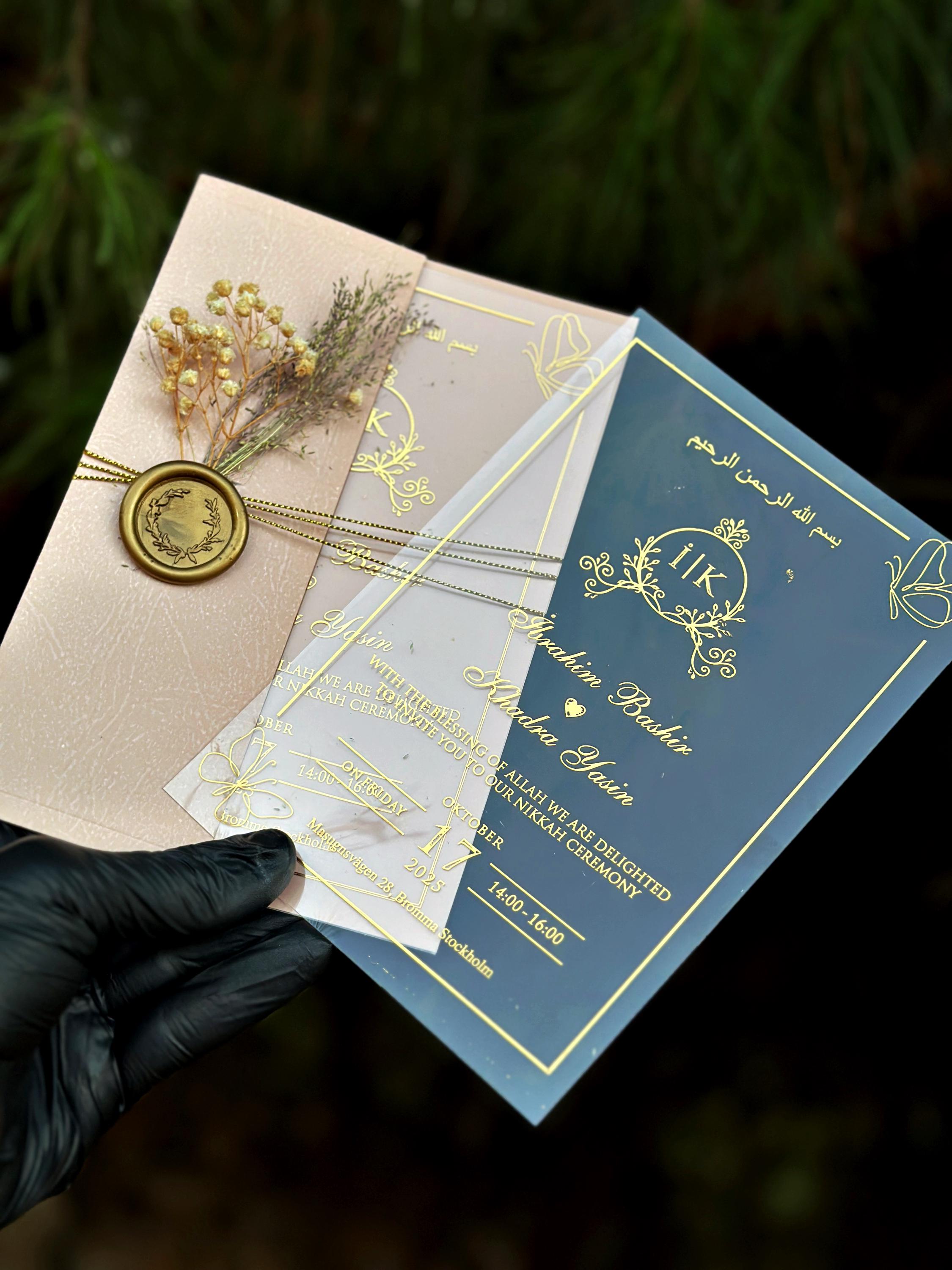
Dusty pink acrylic invitations, because paper was never going to cut it for someone with actual taste. These are the kind of invites guests hold up to the light and forget to put down. There is real weight to them, both literally and in the impression they leave, and that is before anyone reads a single word.
Personalization goes as far as you want it to. Engrave your names, keep it minimal, or lean into something a little unexpected. The acrylic itself is solid enough to survive a toddler treating it like a frisbee, which is more than can be said for any cardstock alternative.
Wedding stationery tends to blur together in people’s memories. A dusty pink acrylic card does not. It lands somewhere between genuinely elegant and quietly subversive, which is exactly the tone some love stories deserve. If you have been quietly dreading the beige envelope phase of wedding planning, this is your exit ramp.
Photo Backed Vellum Foil Invitation
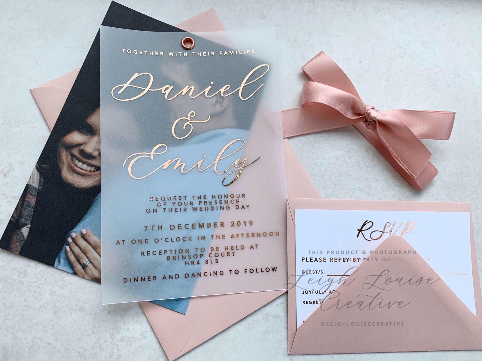
Vellum layered over your photo does something a printed image alone never quite pulls off: it softens the picture just enough to feel intentional rather than literal. The effect reads elegant without trying too hard, which is a harder balance to strike than most invitation designers admit.
The foil detailing catches light the way a well-placed mirror does, which is to say it earns its keep without overwhelming everything around it. RSVPs tend to come in faster when the invite itself feels like an event. Correlation, probably causation.
Your chosen photo anchors the whole thing, giving the design a personal center that stock florals and generic scripts simply cannot replicate. It lands somewhere between sentimental and sharp, old-school photo sentiment with enough polish to feel current. Flair without the glitter cleanup.
Quinceañera Gold Foil Acrylic Invitation
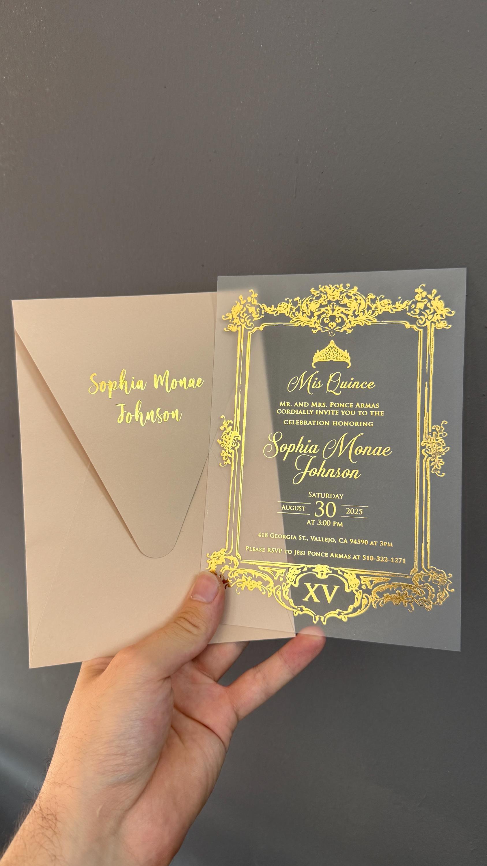
Acrylic with gold foil, 5×7 inches, and zero apologies. This quinceañera invitation is the kind of thing guests actually keep instead of recycling on the drive home. The gold foil catches light the way paper simply cannot, and the acrylic construction gives it a weight and presence that signals the party is worth showing up to.
Durability is the point here. Paper invites get coffee-stained, bent, and buried. This one survives the refrigerator magnet phase and comes out looking good on the other side. It doubles as a keepsake without trying too hard, which is exactly the right energy for an event this significant.
The 5×7 format is standard enough to mail without drama, but the materials make it anything but standard. Gold foil and acrylic together read as deliberate and considered, the kind of detail that tells your guests the quinceañera itself will be just as sharp. Nobody is RSVPing no to this one.
Rustic Cowboy Boots Wedding Invitations
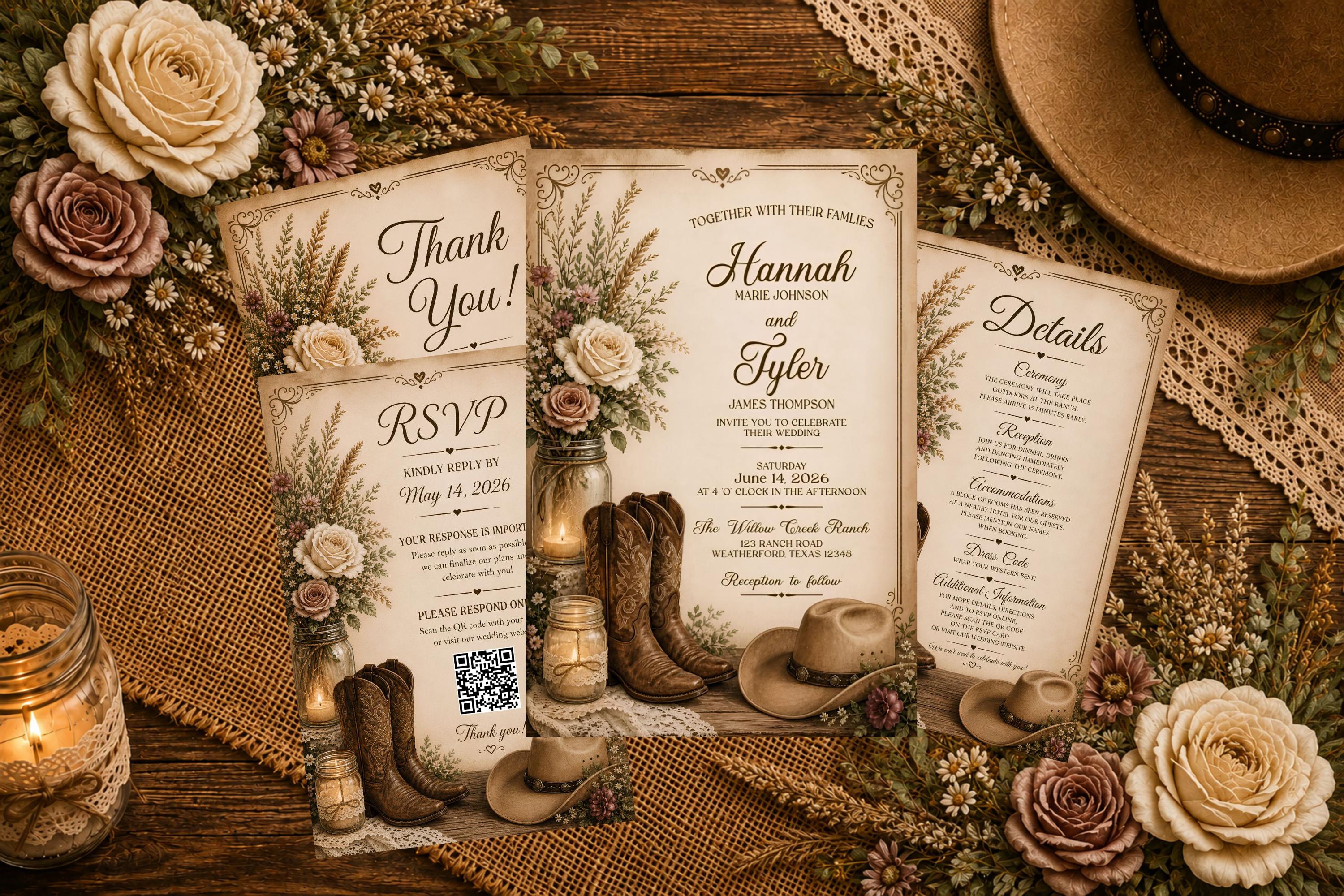
Printed on premium textured cardstock, these Rustic Cowboy Boots Wedding Invitations pair a worn-in boot illustration with wildflower accents for a ranch-chic aesthetic that actually looks polished. The artwork sits against an open-field backdrop, and the layout gives you generous space to fit all your event details without resorting to six-point font.
The design threads the needle between country and refined. No hay bales required, no mechanical bull implied. Just a well-composed invitation that signals your wedding will have personality without going full hoedown. The textured cardstock gives it a tactile quality that flat digital printing can’t replicate, and it photographs well if you’re doing a flat-lay for the ‘gram.
If your venue has a barn or a field, these fit the bill. If it’s a converted warehouse with Edison bulbs and a craft beer list, they still work. Rustic without being kitschy is a harder balance to pull off than it sounds, and this one gets it right.
Sage Baby’s Breath Invitations
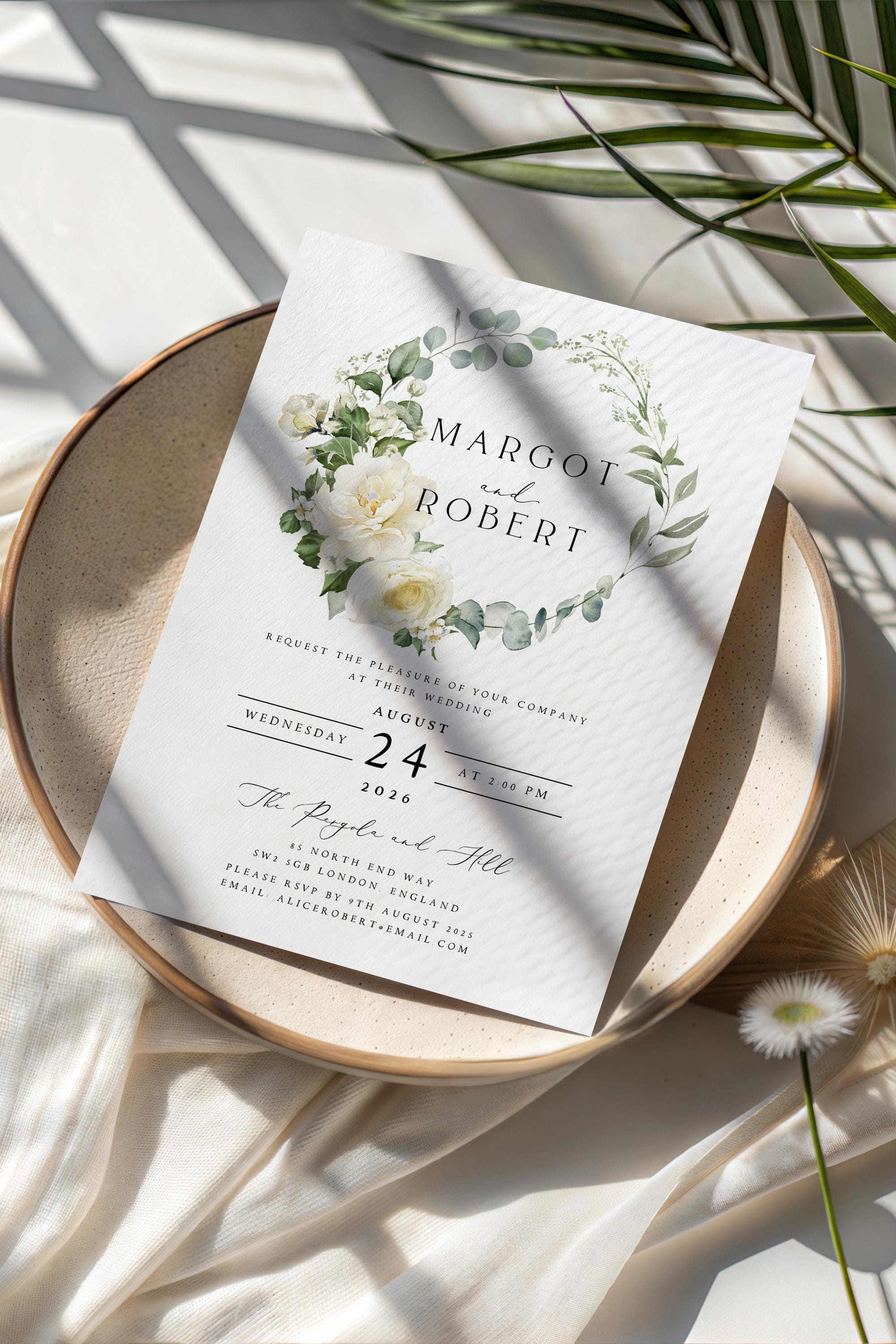
Sage green and baby’s breath printed on 100% recycled card stock. It’s a combination that works the way biscuits and gravy work: no reinvention needed, just solid execution. Your eco-conscious side gets to feel good, and the invitation looks the part.
The minimalist floral design stays tasteful without committing fully to garden party territory (unless that’s exactly what you’re going for). Each invitation is 5″ x 7″, giving you enough room to lay out all the details your great-aunt needs to find parking. Envelopes are included, so you can skip that particular errand.
Fonts are fully customizable, and the text fields are yours to rewrite however you like. The recycled card stock holds up well to printing and feels substantial in hand, not flimsy. If your wedding has a soft, romantic color palette already going, this invitation fits right into it without demanding attention it hasn’t earned.
Vellum Photo Wedding Invitation
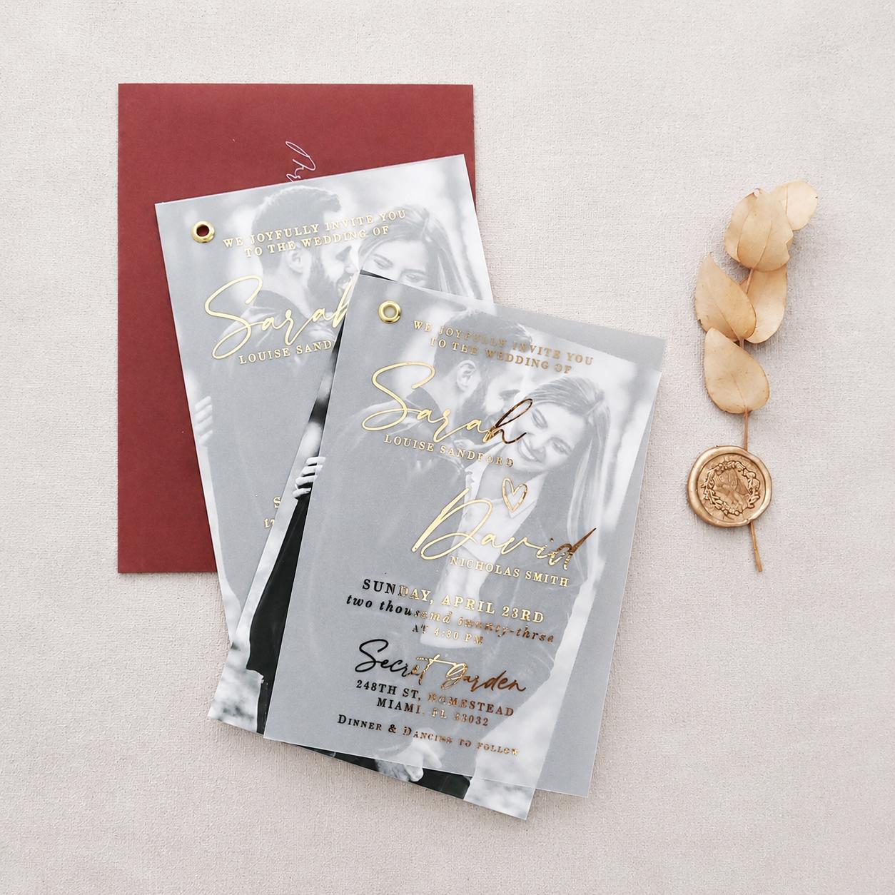
A translucent vellum overlay sits across the front, lightly veiling the couple’s photo beneath it. The frosted surface gives just enough away to make guests curious, and sliding the vellum aside to see the full image is the kind of small tactile moment that gets people talking almost as much as Emma’s drunken dance floor escapades.
Underneath, a quality print photo does the heavy lifting. The combination of vellum and photo print gives the invite a layered, physical presence that a flat card simply cannot replicate. It photographs well, too, for anyone planning to document the whole paper suite.
Customization covers fonts and colors, so you can dial in something that reads distinctly like you without going overboard. The result is the kind of keepsake even minimalist Aunt Susan will quietly hold onto after the big day rather than slip into the recycling bin on the drive home.
Vintage Celestial Tarot Wedding Invitation
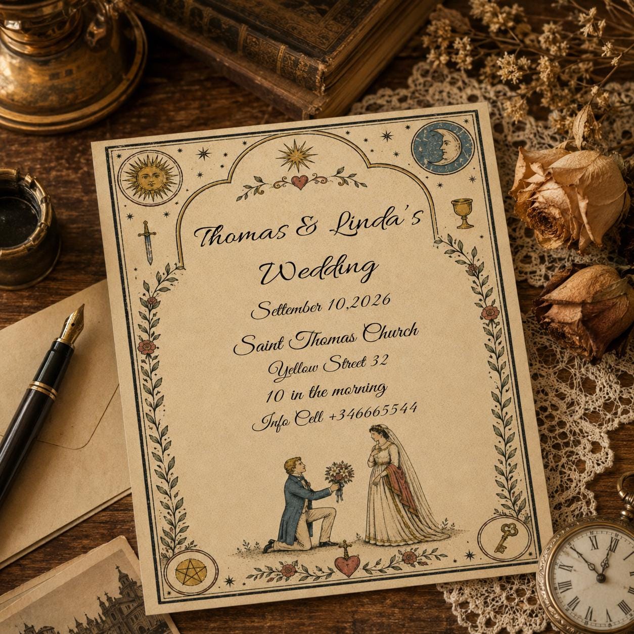
Handcrafted from premium textured cardstock, the Vintage Celestial Tarot Wedding Invitation leans hard into night sky imagery, mystical tarot motifs, and detailed lunar illustration. The whole thing reads like a paper fortune teller, which is either exactly your vibe or a sign you’ve found the right listing. Guests will be checking their horoscopes before they even flip it over.
Customizable options mean you’re not locked into a template someone else thought was “whimsical enough.” Drop in your own details and the celestial framework does the rest. The textured cardstock gives it weight in hand, the kind that makes people hold on to invitations instead of losing them under a pile of takeout menus.
If your love story has always felt like it belonged somewhere between a tarot spread and a stargazing session at 2am, this invitation is a logical conclusion. Shakespeare probably would have approved. No crystal ball required.
Shopping Tips
- It is tempting to upgrade to a pearl shimmer invite finish or a certain trim, especially when it is only 20 cents per invite more! All these little extras quickly add up. Stick to the basic papers that the company is offering free of change and say no to any add-ons.
- RSVP cards are supposed to be stamped when they are sent to guests, save money by asking guests to send their RSVP response via your free wedding website.
- Forget direction or reception cards. Guests will most likely loose them, and the cards will cost an additional $1+ per card. Instead, put a line at the bottom of your wedding invitation directing guests to your wedding website for any additional information.
- Don’t get caught paying extra postage with oddly shaped or over-sized cards.
- If you buy paper, choose standard wedding invitation sizes such as 5″ by 7″ or A7.
- When in doubt, send a postcard. They are less traditional, but will save you money on envelopes and postage.
Don’t forget to pin this to your Wedding Stationery Board for later!