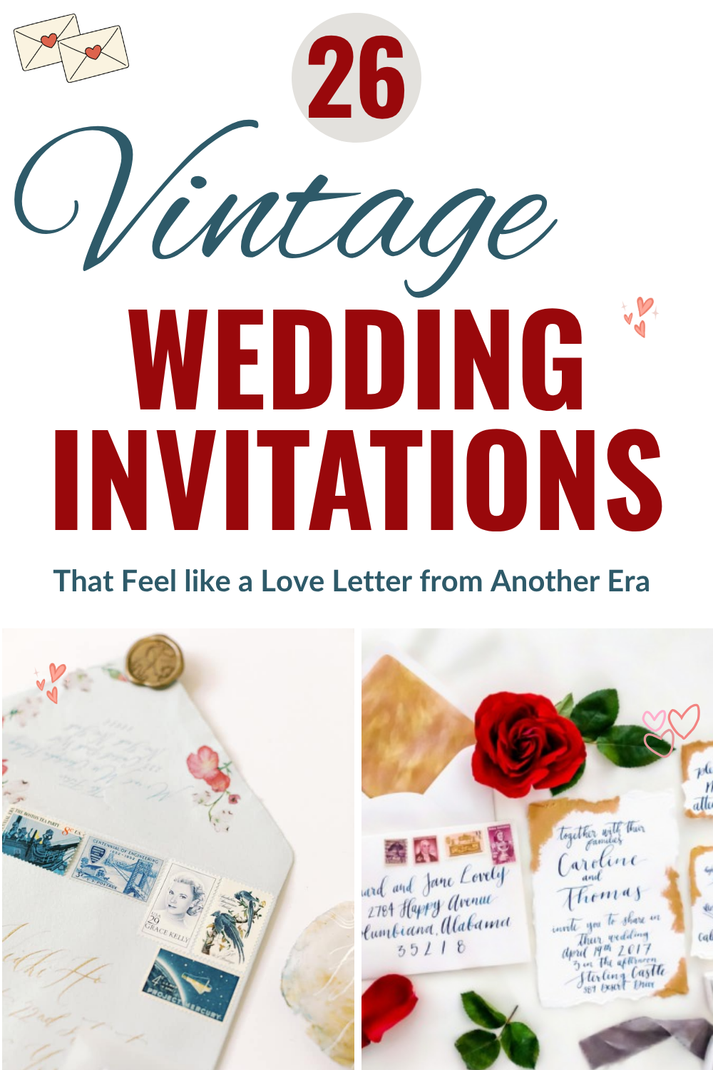
26 Vintage Wedding Invitations From Art Deco to Victorian
There’s a particular kind of joy in receiving a beautiful wedding invitation by mail. Not the generic print-at-home cardstock variety, and not the evite that gets buried under newsletter subscriptions. A real invitation, the kind with weight to it, calligraphy you want to trace with your finger, maybe a wax seal holding the envelope flap closed. That’s the one your guest pins to the fridge and keeps long after the wedding is over. Vintage invitations do that better than almost anything else.
The word “vintage” covers a lot of territory here, which is genuinely good news. If you’re picturing ornate Victorian embossed lace, you’ll find it. If you mean Roaring 20s Art Deco geometry in teal and gold, that’s here too. Rustic chalkboard with chalk-lettered typography, burn-edged paper with actual postage stamps from the 1950s, hand-drawn pen-and-ink florals on deckled-edge paper. Vintage is less a single look and more a shared feeling: intentional, romantic, and a little bit irreplaceable.
Whether you’re drawn to soft watercolor suites, dramatic dark invitations, or something that looks like it arrived from another century entirely, we’ve gathered our favorites below. And if you fall in love with any of these looks, click through to see the full wedding or styled shoot. For even more inspiration, browse our Real Weddings directory.
Romantic Vintage Wedding Invitations
Romantic vintage invitations lean into soft palettes, watercolor botanicals, and calligraphy that feels handwritten rather than printed. These are the suites that make guests want to frame them.
Deckled-Edge Watercolor Suite with Pearl Styling

The torn deckled edges alone put this one in a different category. Displayed on a dark wood table with pearls draped nearby and a gilded feather above, the whole scene feels genuinely old-world. The invitation carries a soft peach-coral watercolor wash and script calligraphy, and the intentional imperfection of the hand-torn paper is exactly the kind of detail that photographs beautifully and feels even better in hand.
See this Roaring 20s Styled Shoot →
Jewel-Toned Botanical Floral Suite with Burgundy Envelope
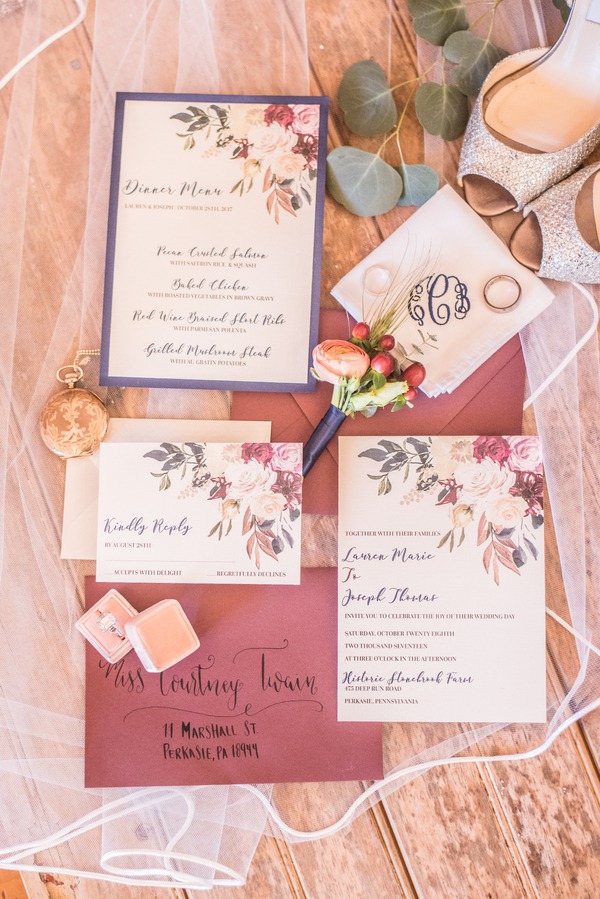
Rich burgundy and blush watercolor botanicals spill across ivory paper in this suite, and the calligraphy script keeps it from feeling too fussy. The deep burgundy envelope is addressed by hand with a copper ink, and even the RSVP card picks up the floral motif so the whole thing feels cohesive rather than assembled from different directions. This is the suite for couples who want something clearly romantic without veering into overly delicate territory.
See this Jewel Tone Styled Wedding →
Blush Peony Watercolor Invitation with Gold Foil Border
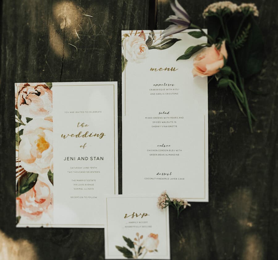
The peonies here are large enough to be the headline, spilling across the left side of the card in pale blush and ivory. A thin gold foil border frames the invitation, and the couple’s names are written in a flowing gold script that keeps everything feeling luxe without being overdone. The menu card and RSVP pick up the same peony motif, so when this suite arrives at someone’s house, it looks considered from every angle.
See this Romantic Vintage Styled Shoot →
Burgundy Floral Invitation with Velvet Ribbon and Wax Seal
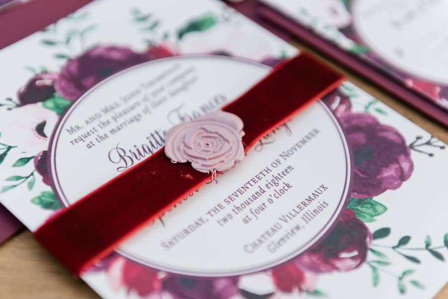
Dark burgundy peonies and deep purple blooms cover this invitation from edge to edge, and a wide cranberry velvet ribbon wraps across the center, held in place by a blush wax seal pressed into the shape of a rose. The text itself is arranged in a circular format inside the wreath of flowers, which gives it a formal, ceremonial quality that feels centuries old. This one is deeply luxurious in a way that photographs beautifully but is even more striking in person.
See this Styled Thanksgiving Wedding →
Botanical Wreath Invitation with Vintage-Style Black-and-White Photos
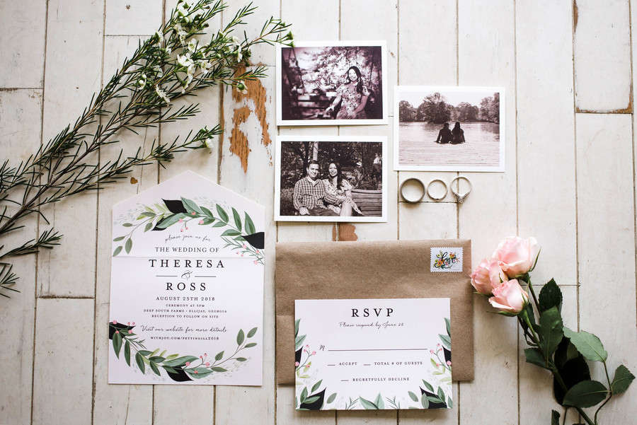
The invitation itself features a delicate watercolor botanical wreath framing the couple’s names, printed on clean white paper alongside an RSVP in the same style. What makes this suite genuinely charming is what surrounds it: black-and-white photographs of the couple styled like vintage prints, alongside the kraft envelope and a single fresh bloom. The whole flat lay feels like a keepsake box from another era, even though it’s completely current.
See Theresa and Ross’s Farm Wedding →
Classic and Ornate Vintage Invitations
Scrollwork borders, oval cameos, chalkboard lettering, and hand-drawn botanicals fall under the classic ornate category. These designs look like they could have been printed in 1890 or designed this year, and that’s exactly the point.
White Invitation with Ornate Scrollwork Border in Maroon and Teal
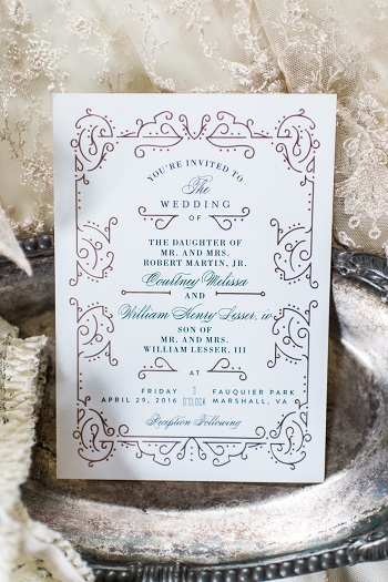
This invitation leads with the border, an elaborate scrollwork design in maroon with teal calligraphy accents that fills all four edges and makes the white card feel almost architectural. The typography inside is formal and traditional, with the couple’s names centered and fully spelled out in the old-fashioned style (“The Daughter of Mr. and Mrs.”). It’s exactly what you’d imagine receiving from a family that takes their paper goods seriously, which is a very specific compliment.
See Courtney and William’s Virginia Park Wedding →
Hand-Drawn Pen-and-Ink Floral Suite with Deckled Edges and Wax Seal

The florals on this invitation are drawn, not printed, pen-and-ink peonies and roses in deep purple that flow up the side of the card. The paper has deckled edges and the calligraphy addressing on the envelope is done by hand. A pink wax seal closes the envelope, and the RSVP card features a burgundy watercolor wash that’s so beautifully done it almost overshadows the main invitation. Almost. This suite was designed to feel as special as the day it’s announcing.
See this Vintage Meets Modern Styled Shoot →
Chalkboard Invitation with White Chalk Typography and Flourishes
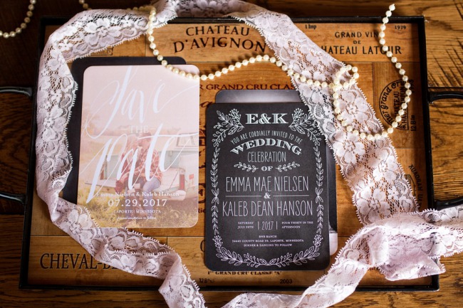
A chalkboard invitation done well is one of those designs that reads as clearly vintage without relying on a specific era. This one sits on an old wine crate labeled “Chateau D’Avignon” with a length of blush lace ribbon and pearls draped across, and the dark card with white chalk-lettered names and decorative flourishes fits right in. It’s rustic vintage rather than formal vintage, which suits barn weddings, outdoor ceremonies, and couples who want something warm and personal over stiff and traditional.
See Emma and Kaleb’s Rustic Barn Wedding →
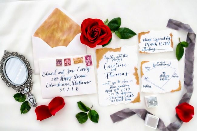
Blue Vintage Typography with Hand-Drawn Botanical Flourishes

Bold vintage typography — part letterpress poster, part formal announcement — fills this blue and white invitation with an old-world confidence that reads immediately as classic. The hand-drawn botanical swirls and tulip details soften the boldness of the lettering, and a circular date badge gives it the kind of graphic structure you’d expect from a 1920s event notice rather than a wedding invitation. It’s one of those designs that looks like it took effort because it actually did.
See Stephanie and Damon’s Alabama Wedding →
Lavender Striped Invitation with Oval Cameo Frame and Bow Detail
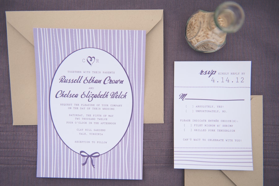
Lavender vertical stripes cover the card background, and a white oval cameo frame sits at the center holding the couple’s names in calligraphy script. A small bow at the bottom adds a detail that’s distinctly old-fashioned in the best way, the kind of flourish that makes the whole design feel like it came out of a Victorian stationery box. The kraft envelope and minimal RSVP card keep it grounded so the main invitation can do its thing.
See this Lavender Inspired Shoot →
Victorian and Old World Vintage Invitations
These are the invitations that look like they belong in a letter box from 1875. Actual vintage postage stamps, hand-drawn venue illustrations, embossed lace borders, antique paper, and calligraphy that feels genuinely old. If you want guests to wonder how your invitation ended up in their century, this section is for you.
Burn-Edged Calligraphy Suite with Vintage Postage Stamps and Ornate Mirror
The edges of the invitation cards here look like they’ve been aged over a flame, and the blue calligraphy script runs across in a way that feels lived-in rather than stiff. A gold envelope liner peeks through when the flap opens, vintage postage stamps seal the outer envelope, and a small ornate silver hand mirror sits beside the suite as if it has always been there. Every element feels like it has a history, which is exactly what you want from a vintage invitation that’s actually modern.
See this Beauty and the Beast Styled Shoot →
Deckled-Edge Suite with Hand-Drawn Venue Illustration and Vintage Stamps

The deckled edges on this suite are torn, not cut, and the paper has a soft grey-beige tone that reads warm without being cream. A hand-drawn sketch of the wedding venue, what appears to be a castle or estate, appears on one of the cards alongside vintage green postage stamps. The envelope is addressed in copper calligraphy, and the whole suite rests on grey linen with botanical sprigs and scattered blueberries. It’s the kind of invitation that makes guests research the venue before they RSVP.
See this Old World Bridal Shoot →
Gold Wreath Invitation Alongside a Genuine Antique Victorian Card
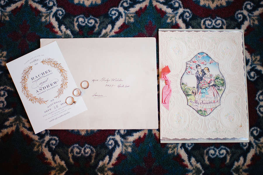
The modern invitation here, a clean white card with a gold laurel wreath and calligraphy, earns its vintage credentials entirely from what it’s placed next to: a genuine antique Victorian card with an embossed lace border, a hand-painted illustration of a Victorian couple under a flowering tree, and the words “To My Sweetheart” printed at the bottom in old-fashioned serif type. The two sit together on a Persian carpet with the couple’s rings between them. If you’re looking for inspiration to mix an actual antique keepsake into your invitation display, this is exactly how it’s done.
See Rachel and Drew’s Lake Erie Wedding →
Floral Envelope Addressed with Actual Vintage Postage Stamps

This is really about the stamps. Actual vintage American postage stamps, including a 29-cent Grace Kelly stamp, a Boston Tea Party stamp, a Project Mercury stamp, and an illustrated bird, line up across the bottom of a floral-printed envelope addressed in copper calligraphy. A gold wax seal finishes the top flap. This is the kind of invitation detail that requires serious thrift store hunting or a well-stocked vintage stamp dealer, and it shows in every photo. If your guests aren’t going to save the envelope, they’re keeping the stamps at least.
See this Greek Goddess Styled Shoot →
Pink-Bordered Invitation with Gold Botanical Illustrations and Calligraphy Envelope

A soft pink border frames this invitation, and gold botanical illustrations with feather motifs decorate the envelope liner. The outer envelope is addressed by hand in flowing calligraphy and sealed with a vintage stamp, and a small decorative fan with dried botanicals sits alongside. Everything here is gentle and considered, the kind of suite that suggests the couple put real thought into how the invitation would feel to hold, not just how it would look in a photo.
See this Garden Romance Wedding →
Art Deco and Roaring 20s Wedding Invitations
Art Deco invitations are vintage with a backbone. The geometric precision, jewel-toned backgrounds, and gold line work make them immediately recognizable, and they suit couples who want their Great Gatsby moment without any ambiguity about which era they’re referencing.
Teal and Gold Art Deco Invitation with Geometric Border

Dark teal with gold geometric borders, sunburst accents, and diamond motifs: this invitation does not leave the decade up for interpretation. The couple’s names are written in elegant calligraphy across the center, and the invitation sits on a sequined fabric that looks like it was pulled directly from a 1920s evening gown, surrounded by pearl necklaces and a vintage brooch. This is an invitation with a full costume, and it works completely. For a New Year’s Eve wedding or any event at a venue with a grand ballroom, this is the invitation that makes sense.
See Megan and Jerry’s New Year’s Eve Wedding →
Dark and Gothic Vintage Invitations
Not every vintage invitation should feel like a garden party. These two lean into the moody, dramatic side of vintage, with aged paper, ornate baroque frames, and black lace. They’re for couples who want the romance of vintage without the pastels.
Aged-Paper Baroque Invitation with Black Lace Ribbon

Aged amber paper with a ornate baroque scrollwork border and dark ink gives this invitation the look of something recovered from a 19th-century manor. Black lace ties around the card and the whole thing sits on a burgundy backing, which adds depth without tipping into pure Halloween territory. The aging on the paper is deliberate and beautifully done, the kind of detail that makes you wonder what the ceremony itself looked like. For couples planning something with a gothic, moody, or Victorian edge, this sets exactly the right tone.
See this Pirates of the Caribbean Styled Shoot →
Invitation Displayed in an Ornate Gold Baroque Frame with Navy Envelope
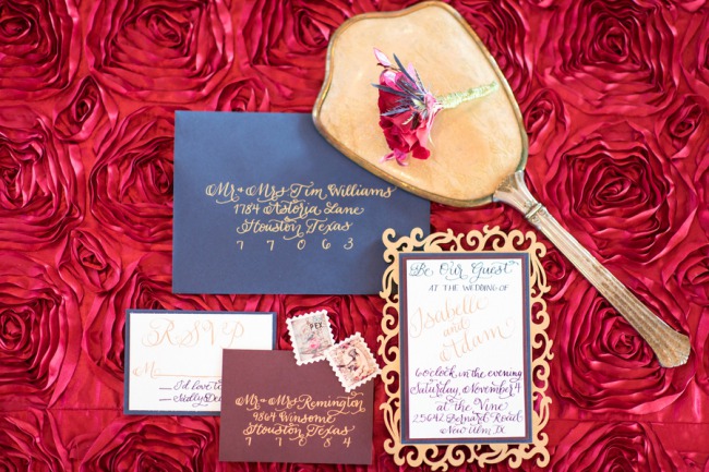
The invitation is displayed inside an ornate gold baroque picture frame, which is an idea that sounds over-the-top until you see it and realize it’s actually brilliant. The navy envelope alongside it carries gold calligraphy and vintage postage stamps, a burgundy envelope holds the RSVP, and a decorative hand mirror rests nearby. All of it sits on a red satin rose-textured fabric that makes the whole thing feel like a theatrical production, the kind of invitation where guests assume the wedding itself will be equally dramatic. Correct assumption.
See this Vineyard Styled Shoot →
FAQs
What makes a wedding invitation look vintage?
Vintage invitations typically share a few key elements: calligraphy or script lettering rather than modern sans-serif fonts, ornate borders, deckled or hand-torn paper edges, muted or jewel-toned color palettes, and details like wax seals, vintage postage stamps, or ribbon closures. You don’t need all of these. Even one or two vintage-specific details can shift the overall feel of an otherwise simple invitation toward something that reads as distinctly old-world.
What paper works best for vintage wedding invitations?
Cotton paper and handmade paper are the most popular choices for vintage invitations because they have natural texture and weight that standard cardstock can’t replicate. Cotton paper (sometimes called cotton rag) feels soft and slightly textured, holds letterpress printing beautifully, and ages gracefully. Handmade paper typically has visible fibers and natural deckled edges straight off the mold. For a more intentionally aged look, parchment or kraft paper both work well, especially for rustic or gothic vintage styles.
What’s the difference between Victorian and Art Deco vintage invitations?
Victorian invitations (roughly 1837 to 1901) tend to favor ornate, flowing designs: embossed lace borders, botanical illustrations, oval cameo frames, ribbon details, and lots of curvilinear flourishes. The overall feel is romantic and feminine. Art Deco invitations (1920s and 30s) are more geometric and graphic: bold angular borders, gold line work, jewel-tone backgrounds, and a certain glamorous confidence. Victorian vintage reads soft and nostalgic; Art Deco reads dramatic and theatrical. Both are legitimately vintage, they just belong to very different decades.
Should I use a wax seal on my vintage invitation?
If your aesthetic supports it, yes. A wax seal is one of the fastest ways to signal vintage intent, and guests genuinely love them. The practical considerations: wax seals can occasionally get damaged in automated postal machines, so hand-canceling your envelopes at the post office is worth the extra trip. You can also seal a liner envelope and leave the outer envelope plain, which protects the seal and still gives guests the moment of breaking it open. Monogram seals, botanical motifs, and simple circular seals all look beautiful depending on the overall suite style.
How far in advance should I send vintage wedding invitations?
The standard timeline is six to eight weeks before the wedding for most invitations. If your wedding requires travel for many guests, send eight to twelve weeks ahead and consider a save-the-date even earlier. Vintage invitations with hand-calligraphed envelopes, custom wax seals, or specialty paper typically have longer production timelines than standard printed stationery, so factor that in when placing your order. Ask your stationer or designer how much time they need from final approval to delivery, and add a buffer for any corrections.