What makes watercolor work so well for wedding stationery is the warmth of it. Unlike foil or letterpress, which can feel formal and untouchable, watercolor looks like someone made it specifically for you. Even the most polished suites in this roundup have a handmade quality that printed-on-demand invitations just can’t replicate. That’s why guests hold onto these. Some literally frame them.
Below we’ve grouped our favorites by style so you can find the right direction for your wedding’s mood. Whether you’re leaning soft and romantic, garden-inspired and botanical, or bold and painterly, there’s a suite here that fits. Click through any image to see the full wedding it came from. And for even more inspiration, browse our Real Weddings directory.

Romantic Watercolor Floral Invitations
Soft pinks, blush tones, and delicate florals are the heart of romantic watercolor stationery. These suites lean feminine and warm without tipping into fussy. They work beautifully for garden weddings, vineyard ceremonies, and anything with a gentle color palette.
Blush Floral Wreath Suite with Gold-Lined Envelope

A watercolor floral wreath in soft pinks and greens frames the couple’s initials on the main invitation card, and the matching RSVP carries a whisper of the same blush tone. The gold-lined envelope is what elevates this from pretty to polished. It’s the kind of suite where guests pause before opening it because they don’t want to mess it up.
See Robyn and Zac’s Texas Wedding →
Pink Floral Wreath with Watercolor Envelope Liner

Pink and blue watercolor florals form a loose wreath on the invitation, with the same motif blooming inside the envelope liner. Against a dark wood background, the soft palette reads more moody than saccharine. The suite includes the main invitation, RSVP, and a details card that all feel like they belong to each other without being matchy in a rigid way.
See this Virginia Styled Shoot →
Hand-Painted Blush Peony with Brush Lettering
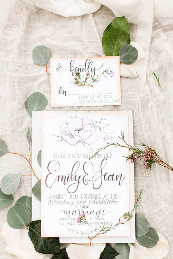
A single oversized watercolor peony anchors the top of this invitation while romantic brush calligraphy runs the length of the card. The blush paper and deckled edges make it look genuinely handmade, not just “handmade aesthetic.” Laid on a linen cloth with eucalyptus, wax flowers, and a matching RSVP card, this is the suite for a bride who wanted her stationery to feel like art, not a form letter.
See this Rustic Chic Styled Shoot →
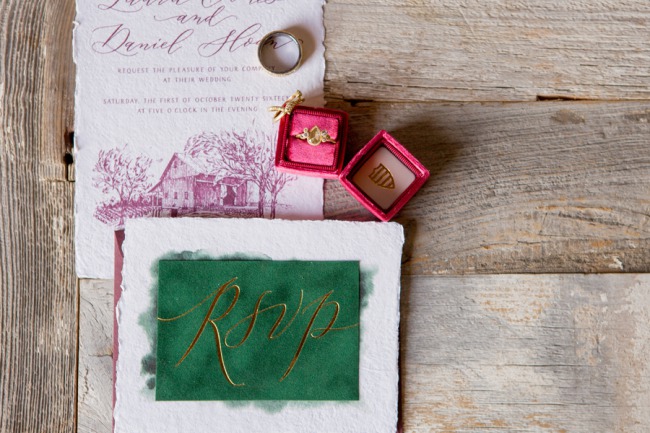
Blush Floral Suite with Gold Border and Purple Script

A blush watercolor floral border wraps the invitation while a thin gold metallic frame holds it together, and the names are hand-lettered in soft purple to match the suite’s palette. Styled on stone with the wedding rings and a pendant, it carries the gold-and-purple story of this Montana mansion wedding right onto the card.
See Elaina and Brian’s Montana Wedding →
Warm Peach Watercolor Wash Suite with Deckled Edges

A soft peach and terracotta watercolor wash bleeds across every card in this suite, with deckled edges adding a handmade finish that feels vintage and intimate at once. It’s one of those palettes that photographs warmly at every hour of the day, which makes sense given it appeared at a shoot inspired by the roaring twenties. Less gold-and-glitz, more sun-faded romance.
See this Roaring 20s Styled Shoot →
Oversized Painterly Peonies with Gold Foil Calligraphy
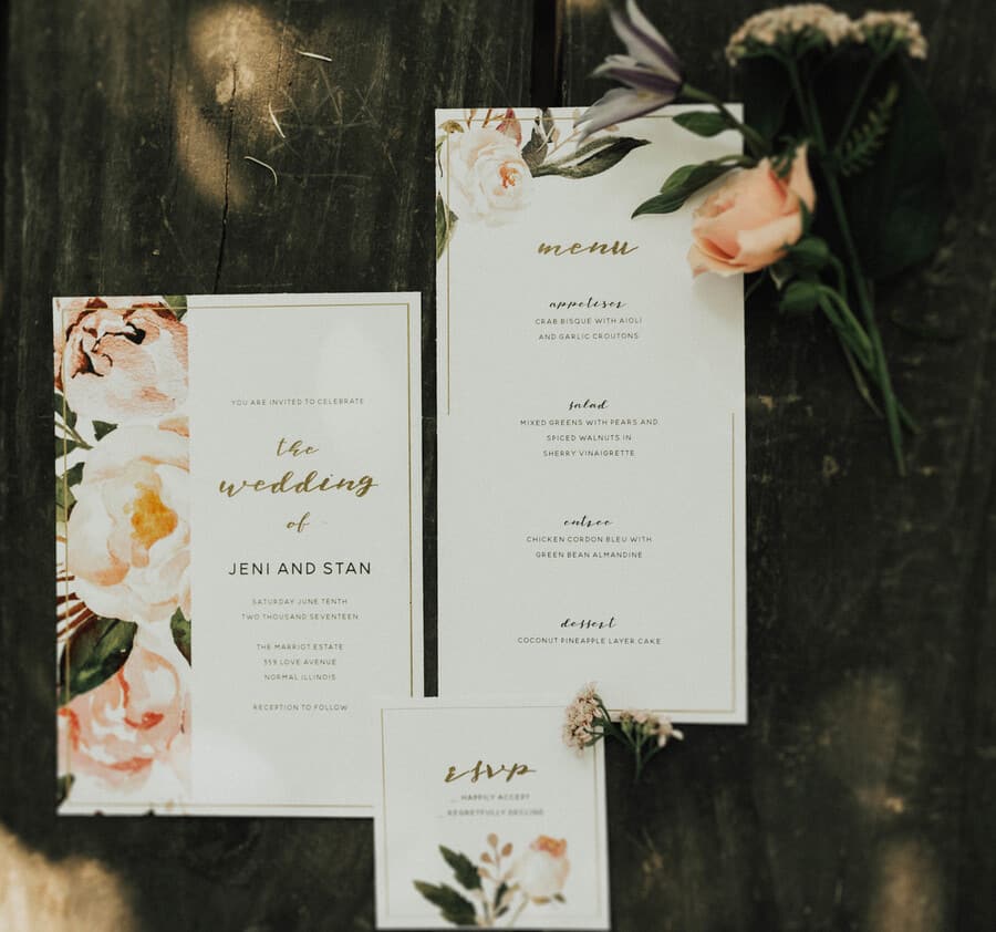
These peonies are not small. They take up the card. The hand-painted blush and soft green florals are lush to the point of editorial, and the gold foil calligraphy pulls it back toward polished without losing the painterly feel. The suite includes the invitation, menu, and RSVP, all in the same bold floral language. It’s the kind of stationery people describe as “too pretty to throw away” and genuinely mean.
See this Romantic Vintage Styled Shoot →
Deep Rose Floral Suite with Watercolor Venue Portrait
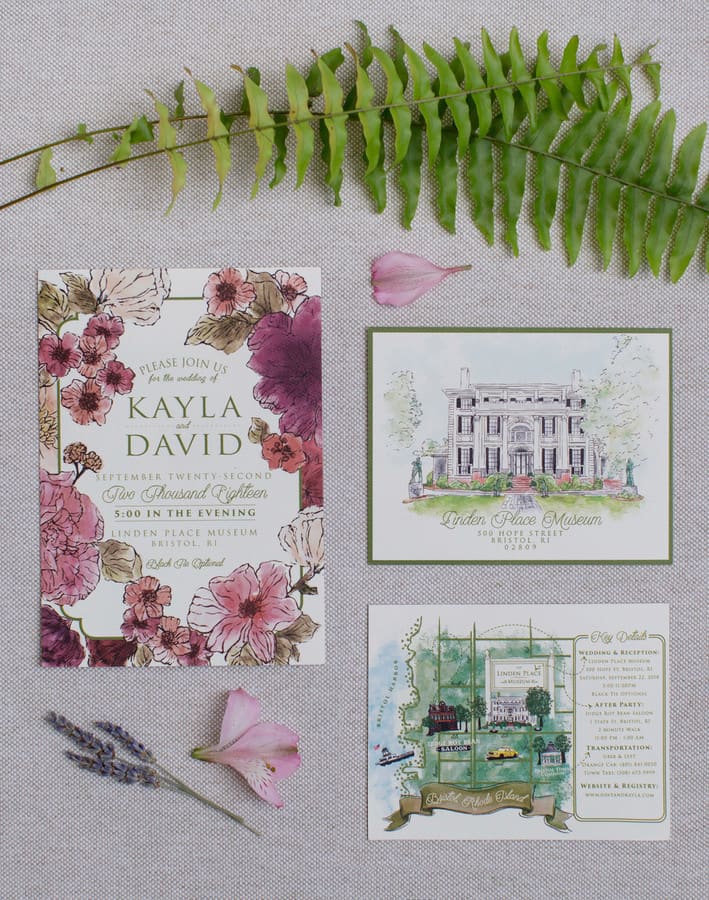
Deep rose and mauve watercolor florals crowd the edges of this invitation in a lush, botanical border, and the suite goes further with a second card: a detailed watercolor portrait of Linden Place, the 1810 Rhode Island mansion where Kayla and David married. Getting the actual venue painted and slipped into the same envelope as the invitation is the kind of stationery detail guests keep long after the wedding.
See Kayla and Dave’s Rhode Island Wedding →
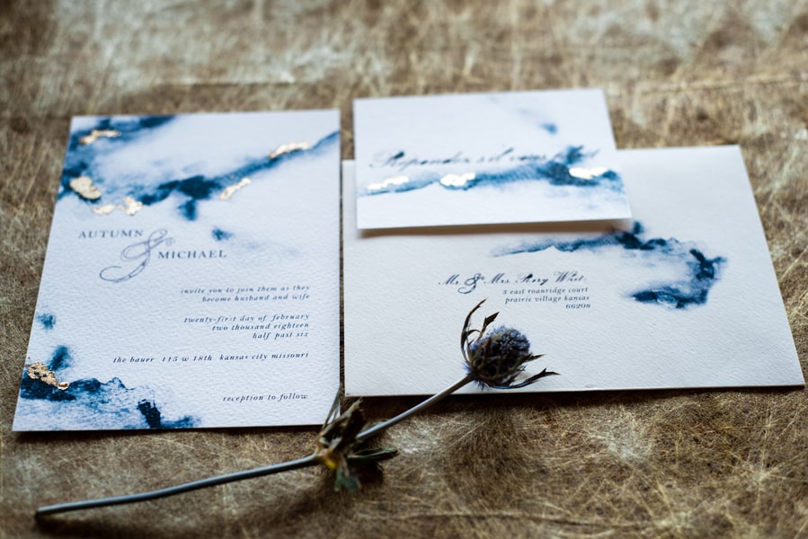
Pale Icy Blue Watercolor with Deckled Edges and Gold Calligraphy
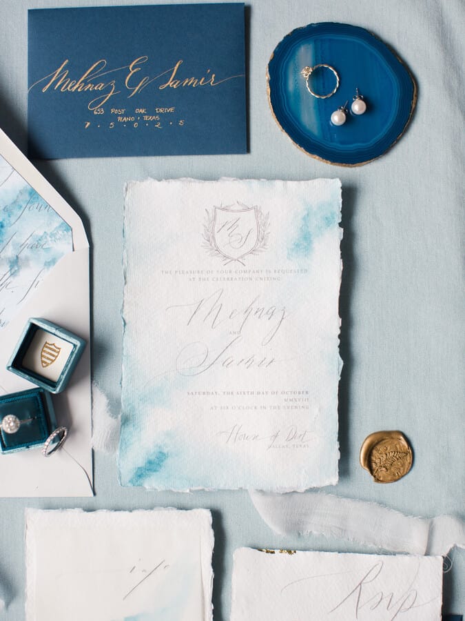
A soft, ethereal blue watercolor wash covers the invitation in a way that feels like early morning light, not bold color. The deckled edges, gold calligraphy, and crest monogram give it a formal elegance the pale palette keeps from feeling stiff. The dark navy envelope with gold hand-lettered addressing is the twist that makes it. Styled here with a blue agate ring dish and pearl earrings, it’s a suite that feels like it arrived from someone who takes their correspondence seriously.
See Mehnaz and Samir’s Wedding →
Garden & Botanical Watercolor Invitations
For weddings with an outdoor, nature-forward feel, botanical watercolor invitations do the heavy lifting. These lean green, lush, and alive. They work for garden parties, forest ceremonies, destination weddings, and any couple who’d rather have ferns on their table than roses.
Watercolor Greenery Suite with Navy Accents

Loose watercolor leaves and soft white florals border this invitation in a way that feels fresh and garden-ready without going full maximalist. The navy blue on the envelopes and accent cards adds structure without taking the warmth out of it. This is a flatlay that makes you want to put on linen and head outside. The glitter heels and scattered anemones in the image are there because of course they are.
See Emily and Drew’s Wedding →
Botanical Wreath Invitation with Engagement Photo Flatlay

A painted leaf wreath frames the couple’s names on this invitation, and the suite is styled alongside their black-and-white engagement photos, a watercolor stamp, and soft pink roses. It’s a flatlay that tells you everything about who these people are before you read a single word. The kraft envelope with hand lettering feels intentional, not rustic-by-default.
See this Romantic May Day Styled Shoot →
Watercolor Foliage Corner Suite with Calligraphy Script
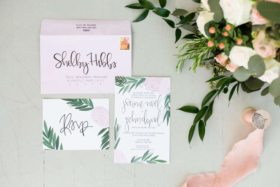
Green watercolor foliage fans out from the corners of both the invitation and RSVP card, with calligraphy script running the length of the main card. The addressed envelope included in the flatlay makes it feel like something you’d actually pull from a real mailbox, not a styled prop.
See Joanie and John’s Elegant Blush Spring Wedding →
Cascading Watercolor Wisteria with Purple Script Names

The wisteria hangs from the upper right corner in loose, painterly brushstrokes, with a few stems of greenery tucked in at the bottom left. The couple’s names are printed in the same soft purple as the blooms, a detail that connects the typography to the illustration in an obvious but satisfying way.
See Stephanie and Dalton’s Wisconsin Wedding →
Tropical Botanical Border with Watercolor Blue Wash

This one stops the scroll. A border of lush watercolor succulents and tropical leaves frames the invitation on all four sides, with a soft blue wash behind the text. The shape is unique too, a pointed top that looks like an envelope itself, which means it stands out in the pile before anyone even reads the names. From a seaside Costa Rica wedding, it captures the lush, destination energy of the day from the moment it hits the mailbox.
See Miranda and William’s Costa Rica Wedding →
Illustrated Botanical Crest with Watercolor Greenery Liner
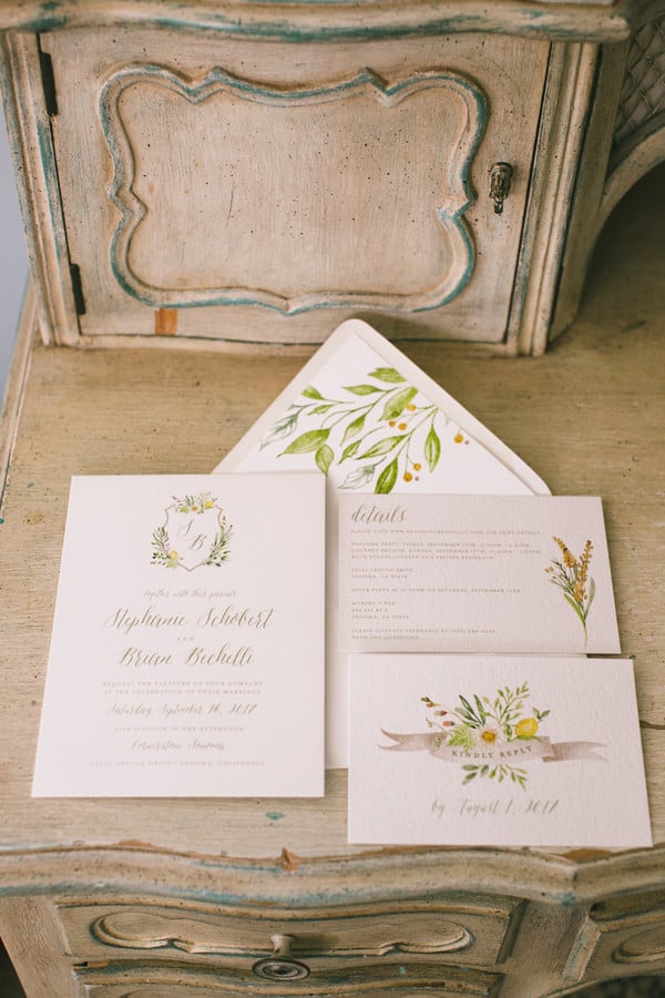
The botanical crest on this invitation is hand-illustrated with delicate precision, but the real reveal is inside the envelope: a full watercolor greenery liner in deep, lush tones that feels like opening a garden. Styled on a vintage French dresser with roses, it has an old-world quality that gives watercolor stationery a more formal, heirloom register. The suite includes the invitation and a matching RSVP, both framed by the same botanical language.
See Stephanie and Brian’s Wedding →
Venue Watercolor Illustration with Green Watercolor Wash RSVP
The main invitation features a hand-painted watercolor illustration of the venue, which is one of those design choices that sounds ambitious and delivers completely. The RSVP card goes in a different direction: a rich green watercolor wash with gold calligraphy that feels like a garden in its own right. Together the two cards cover a lot of emotional ground without fighting each other. From a ranch elopement, and it shows in the best way.
See this Strawberry Creek Ranch Elopement →
Misty Blue-Green Watercolor Suite Bundled with Twine

The misty blue-green wash across this suite is the color of fog over a Pacific Northwest forest, and the decision to photograph the whole thing bundled in twine makes it feel like something arriving in the mail from somewhere beautiful. Most invitation flatlays spread the suite wide to show everything at once. This one keeps the mystery, and it works. The Tickle Tree Design Studio has a specific handwriting, and this is it.
See this Pacific Northwest Styled Shoot →
Bold & Artistic Watercolor Invitations
Not all watercolor invitations are soft and whisper-quiet. These suites lean into the paint. Deep cobalt washes, deckled edges, gold foil contrasts, and warm sun-soaked florals: these are invitations that make guests stop and say “wait, did someone paint this?”
Cobalt Blue Watercolor Wash with Deckled Edges and Calligraphy
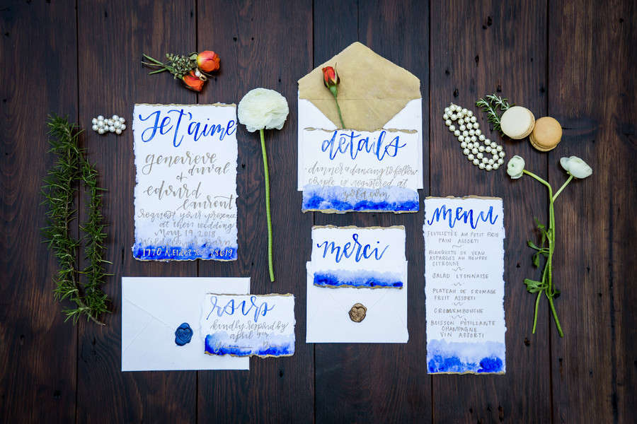
This is the invitation suite for someone who spent a lot of time on Pinterest boards labeled “Parisian” and “Art Studio.” A deep cobalt blue watercolor wash bleeds across the bottom of every card, the deckled edges are hand-torn, and the calligraphy is fully hand-painted (you can see the brushwork). The French touches (“Je t’aime,” “merci,” “détails”) make the whole thing feel like correspondence from another era. The suite includes an invitation, details card, RSVP, and menu, all coordinating, none identical.
See this French Impressionist Styled Wedding →
Watercolor Protea Invitation with Gold Foil Diamond Frame
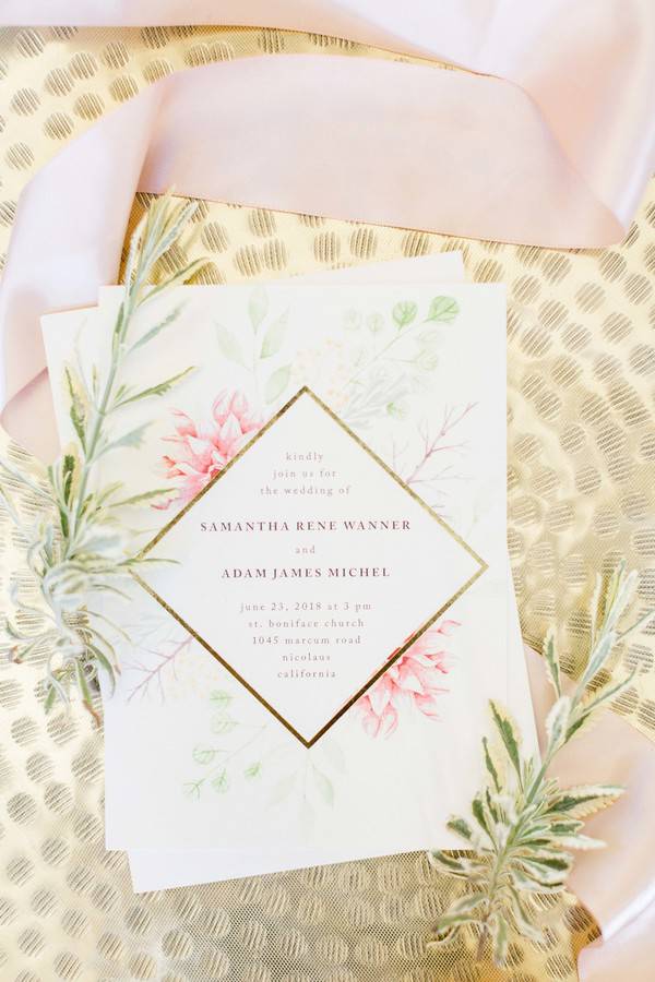
Soft pink protea and watercolor eucalyptus spread freely across this invitation, then get reined in by a sharp gold foil diamond frame around the text. The tension between organic and geometric is exactly what makes this one work. Styled on a gold charger with silk ribbon and air plants, it photographs beautifully, which clearly was part of the plan. From a California wedding, it leans romantic but with an editorial edge that keeps it from feeling too sweet.
See Samantha and Adam’s California Wedding →
Warm Yellow Floral Watercolor Full Suite

Golden-yellow watercolor florals and soft green leaves wash across the invitation, table numbers, and place cards in this sunshine-colored suite. The matching envelope is hand-lettered with the same warm script, so the whole thing coordinates from the first RSVP to the last seating card. It’s one of those suites where you realize the design didn’t stop at the invitation, and that makes the whole wedding feel more considered.
See this Woodland Styled Shoot →
Deep Burgundy and Cream Watercolor Floral Suite
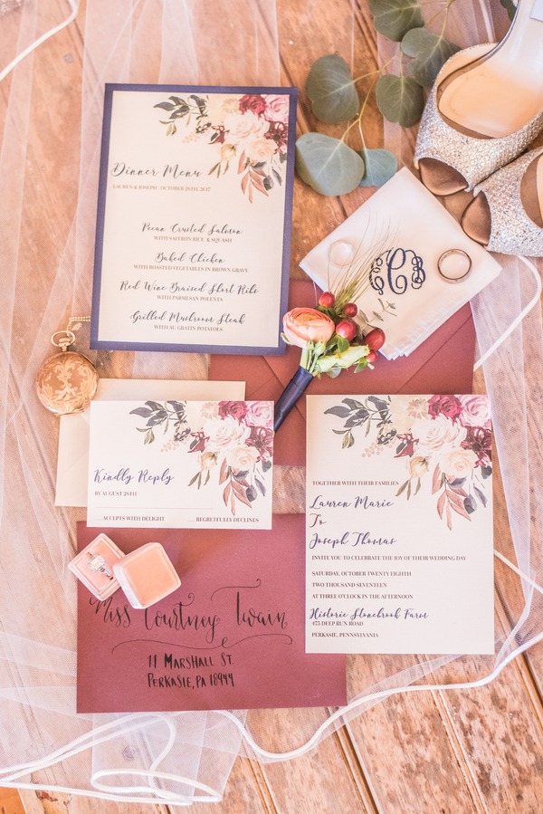
Rich burgundy watercolor florals spill across the invitation card against cream paper, and the full suite includes a menu and RSVP that carry the same deep, moody palette. For anyone who thinks watercolor has to mean soft and pastel, this is the counter-argument. The dark background in the flatlay makes the burgundy pop even further, and the styling keeps it feeling lush rather than heavy. From a Stonebrook Farm wedding, where the color story clearly ran all the way through.
See this Stonebrook Farm Styled Wedding →
Abstract Indigo Watercolor with Gold Ink Splatter
This is watercolor at its most abstract: a deep indigo wash with deliberate gold ink splatter across the invitation card, like someone pointed a paint brush at it and meant every drop. There’s no floral motif, no botanical border, just paint and intention. The envelope and RSVP follow the same language, so the whole suite feels like it belongs to a couple who designs their life rather than just plans their wedding. From an urban loft styled shoot, which makes sense.
See this Gold Chic Urban Loft Styled Shoot →
Dark Slate Watercolor Wash with Rose Gold Foil Frames

A cool slate-gray watercolor wash grounds this suite, and the rose gold foil geometric frames give it structure without going corporate. The full flatlay includes the invitation, program, and coordinating cards, all in the same dark, dramatic palette. It’s the watercolor invitation for a couple whose aesthetic runs more moody editorial than garden party, and the ring and winter styling in the image match that energy completely.
See this Winter Styled Shoot on Ice →
FAQs
What makes an invitation “watercolor” vs. just printed with a floral design?
True watercolor invitations start with original painted artwork, either hand-painted by a calligrapher or stationer, or created digitally to mimic the look of watercolor brushwork. The telltale signs are soft color bleeds, visible brush texture, and edges that fade rather than stop sharply. A printed floral design usually has harder lines and cleaner color fills. The distinction matters because watercolor invitations tend to feel more personal and one-of-a-kind, even when they’re printed in large quantities.
How much do watercolor wedding invitations cost?
The range is wide. Custom hand-painted suites from a calligrapher or stationer can run anywhere from $8 to $20 per suite (and up, depending on the artist). Semi-custom watercolor designs from Etsy or stationery studios typically fall in the $3 to $7 per suite range once you factor in printing and envelopes. Digital watercolor designs you print yourself are on the lower end. Budget for the full suite: invitation, RSVP, envelope, and any inserts like directions or details cards. Postage can also run higher than standard if the suite is heavy or oversized.
What paper stock works best for watercolor invitations?
Cotton paper and thick matte cardstock both show watercolor artwork well. Glossy finishes tend to flatten the texture and make the design look more like a printed photo than a painting. If you’re going for a handmade feel, ask your printer about deckled edges or soft-touch lamination, which gives the card a slight texture without adding shine. For hand-painted originals, cold press watercolor paper is the standard. Just know that the heavier the paper, the more your postage costs go up.
What wedding styles suit watercolor invitations?
Watercolor works across a wider range of styles than people give it credit for. It’s a natural fit for garden, botanical, and outdoor weddings. But it also works for romantic ballroom weddings (in soft blush and gold), destination weddings (with tropical or coastal motifs), and even minimalist weddings when the palette is restrained. What it doesn’t do well is ultra-modern or industrial aesthetics, where sharp lines and clean graphics tend to land better. If your venue has chandeliers and exposed brick, watercolor can still work, you just want a design that leans more graphic than painterly.
When should watercolor invitations go out?
The same timeline applies as any other invitation: six to eight weeks before the wedding for local guests, and eight to twelve weeks if many guests are traveling or need to make travel arrangements. What changes with watercolor is how early you need to start working with your stationer. Custom watercolor suites require proofing rounds, and any hand-lettered elements take additional time. Build in at least eight to twelve weeks from your first conversation with the designer to when you want the invitations in guests’ hands. That’s not counting printing or shipping lead times.
Don’t forget to pin this to your Wedding Stationery Board for later!